Brand Design | Logo Design | Brand Identity
The Eggroll Factory
The logo for The Eggroll Factory, a Houston-based culinary venture, presents a striking and cohesive visual identity that successfully bridges the gap between the culinary world and an industrial aesthetic. By taking the restaurant’s name literally, the design establishes a robust, memorable brand presence built on the concepts of efficiency, consistency, and bold flavor.
Here is a comprehensive breakdown of the logo’s design elements, strategic choices, and brand implications.
Core Concept
The design utilizes a badge or emblem layout, a highly effective format for food and beverage branding. Emblem logos naturally suggest a “seal of quality” or a stamp of approval, assuring the customer of a standardized, reliable product.
By avoiding literal representations of food—such as illustrations of egg rolls, chopsticks, or takeaway boxes—the design takes a more sophisticated, conceptual approach. It sells the concept of the restaurant (a high-output, reliable, and perhaps innovative “factory”) rather than just the menu items.
Iconography: The Gear Motif
The central anchor of the visual identity is the stylized gear or cogwheel.
Symbolism of the Gear: The gear is the universal symbol for machinery, industry, and manufacturing. In the context of a restaurant, it communicates high volume, streamlined processes, and engineered consistency. It implies that the restaurant has perfected the art of the egg roll, churning them out with precision.
The Intersecting Bands: Two thick black horizontal bands dissect the gear. These lines create a visual break that houses the primary wordmark while also resembling a conveyor belt or a structural steel beam, further reinforcing the “factory” theme. The semi-circular arch in the center creates dynamic negative space, drawing the eye directly to the core product: the eggroll.
Typography & Visual Hierarchy
The logo employs a deliberate typographic contrast to establish hierarchy and reinforce the brand’s dual nature.
Primary Wordmark (“EGGROLL”): The central text utilizes a heavy, bold, slab-serif typeface. Slab serifs are historically associated with industrial revolution-era advertising, machinery, and typewriters. The blocky, substantial letters give the word weight and prominence, suggesting a product that is hearty, filling, and substantial.
Secondary Text (“THE” and “FACTORY”): The supporting words are rendered in a clean, modern sans-serif font. Placed on a curved baseline conforming to the shape of the gear, this typography softens the heavy industrial feel slightly and ensures high legibility even when the logo is scaled down.
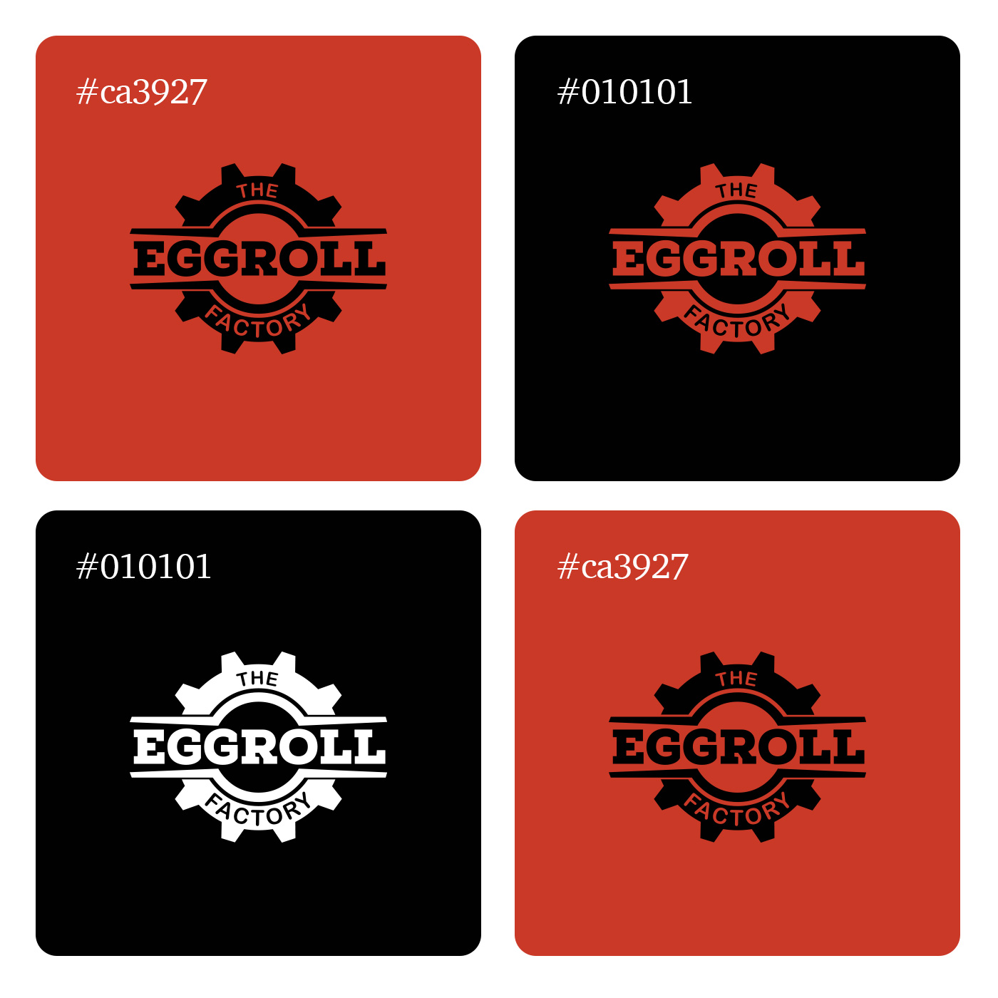
Color Psychology and Palette
The logo relies on a strict, high-contrast, two-color palette (plus the white of the negative space), which is both cost-effective for physical printing and visually commanding.
Rust/Brick Red: The primary color is a warm, muted terracotta or rust red. In food branding, red is famously used to stimulate the appetite and convey energy and heat. However, by choosing a slightly desaturated, “rusty” hue rather than a bright primary red, the design stays true to the industrial factory motif. It evokes images of brick warehouses, heated metal, and savory spices.
Industrial Black: The stark black used for the structural bands provides structural grounding and high visual contrast, ensuring the typography and the central shape pop instantly. It adds an element of boldness and modernity.