Get In Touch
541 Melville Ave, Palo Alto, CA 94301,
ask@ohio.clbthemes.com
Ph: +1.831.705.5448
Work Inquiries
work@ohio.clbthemes.com
Ph: +1.831.306.6725
BRAND DESIGN | LOGO DESIGN | BRAND IDENTITY

Colombian Orchid Ballet

The Colombian Orchid Ballet is a Houston-based dance group dedicated to celebrating and elevating Colombian cultural heritage through the art of ballet. Situated in a city known for its diverse and vibrant arts scene, the organization required a visual identity that could stand out in a metropolitan market while remaining deeply authentic to its roots.

Colombian-Orchid-Ballet-logo-02

Design Objectives

The primary goal was to create a cohesive brand mark that bridges two distinct worlds: the classical, disciplined elegance of ballet and the vibrant, passionate spirit of Colombia. The logo needed to convey movement, grace, and cultural pride without relying on overused dance clichés.

Colombian-Orchid-Ballet-logo-03
Colombian-Orchid-Ballet-logo-04

Visual Strategy & Iconography

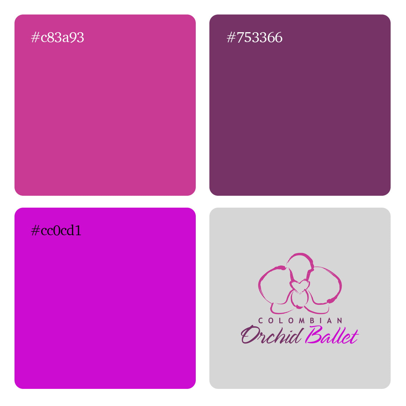
The Floral Metaphor: The centerpiece is a stylized representation of the Cattleya trianae, the national flower of Colombia. This immediately establishes the cultural foundation of the brand.

Kinetic Energy: Instead of a rigid vector illustration, the orchid is rendered in loose, expressive brushstrokes. This artistic choice injects kinetic energy into the design, mirroring the fluid, sweeping motions of a dancer in mid-leap.

Dual Imagery: The organic curves of the lower petals double as a visual nod to the soft, draped tulle of a romantic ballet tutu, creating a seamless connection between the flora and the art form.

The Emotional Core: At the center of the orchid’s lip, the negative and positive space forms a subtle heart, symbolizing the passion of the performers and their dedication to their craft.

Typography & Visual Hierarchy

The typography establishes a balanced structural hierarchy, contrasting stability with motion:

The Foundation: The word “COLOMBIAN” is set in a modern, sans-serif typeface with wide tracking. This acts as the architectural stage, providing a clean, grounded base for the logo.

The Choreography: “Orchid Ballet” utilizes an elegant, flowing script. The rhythmic loops and connective strokes of the lettering capture the continuous, graceful choreography of ballet.

Colombian-Orchid-Ballet-logo-05
color-Colombian-Orchid

Color Palette

The color system relies on an analogous palette of deep plums, magentas, and bright fuchsias.

The gradient transition across the “Orchid Ballet” script—moving from a grounded, darker purple to an electric, vibrant pink—creates a sense of forward momentum.

These tones evoke theatrical drama, feminine energy, and the colorful vitality inherent to Colombian culture, ensuring the brand feels both sophisticated and lively.

  • Rotterdam

    Ohio Digital Media LTD.
    Graaf Florisstraat 22A,
    3021 CH Rotterdam
    Netherlands
  • Barcelona

    Ohio Digital LTD.
    365 Gran Via de Corts
    Catalanes, BA 08015
  • Address

    Aert van Nesstraat
    Lote 25, 3012 CA, 5320-430
    Rotterdam,
    the Netherlands
  • GPS
    N 64° 35' 84.36"
    W 5° 45' 6.20"
    Get Direction
  • Work inquiries

    Interested in working with us?
    hello@clbthemes.com
  • Career

    Looking for a job opportunity?
    See open positions
  • Address

    Witte de Withstraat
    Lote 50, 3012 BR, 6518-25
    Groningen,
    the Netherlands
  • GPS
    N 64° 35' 84.36"
    W 5° 45' 6.20"
    Get Direction
  • Sign up for the newsletter

This website stores cookies on your computer. Cookie Policy