Mr.G’s Pizza
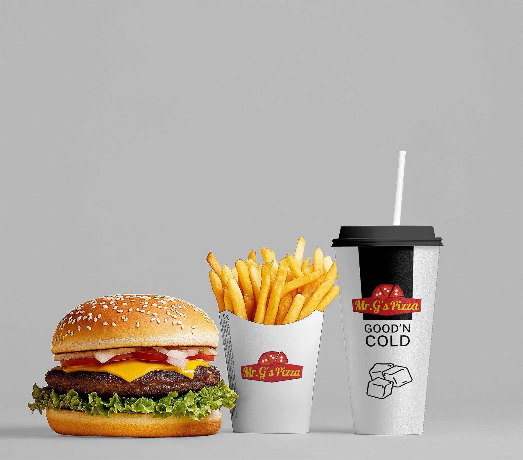
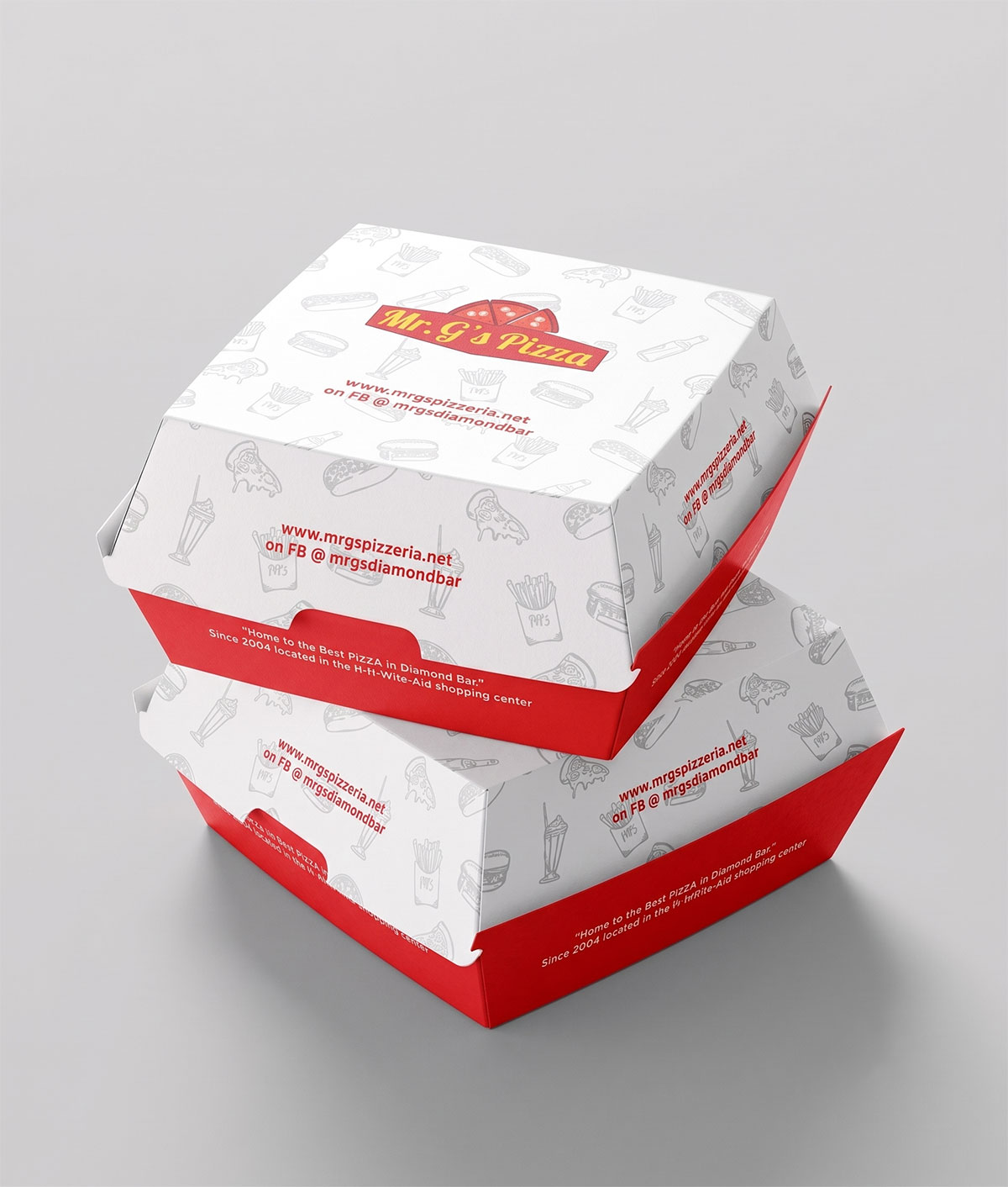
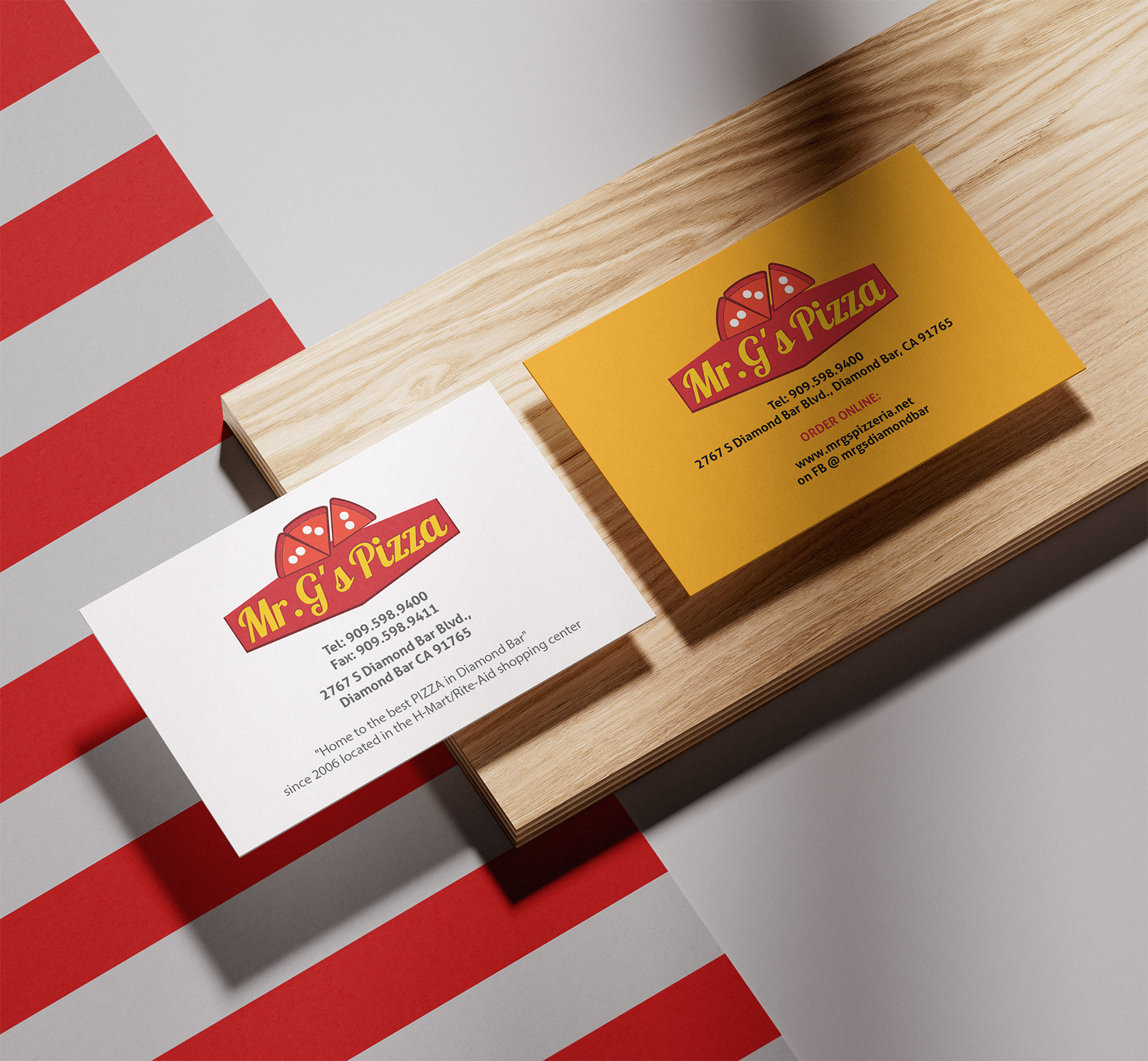
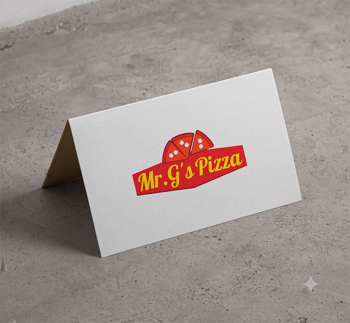
Based on its presence in Diamond Bar, Mr. G’s Pizza positions itself as a proud, family-owned, community-focused alternative to massive corporate pizza chains. The design strategy behind this logo intentionally avoids ultra-modern, minimalist trends. Instead, it leans heavily into a nostalgic, classic pizzeria aesthetic. The goal of this design is to immediately communicate comfort, reliability, and the feel of a longstanding “neighborhood joint.”
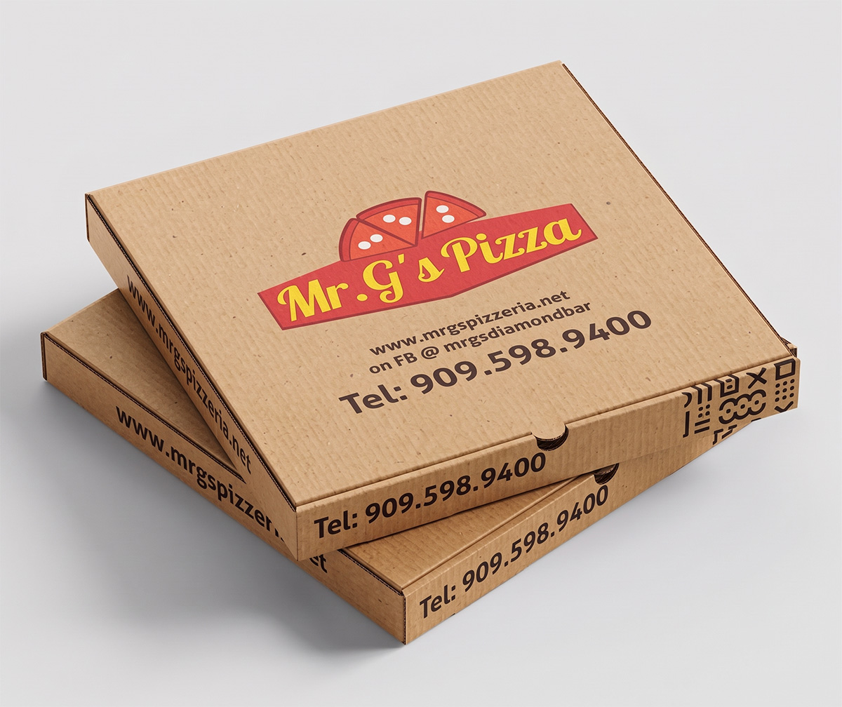
Iconography (The Pizza Crown)
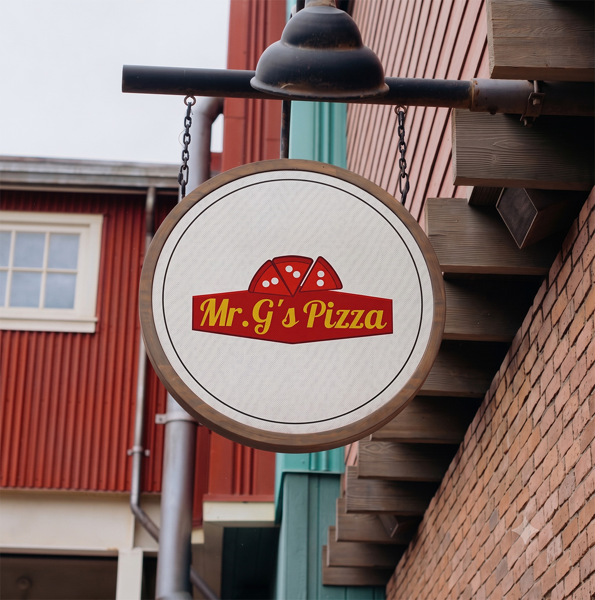
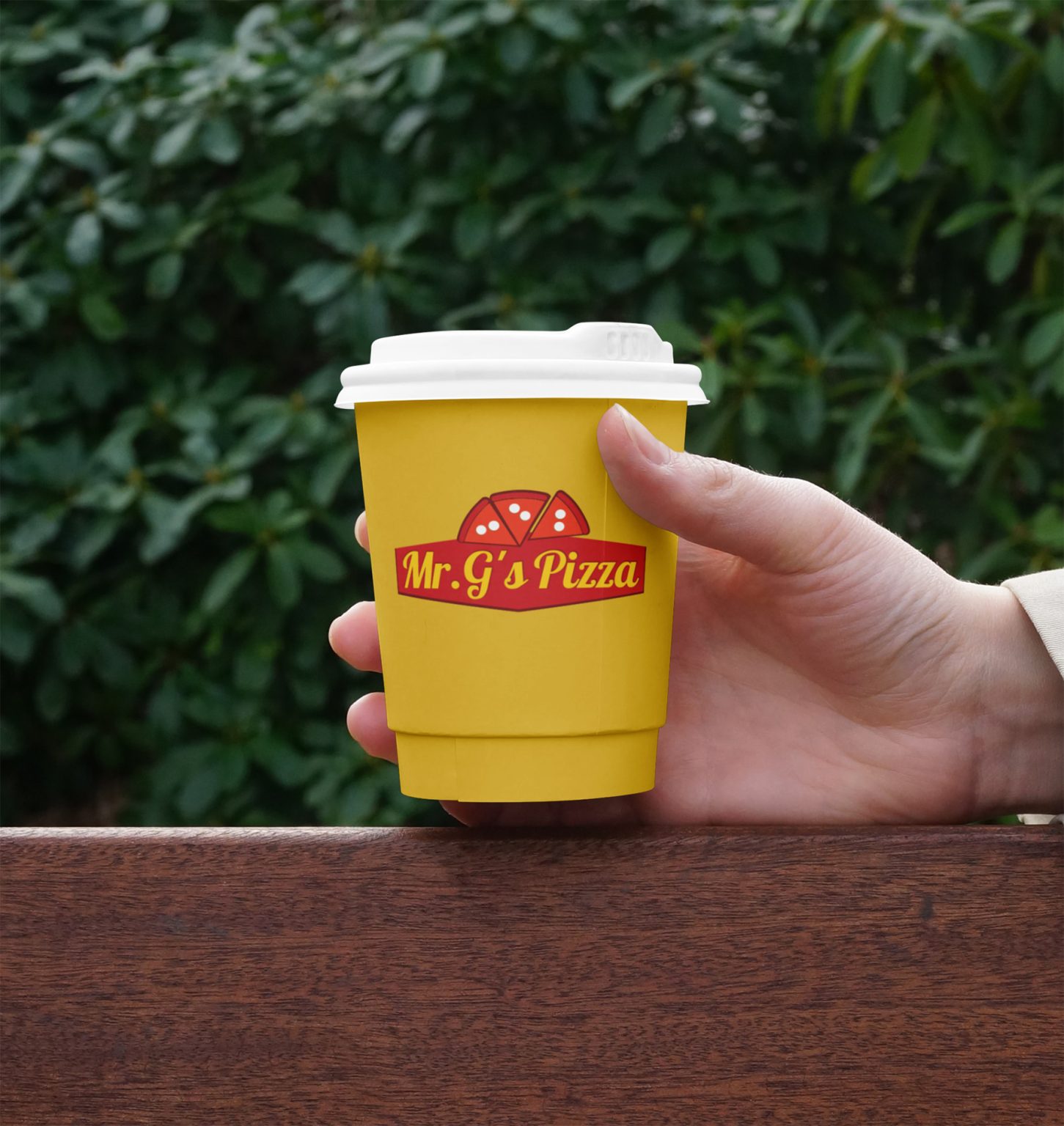
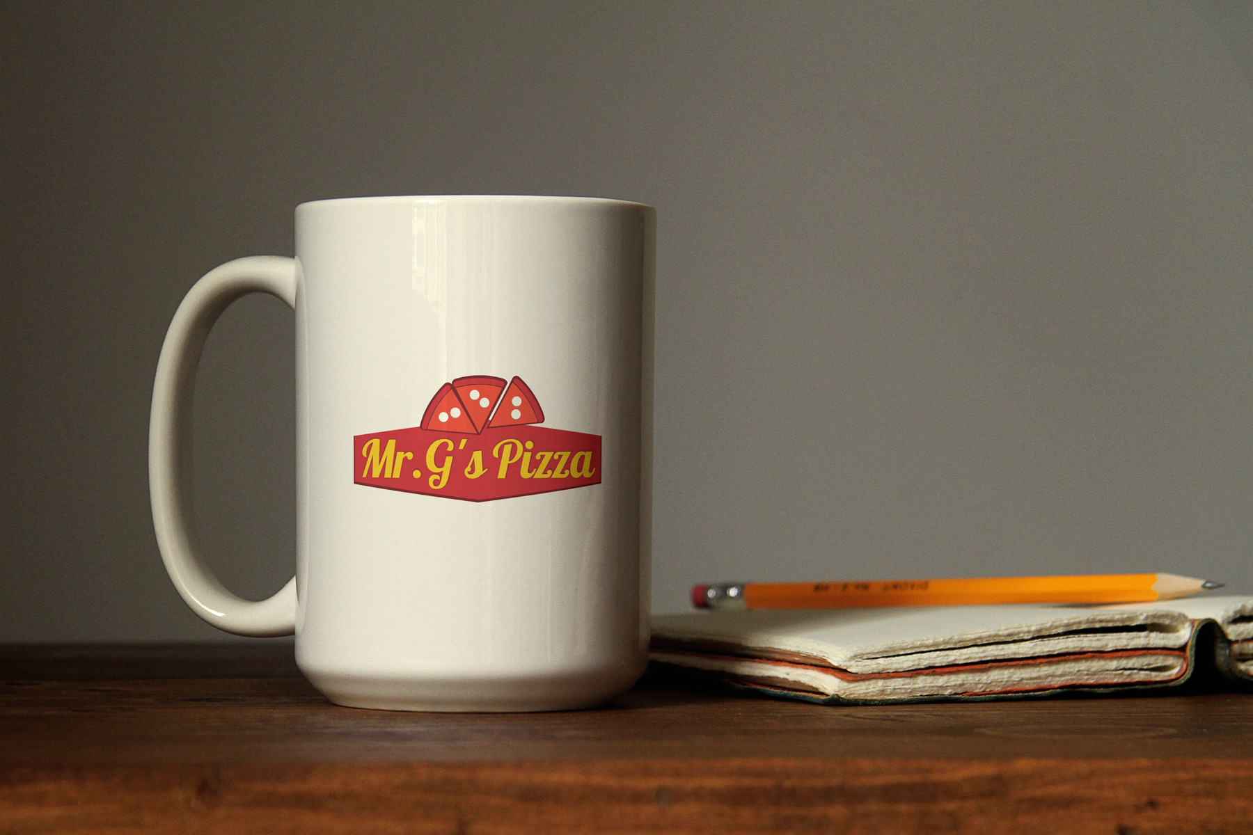
The design is topped with three stylized, overlapping pizza slices arranged in a fan shape. The graphic execution is deliberately flat and vector-based, using simple white circles to represent cheese or pepperoni. This simplicity is highly functional, ensuring the logo remains recognizable whether printed on a large storefront sign along Diamond Bar Blvd or scaled down on a small takeout menu.
Typography
The primary wordmark features a flowing, yellow script font. This cursive style mimics the hand-painted window signage of mid-20th-century American diners and Italian eateries. It softens the brand, making it feel homemade, friendly, and human-centric.
The Container (The Badge)
The text is anchored inside a dark red, geometric banner that comes to a subtle point at the bottom center. This badge-like container grounds the swooping script, creates a cohesive unit out of the logo, and provides a solid, heavy base that balances the lighter pizza graphics on top.
Color Psychology and Palette
The logo utilizes the most historically proven color palette in the restaurant industry—the classic “ketchup and mustard” strategy:
Red & Dark Red: Red is scientifically proven to stimulate appetite, increase heart rate, and draw the eye. In this context, it also literally represents traditional pizza ingredients (rich marinara sauce, brick ovens, and cured meats). The two-tone red creates a subtle depth without relying on complex gradients.
Yellow/Gold: Yellow represents warmth, happiness, and accessibility. Placing bright yellow text on a dark red background creates maximum contrast, ensuring the restaurant’s name is highly legible from the street, even at night.