Ovoid Atelier
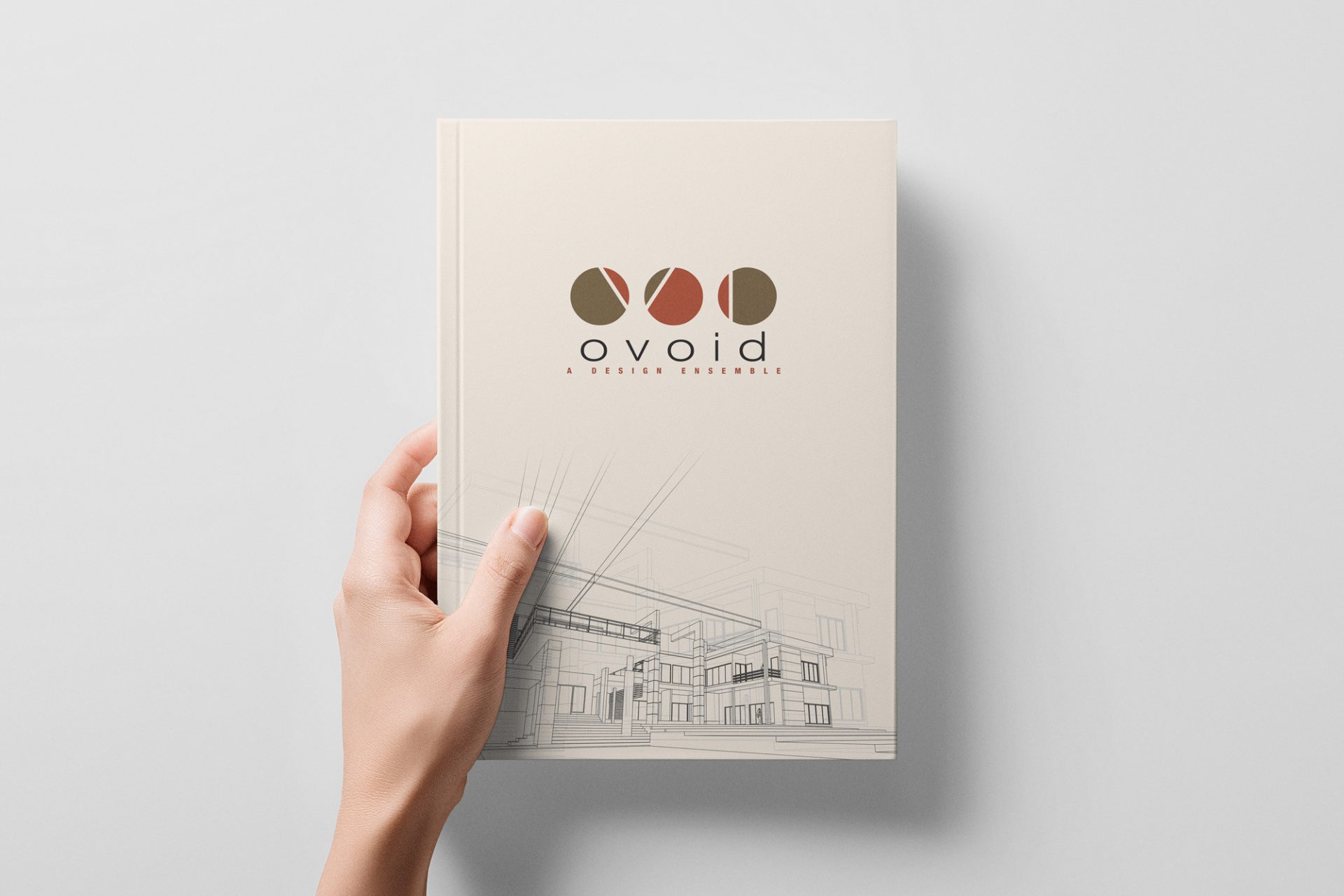
Ovoid Atelier is known in the Pondicherry region for its hands-on, eco-friendly approach to architecture, sustainable living solutions, and the use of physical prototypes. The design strategy for this logo completely bypasses cliché architectural tropes (like roofs, compasses, or buildings). Instead, it leans heavily into abstract geometry, spatial relationships, and materiality. It visually communicates that the firm manipulates raw forms and space to create something functional and beautiful.
Design Concept & Philosophy
The logo leans heavily into geometric abstraction, utilizing foundational architectural elements: the circle, the line, and the interplay of positive and negative space. Taking a human-centered approach to the brand identity, the design aims to evoke a sense of spatial awareness and structure before the viewer even reads the company name.
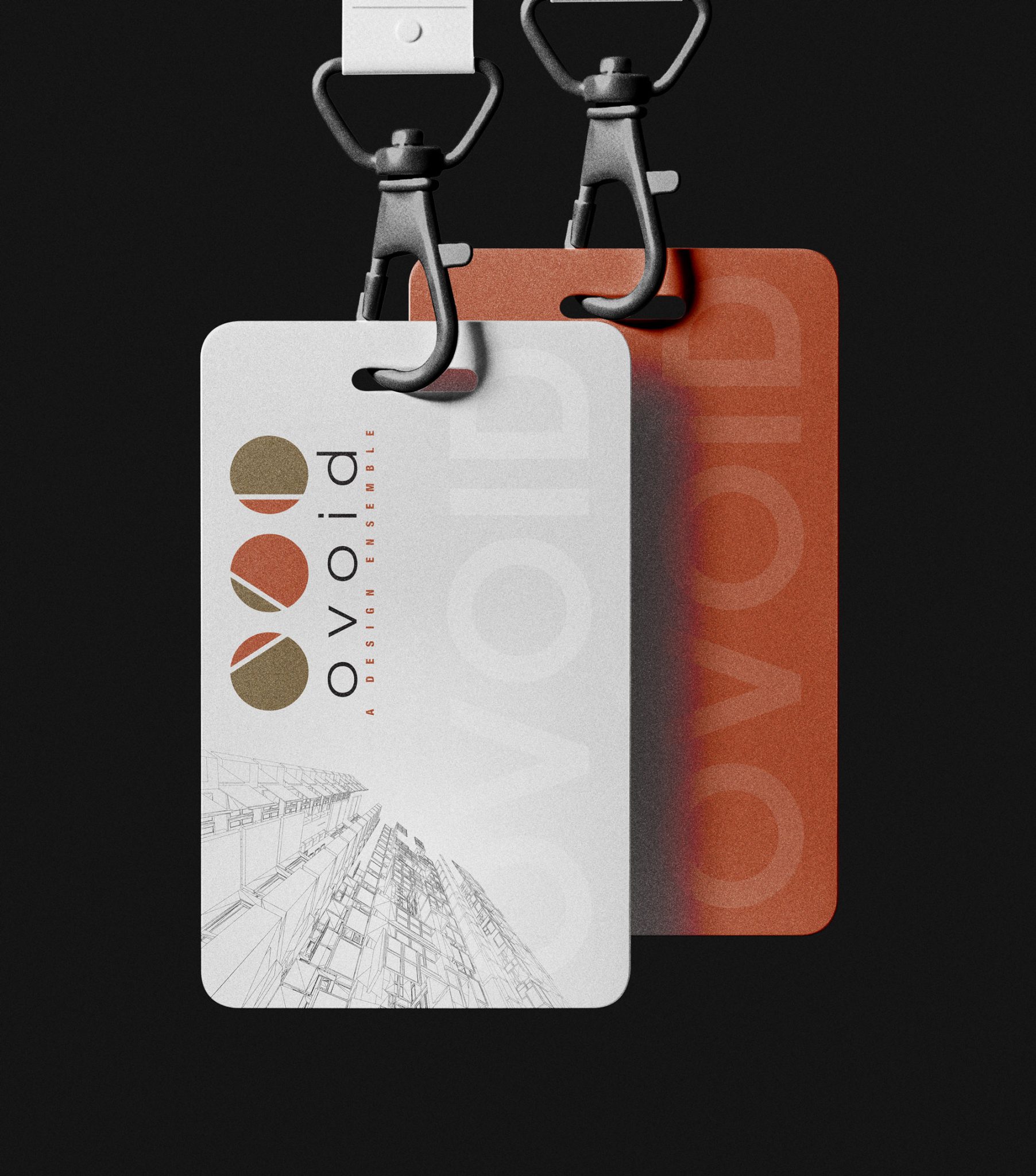
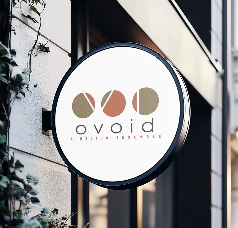
The three distinct circular marks visually manifest the word “Ensemble.” While each mark is sliced and oriented differently, they share a consistent visual language, representing different disciplines, perspectives, or structural elements coming together to form a cohesive practice.
The Logomark (Geometric Abstraction)
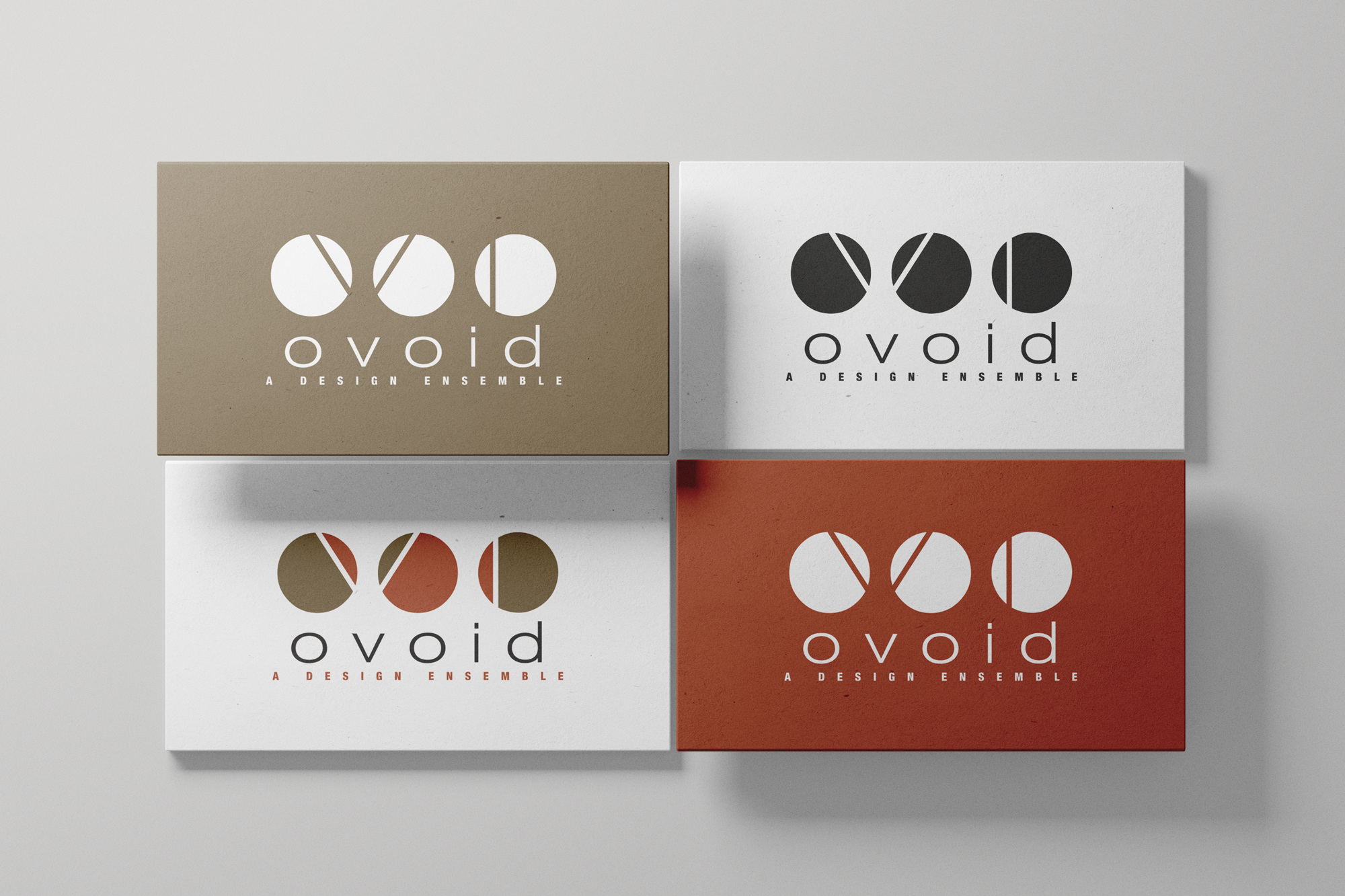
The three circles are intersected by stark white lines, acting as negative space. These slices are highly evocative of architectural drafting, representing cross-sections, floor plans, or the dynamic play of light and shadow cutting across a physical structure. The angled cuts in the first two circles suggest perspective and movement, while the vertical cut in the third provides a grounding anchor.
Typography
The primary wordmark, “ovoid,” uses a clean, widely tracked, geometric sans-serif font in all lowercase. The perfect circular nature of the “o”s mirrors the logomark above it, creating a rhythmic, balanced repetition. The secondary text, “A DESIGN ENSEMBLE,” is rendered in an assertive, tracking-heavy uppercase. This structural alignment anchors the floating geometric shapes above, much like a solid foundation supports a building.
Color Palette (Contextual & Earthy)
The palette directly channels the terroir of Pondicherry and Southern India.
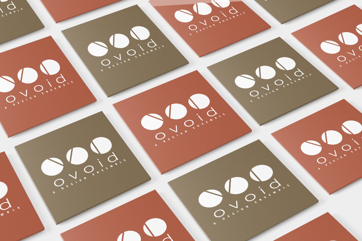
Terracotta/Rust: Evokes the red earth, exposed brickwork, and classic French colonial tiled roofs prevalent in the region.
Olive/Muted Bronze: Represents natural materials, timber, and the grounded, sustainable aspect of modern architectural practices.