Get In Touch
10/A, Indira Gandhi Street, Sengeniammal Nagar,
Orlean Pet, Pondicherry – 605005. (INDIA)
Work Inquiries
venki@venkidesigns.com
Ph: +91.994.440.0361
STRATEGY | UI/UX | WEB APP

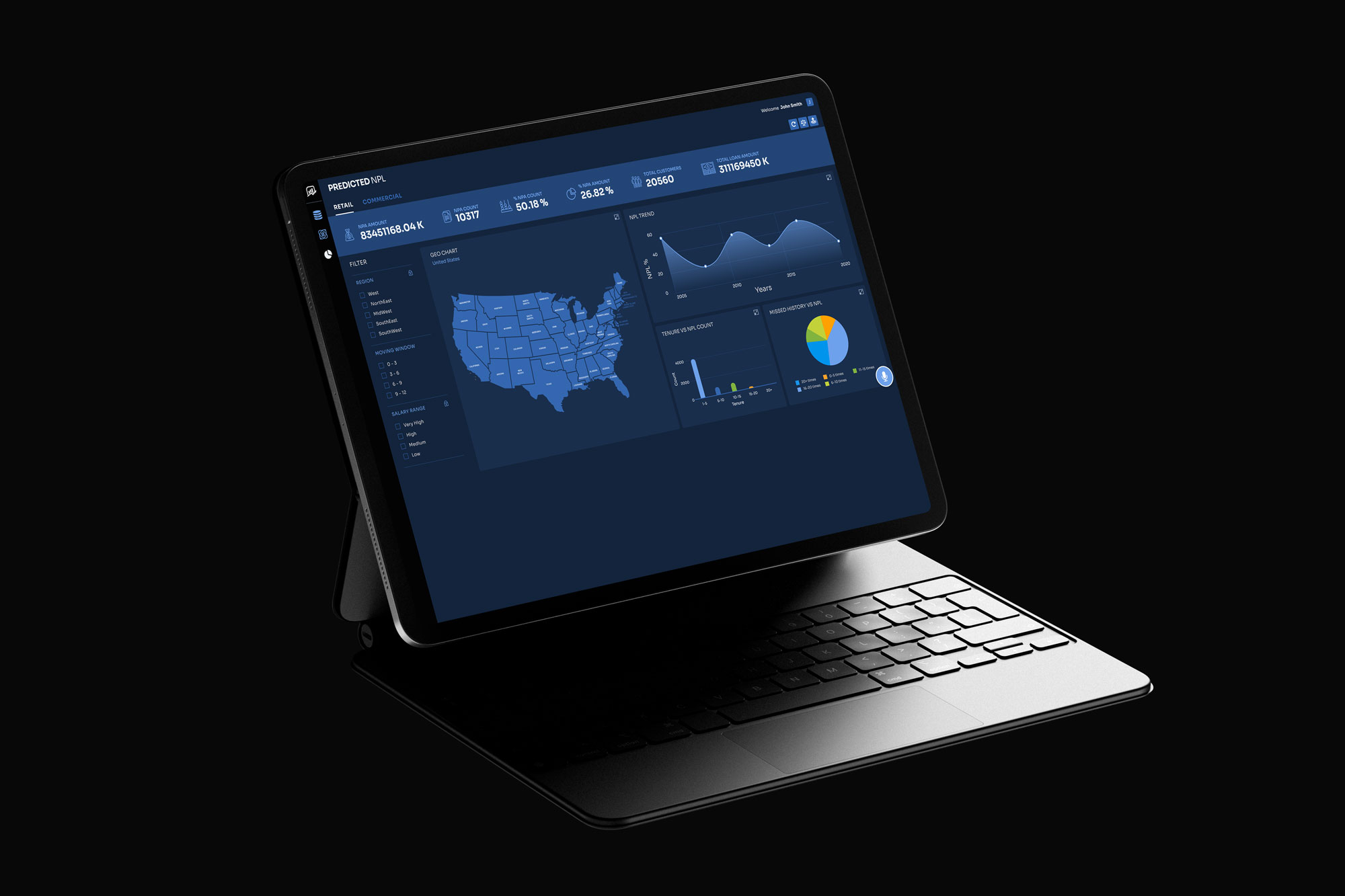
Non-Performing Loans – Early Warning System Appliction

With non-performing loans (NPLs) and defaults on the rise, traditional, labor-intensive prediction methods are no longer sufficient. By leveraging AI to enhance predictive accuracy across loan portfolios, lenders can significantly mitigate risk—reducing both the frequency and financial severity of NPLs.

MarketS-04

Project Overview

Financial institutions face significant revenue loss from Non-Performing Loans (loans in default or close to default). Traditionally, risk management teams rely on retroactive data and manual spreadsheet analysis to identify at-risk borrowers, which is often too slow to prevent default.

The Goal: Design a predictive, AI-driven web application that serves as an Early Warning System (EWS). The platform must translate complex financial data and machine learning algorithms into intuitive, actionable insights, allowing risk officers to proactively mitigate loan defaults.

Problem Statement

Financial institutions are incurring avoidable losses because their credit risk teams lack the tools to proactively identify and mitigate deteriorating loans. Current risk management workflows rely on fragmented legacy systems, dense spreadsheets, and retroactive reporting. This creates a severe cognitive overload for analysts, making it nearly impossible to spot early indicators of default before they become irreversible.

Furthermore, while predictive AI models exist to forecast risk, the lack of an intuitive, transparent interface prevents users from trusting or acting upon the AI’s recommendations.

2. Detailed UX/UI Pain Points

To solve the problem, we must understand exactly what the users (Credit Risk Analysts, Portfolio Managers) are struggling with on a daily basis.

  • Pain Point 1: Cognitive Overload & Data Fragmentation

    • The Reality: Analysts currently have to switch between 4–5 different systems (Core Banking, CRM, external credit bureaus, macro-economic news feeds) to gather context on a single borrower.

    • The UX Failure: There is no “single source of truth.” Dashboards are cluttered with raw data tables lacking visual hierarchy, forcing users to mentally calculate trends rather than instantly seeing them.

  • Pain Point 2: Reactive vs. Proactive Workflows

    • The Reality: Alerts are often generated only after a borrower misses a payment (which is already too late).

    • The UX Failure: Current interfaces function like an archive rather than a radar. They lack proactive push notifications, prioritizing historical data over predictive indicators. Analysts spend 80% of their time searching for risks and only 20% acting on them.

  • Pain Point 3: The “Black Box” AI Trust Deficit

    • The Reality: Banks are adopting machine learning to predict defaults, but analysts are skeptical of algorithms they don’t understand. If an AI flags a seemingly healthy company as “High Risk,” the analyst might ignore it.

    • The UX Failure: The UI provides a risk score (e.g., “85/100”) but fails to provide the context (Explainable AI). Without seeing why the score changed, the user cannot confidently recommend a mitigation strategy to their superiors.

  • Pain Point 4: Disconnected Mitigation Workflows

    • The Reality: Identifying a risk is only step one. The analyst must then assign tasks, contact the client, or restructure the loan.

    • The UX Failure: The analysis tool and the action/task management tool are separate. Users have to take screenshots or copy-paste data into emails to collaborate, leading to bottlenecks and lost information.

3. The Business Impact of Poor UX

In financial risk management, bad UX directly correlates to lost capital.

  • Slower Response Times: If an analyst takes three days to compile data on a deteriorating account, the window to safely restructure the loan may close.

  • Analyst Burnout & Error: High cognitive load leads to alert fatigue. Analysts start ignoring warnings, increasing the institutional Non-Performing Loan (NPL) ratio.

  • Wasted Tech Investment: If the UX fails to build trust in the predictive AI, the institution’s expensive data science initiatives go completely unused.

MarketS-01
THE SOLUTION

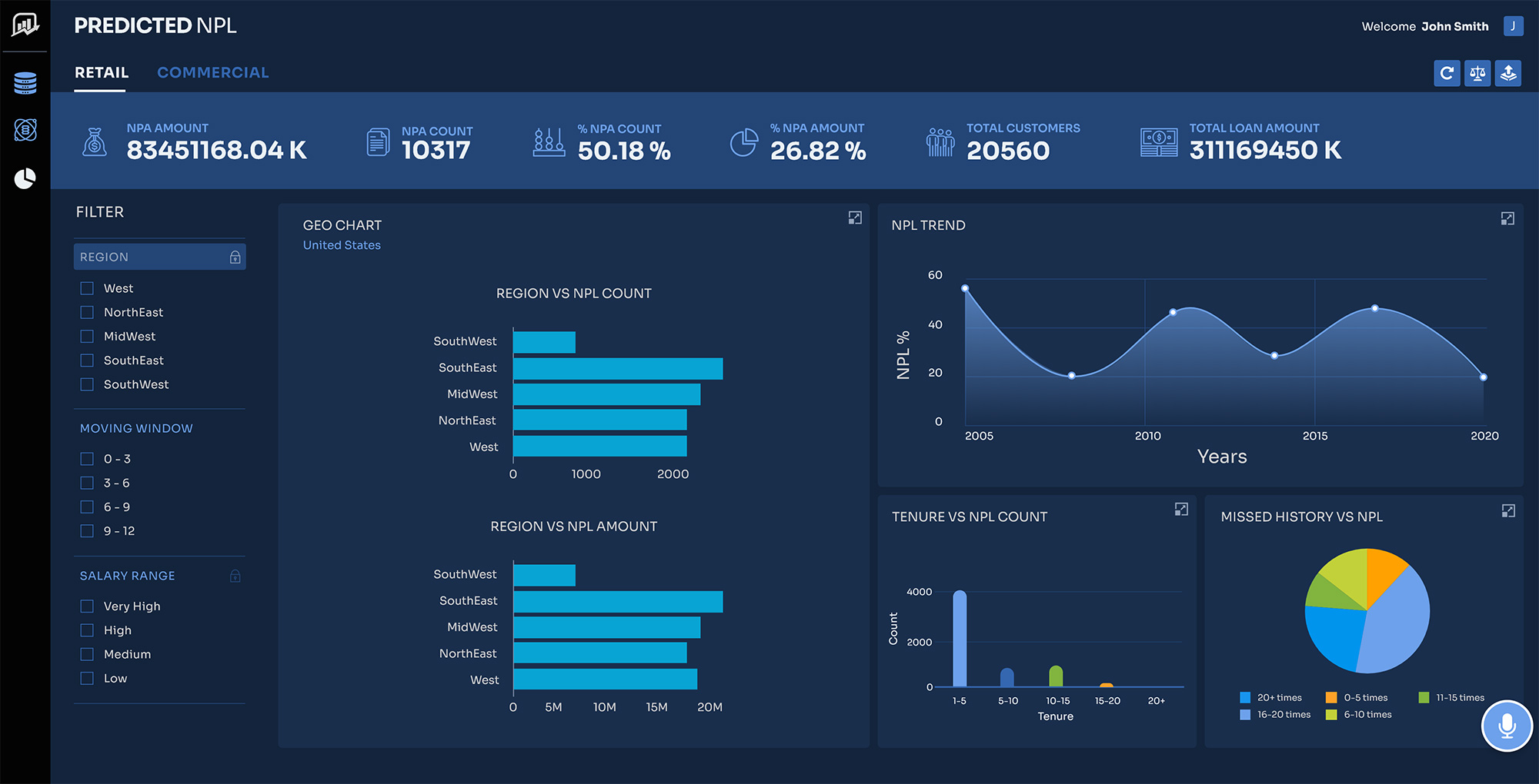
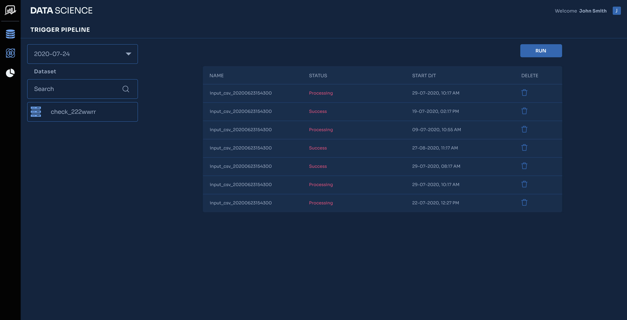
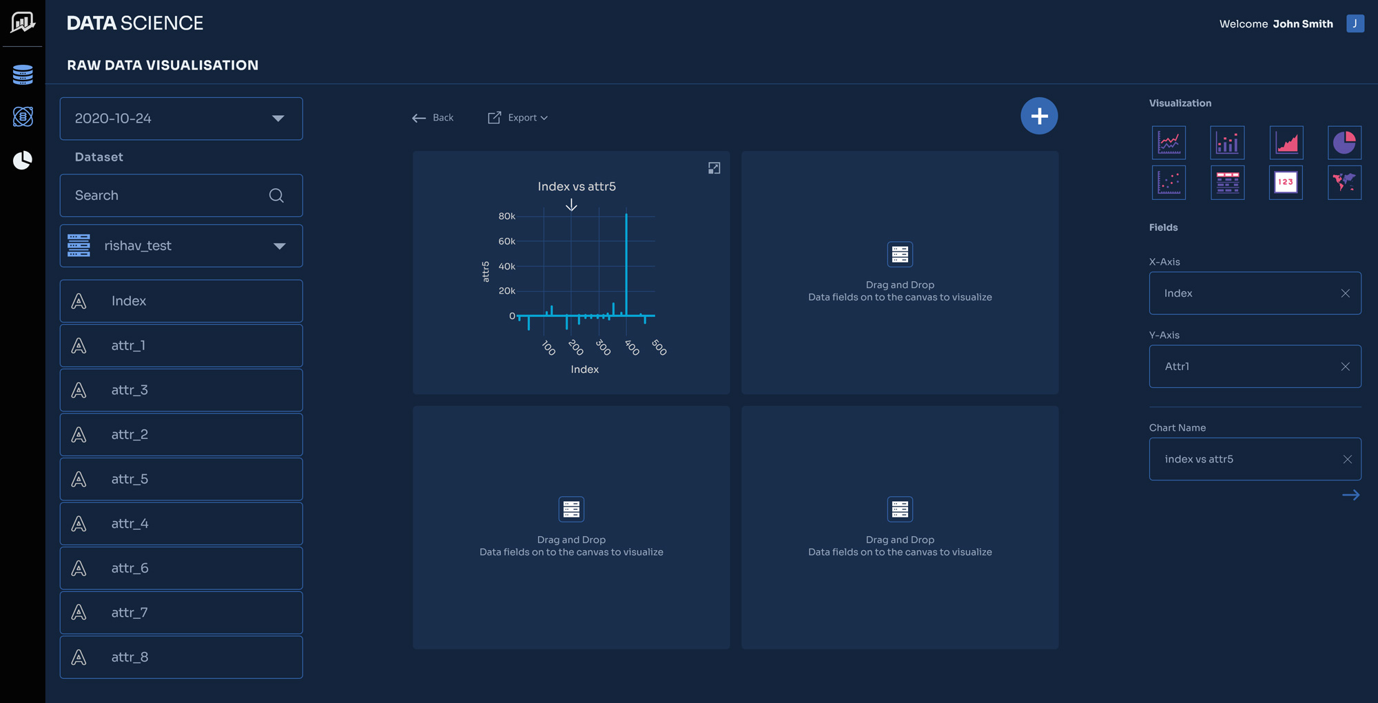
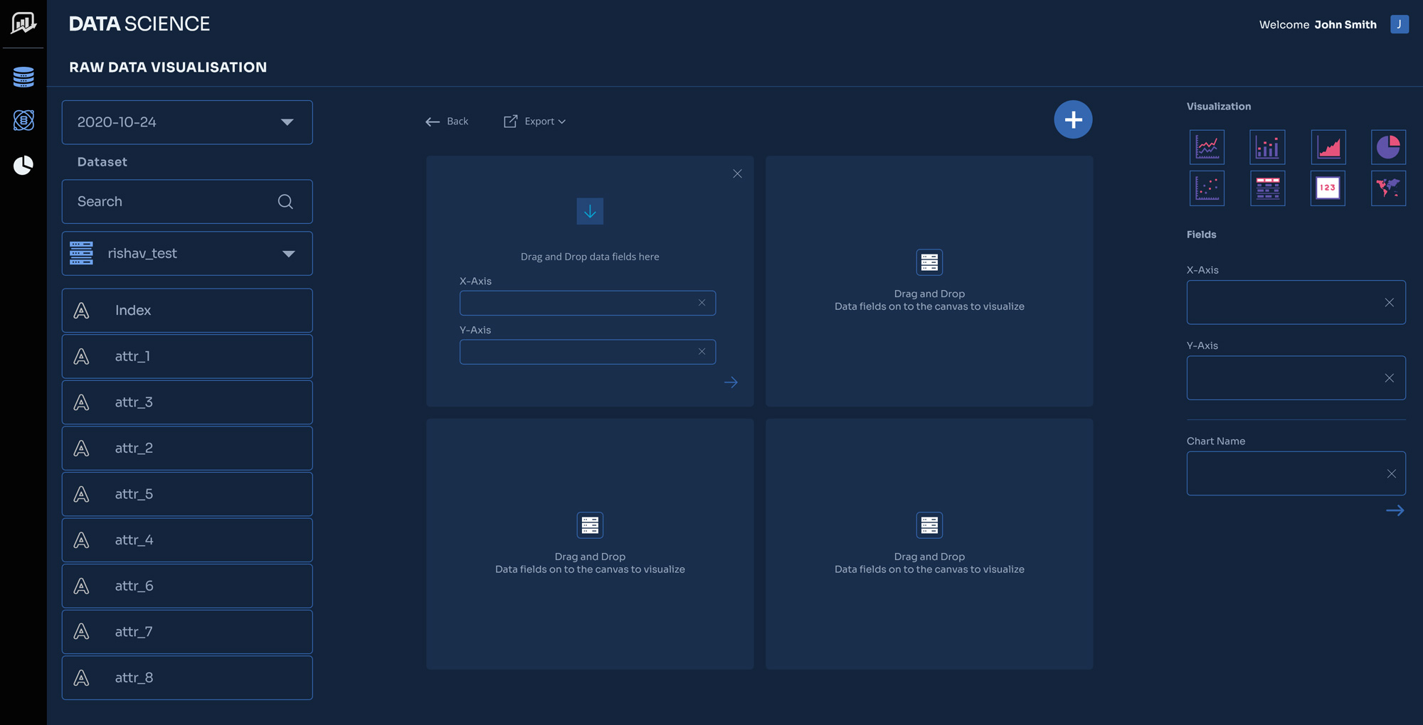
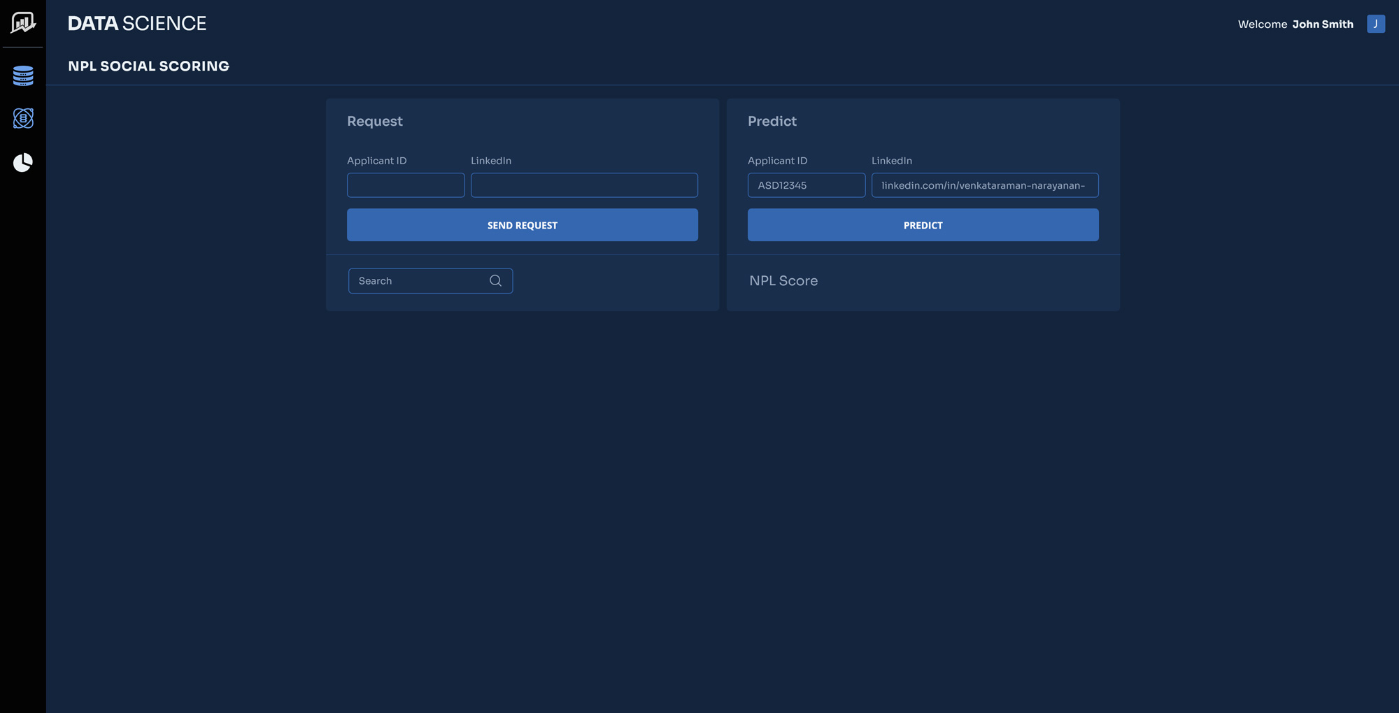
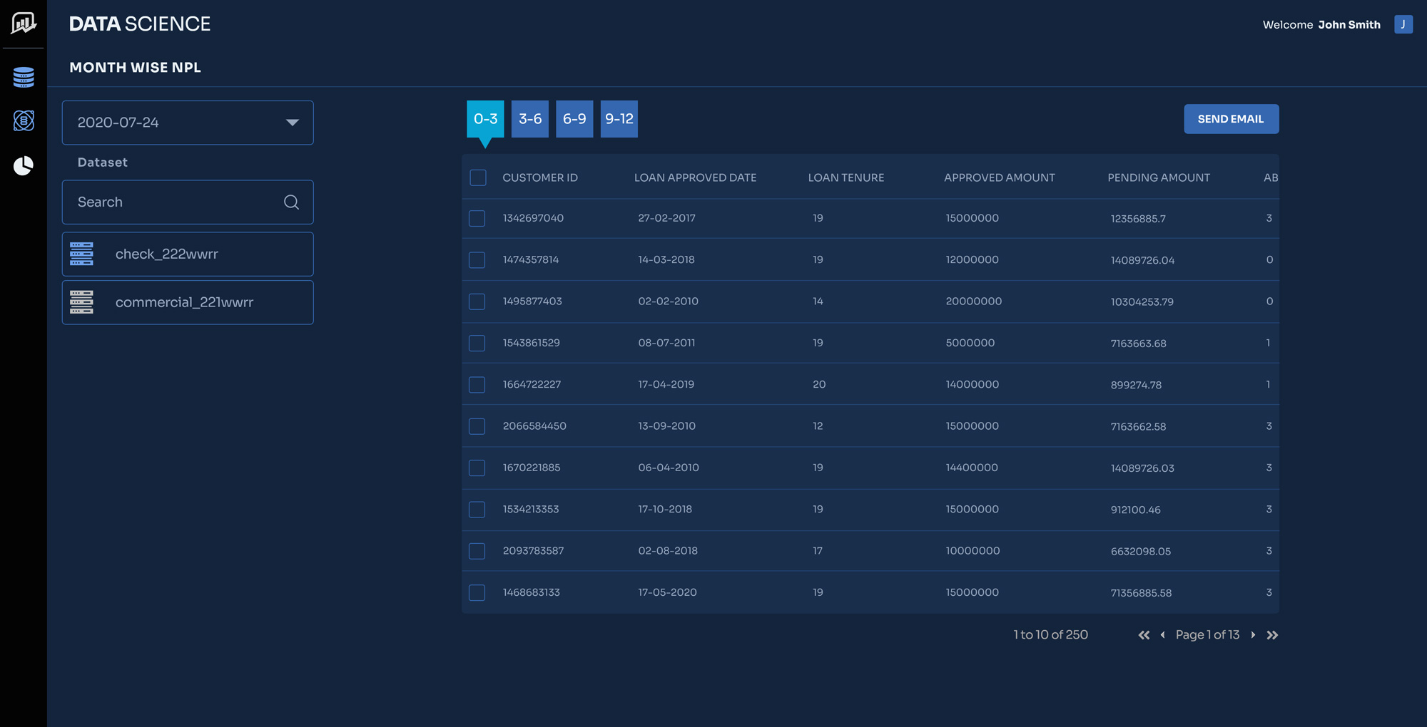
The design solution transforms the interface from a passive data repository into a proactive, intelligent command center.

1. Solving Cognitive Overload: The Unified Command Center

Instead of forcing analysts to toggle between multiple legacy systems, the UI acts as a “single source of truth,” utilizing the principle of progressive disclosure to present data logically.

  • Modular Dashboard: The home screen features customizable widgets. Users only see the data relevant to their specific portfolio, reducing visual noise.

  • The 3-Tier Data Architecture:

    1. Macro (The Bird’s Eye): Institutional NPL ratios, sector-based risk heatmaps, and macro-economic indicators.

    2. Meso (The Triage List): A prioritized queue of accounts requiring immediate attention.

    3. Micro (The Deep Dive): An individual borrower’s comprehensive profile, consolidating CRM data, core banking financials, and external news feeds into a single scrolling view.

2. Solving Reactive Workflows: Proactive Alerting & Smart Triage

The UI is designed to function as an early-warning radar, shifting the user’s focus from historical analysis to future prevention.

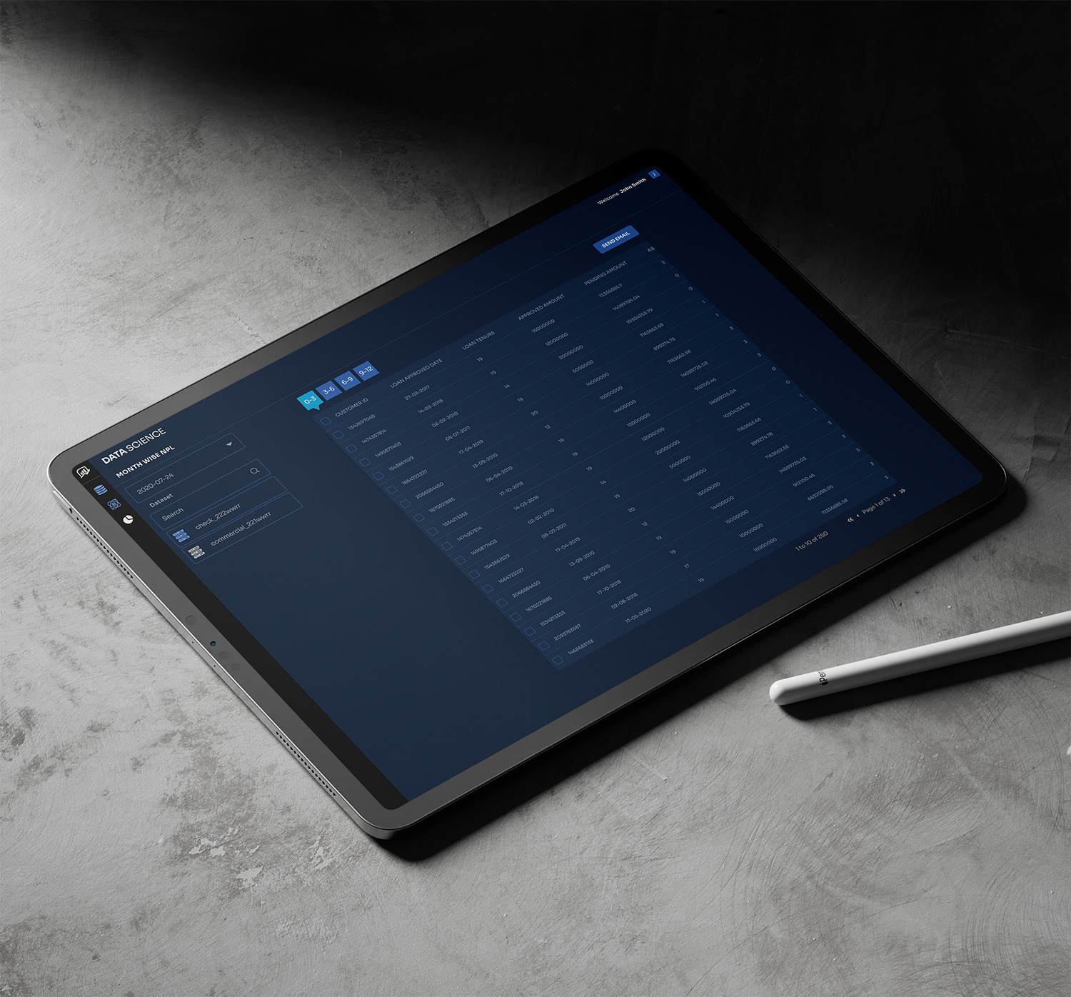
  • Dynamic Risk Queues: Instead of standard alphabetical or date-based lists, the inbox automatically sorts borrowers by Probability of Default (PoD) and Exposure Amount.

  • Contextual Badging & Color Coding: The UI moves away from simple “Red = Bad, Green = Good” paradigms, which are problematic for accessibility. Instead, it uses a combination of shapes, icons, and a colorblind-safe palette (e.g., Deep Navy for stable, Amber/Warning Triangles for monitoring, Vermilion/Octagons for critical action) to indicate urgency.

  • Push Notifications via System Tray: A dedicated alert center minimizes disruption while ensuring critical triggers (e.g., “Borrower XYZ just missed a payment to a major supplier”) are immediately visible.

3. Solving the “Black Box” Trust Deficit: Explainable AI (XAI) UI

To ensure analysts trust and act on the algorithm’s predictions, the UI must translate complex machine learning outputs into plain language and visual proof.

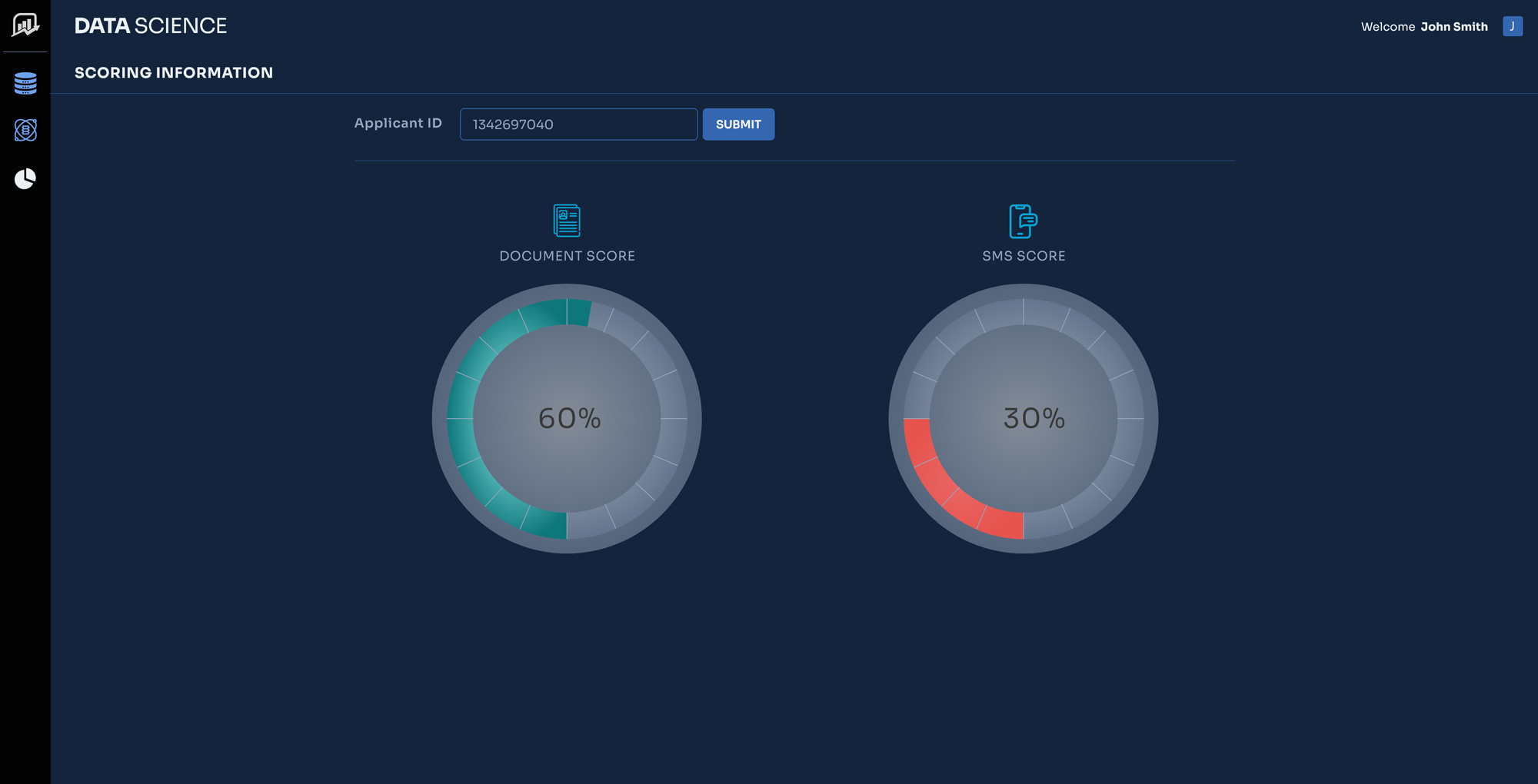
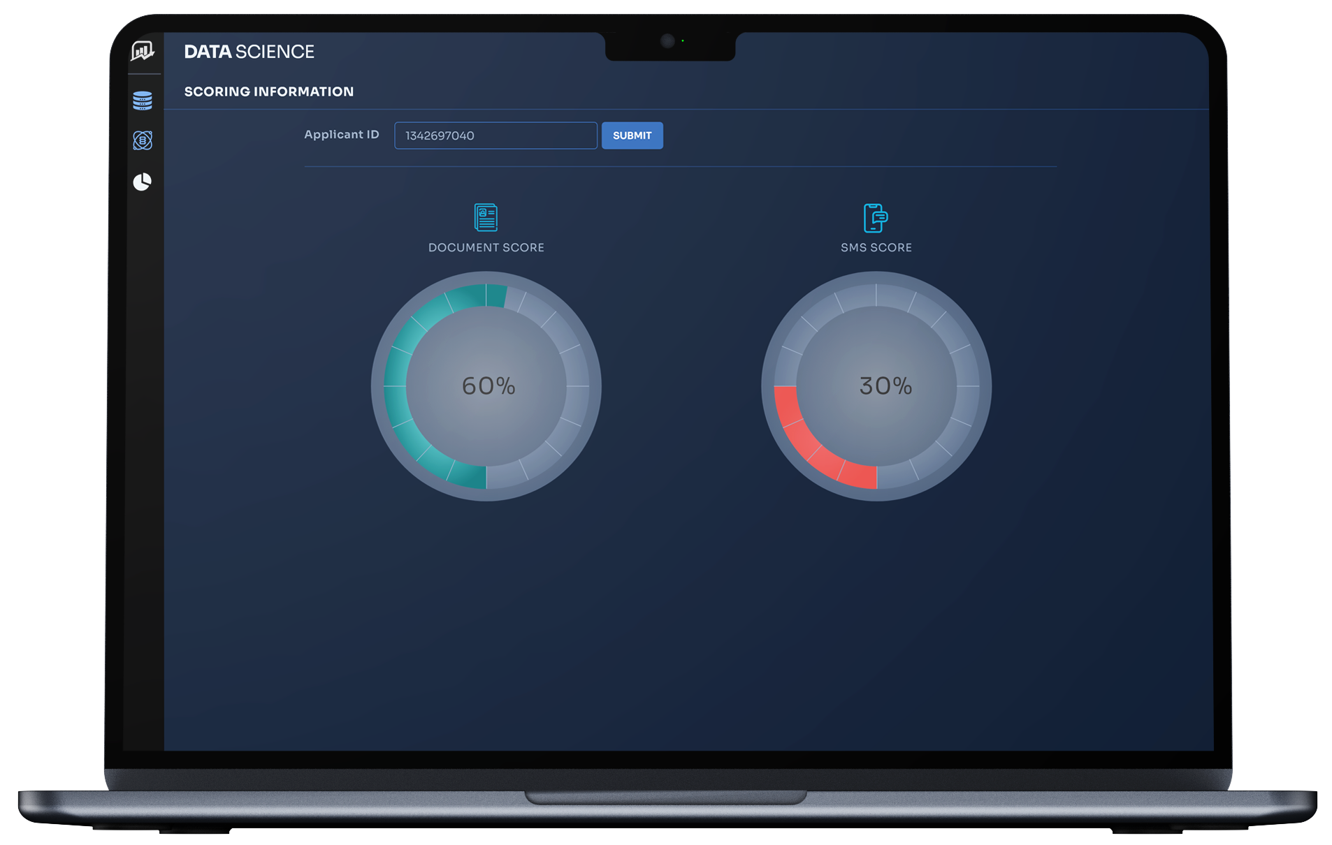
  • The “Why Was This Flagged?” Panel: Whenever an account is marked as high-risk, a dedicated UI card explicitly breaks down the AI’s reasoning.

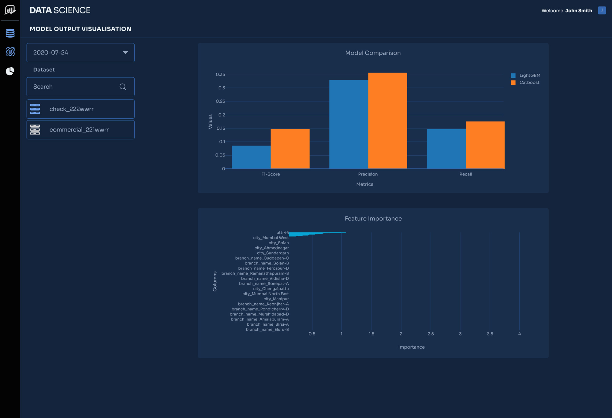
  • Impact Bars (Feature Importance): Visual horizontal bar charts show exactly which variables drove the risk score up or down.

    • Example Visual: A red bar showing +15% risk due to “Declining Quarterly Revenue,” offset by a blue bar showing -5% risk due to “Strong Collateral Value.”

  • Natural Language Generation (NLG): The UI auto-generates a two-sentence summary of the risk, turning data into a readable narrative: “This account was flagged due to a sudden 30-day delay in trade credit payments combined with negative sentiment in recent industry news.”

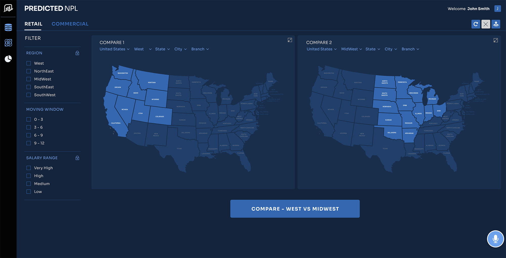
  • “What-If” Scenario Sliders: An interactive module allowing analysts to adjust variables (e.g., “What if interest rates rise by 2%?”) to see how the AI’s risk prediction changes in real-time.

4. Solving Disconnected Workflows: Integrated Action & Collaboration

Identifying a risk is useless if the system does not facilitate immediate mitigation. The solution embeds task management directly into the analytical workflow.

  • One-Click Mitigation Actions: Floating action buttons (FABs) or sticky footers on a borrower’s profile allow analysts to instantly “Initiate Loan Restructuring,” “Assign to Collections,” or “Schedule Client Call.”

  • In-Line Collaboration: A right-hand sidebar serves as a communication hub where team members can @mention each other, leave notes on specific financial anomalies, and attach external documents.

  • Automated Audit Trails: Every action taken in the system is automatically logged in a visual timeline. This protects the institution during regulatory audits and prevents duplication of effort among team members.

DEEP UNDERSTANDING

The Users and the Industry

1. Understanding the Users & Their Psychology

The primary users are Credit Risk Analysts and Portfolio Managers. To design for them, we must understand their daily psychological and operational hurdles.


The Threat of “Alert Fatigue”

The biggest UX hurdle in implementing AI-driven risk software is the prevalence of false positives. If an EWS is poorly calibrated, a vast majority of early warning signals can turn out to be false alarms.

  • The UX Implication: When systems generate too much noise, analysts become desensitized and start ignoring the dashboard entirely. The UI must build trust by clearly prioritizing alerts by severity and strictly gating low-probability warnings.

The Demand for “Explainability”

Risk officers are naturally skeptical of “black box” algorithms. They cannot go to a credit committee and recommend altering a multi-million-dollar loan simply because “the computer said so.”

  • The UX Implication: The interface must use Explainable AI (XAI). Every risk score must be visually deconstructed into its contributing factors so the human expert can validate the machine’s logic.

2. The Anatomy of Early Warning Signals

A modern EWS aggregates disparate data sources to find correlation. The UX must organize these complex signals into an easily scannable hierarchy:


Signal CategoryWhat is MonitoredUX/UI Presentation
Internal & FinancialCash flow drops, line-of-credit utilization spikes, delayed payments.Trend lines overlaying historical baselines to show deviations.
Operational & BehavioralManagement turnover, delays in financial reporting, covenant breaches.Timeline events or contextual badges on the borrower’s profile.
External & MacroIndustry downturns, negative news sentiment, macroeconomic shifts.Integrated news feeds and sector-level heatmaps.


3. The Proactive User Journey

To replace fragmented legacy workflows, the UX must seamlessly guide the user from the moment an anomaly is detected to the moment the risk is mitigated.

1.Signal Aggregation & Smart Alerting: System-Driven.

The EWS continuously scans internal data and external market sentiment. It detects a subtle pattern—e.g., a borrower is paying the bank on time, but is suddenly delaying payments to their trade suppliers. The system generates a prioritized alert.

2.Triage & Investigation: Human-in-the-Loop.

The analyst logs in and sees a prioritized queue sorted by Probability of Default and Exposure Amount. They click into the flagged profile, where the UI clearly explains why the AI flagged the account, combining financial charts with natural language summaries.
3.Validation & Decision: Human-in-the-Loop.

The analyst reviews the evidence. They can adjust “what-if” parameters to see how the risk score changes. They validate the alert as a true threat rather than a false positive, which concurrently trains the AI model.

4.Pre-emptive Mitigation: Collaborative Action.

Without leaving the platform, the analyst uses built-in workflow tools to assign the account to a relationship manager with a recommended action plan, such as restructuring the covenant.


MarketS-07
I MADE A

Personas & User Journey Maps

My interviews with the Business Users and Users provided critical, detailed information. This foundation allowed me to successfully create the resulting personas and journey maps.

Personas

Personas

Empathy is the foundation of great design. I develop UX Personas to humanize our target audience, allowing us to step into the user’s shoes. Understanding their ‘why’ helps me design interfaces that don’t just look good, but feel relevant and intuitive to the people using them.

MarketScore-Personas-01
Persona 1: The Micro-Level Investigator
Persona 2: The Meso-Level Strategist
Persona 3: The Macro-Level Executive
empathy-map-img

Empathy Map

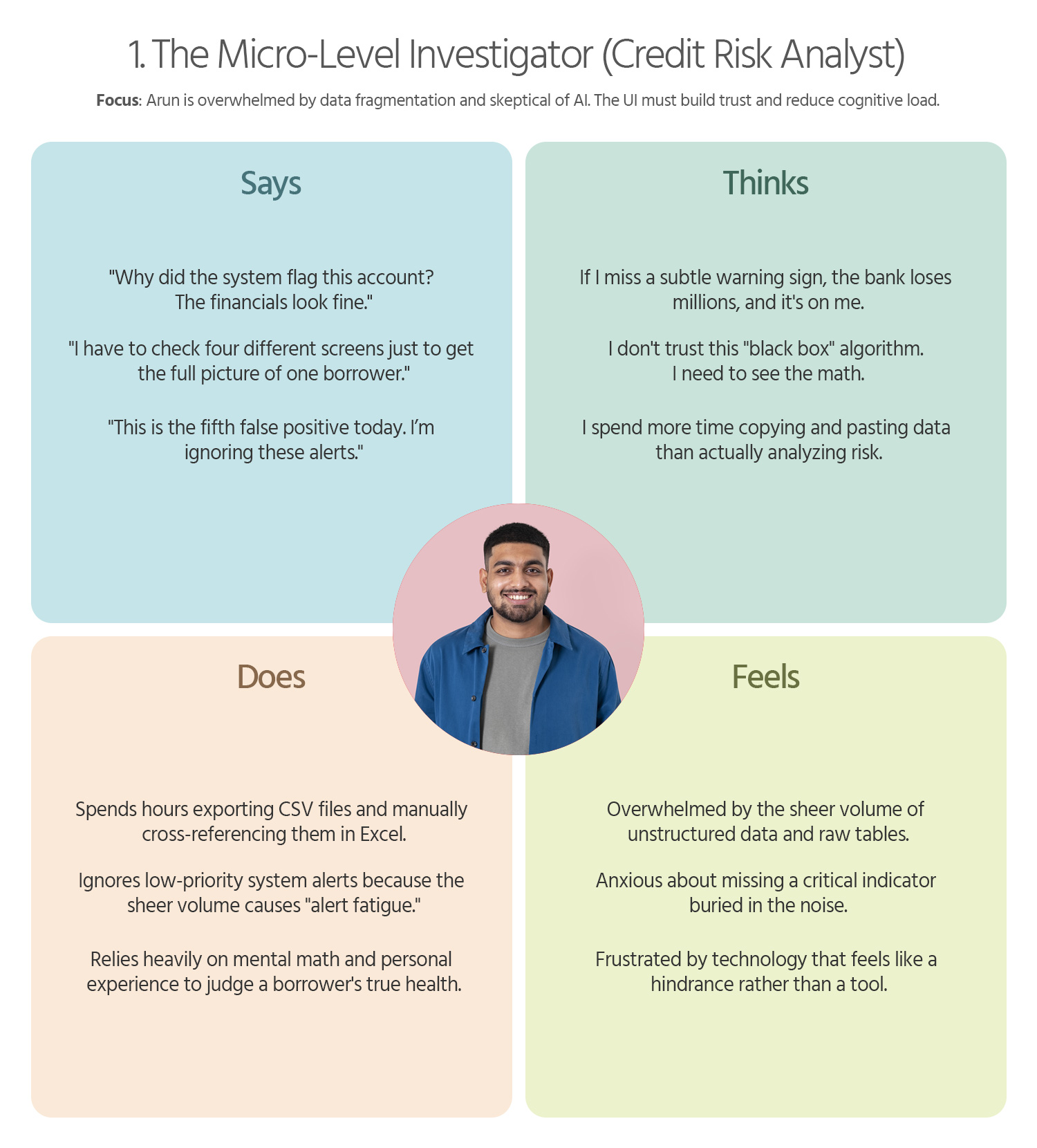
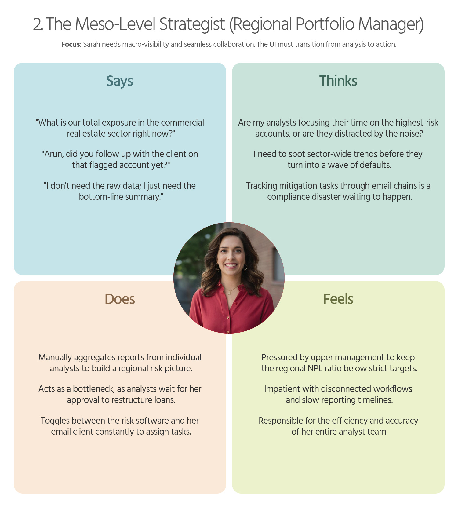
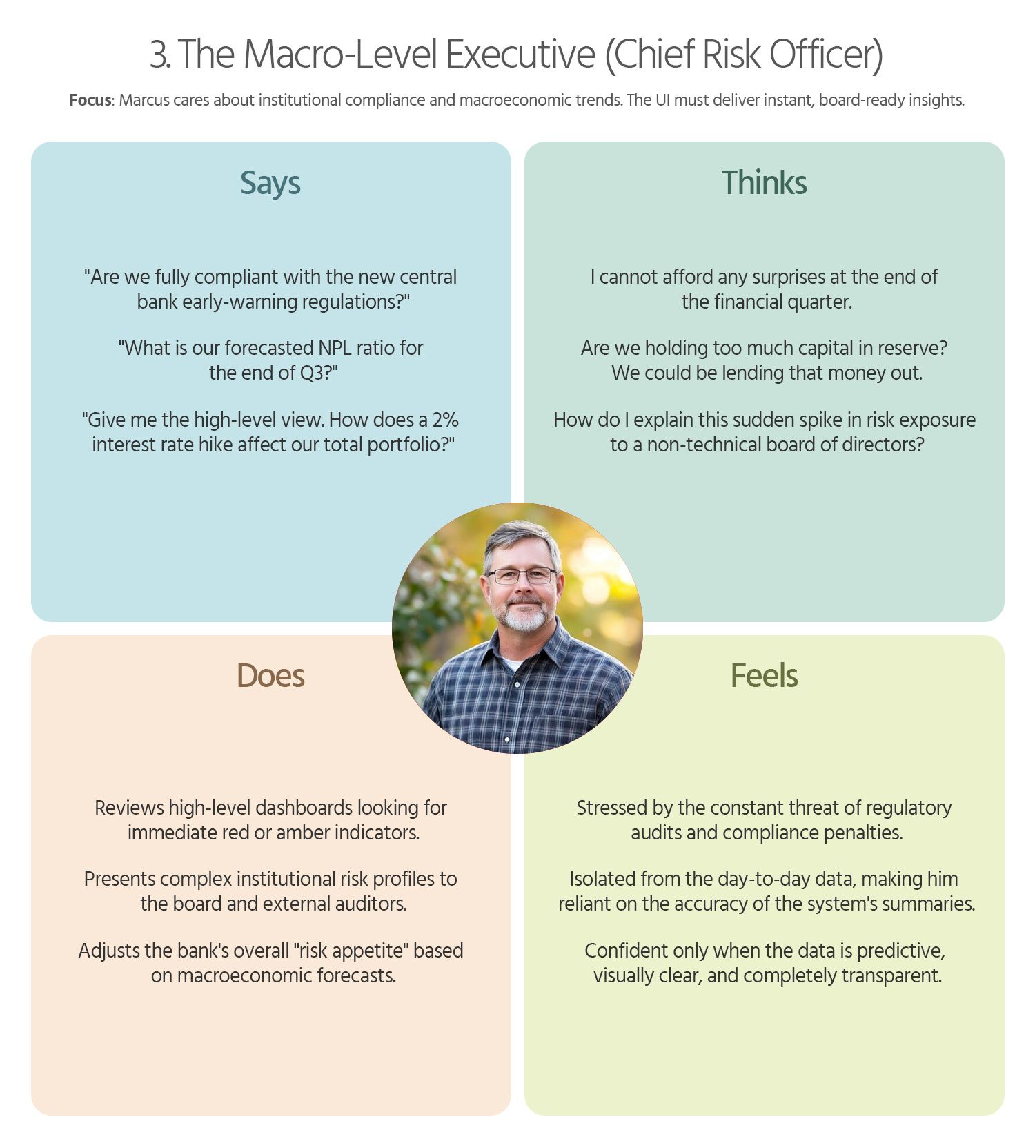
To truly design a “delightful” and human-centered product, we must look beyond functional requirements and map the emotional landscape of our users. Below is a detailed Empathy Map for each of your three core personas, focusing on their sensory experiences and internal motivations.

MarketScore-Empathy-Map-01
1. The Micro-Level Investigator (Credit Risk Analyst)
MarketScore-Empathy-Map-02
2. The Meso-Level Strategist (Regional Portfolio Manager)
MarketScore-Empathy-Map-03
3. The Macro-Level Executive (Chief Risk Officer)
User-Journey-Maps

User Journey Maps

I use User Journey Maps to visualize the end-to-end experience and uncover hidden friction points. By mapping out every touchpoint—from discovery to conversion—I identify where users get frustrated or lose interest. This allows us to turn ‘drop-off points’ into opportunities for engagement.

MarketScore-User-Journey-Maps-01
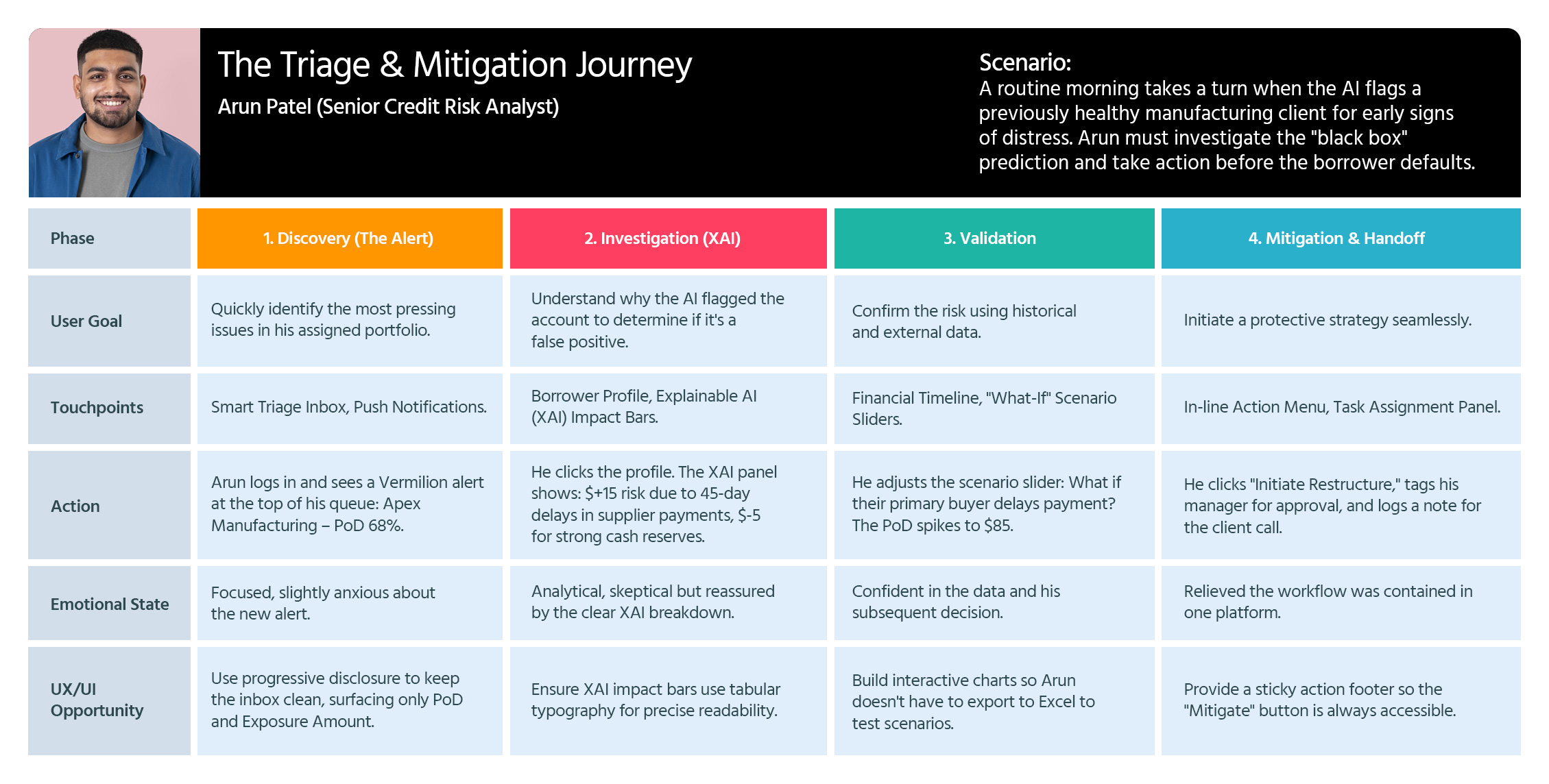
Journey Map 1: The Triage & Mitigation Journey
MarketScore-User-Journey-Maps-02
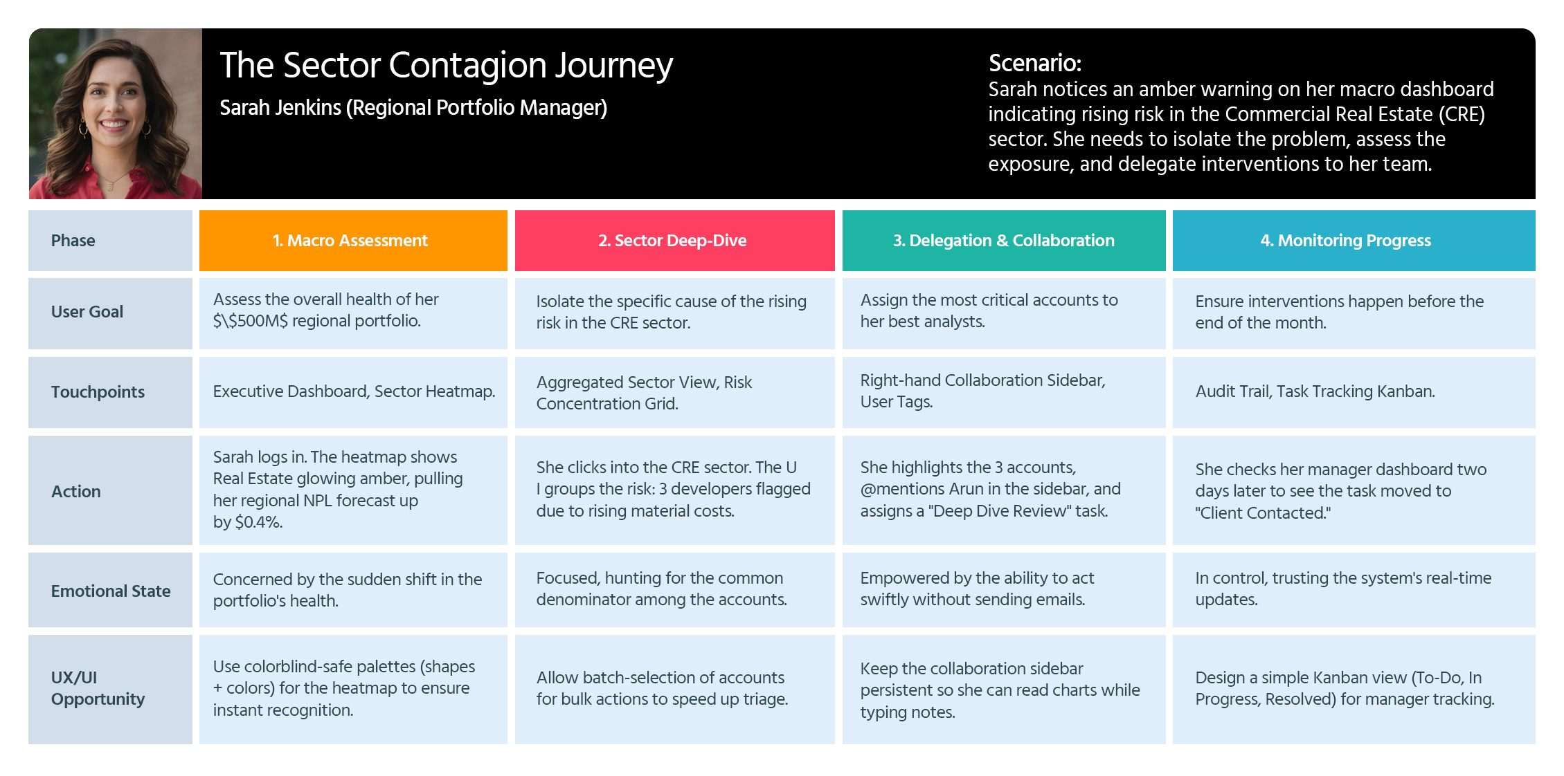
Journey Map 2: The Sector Contagion Journey
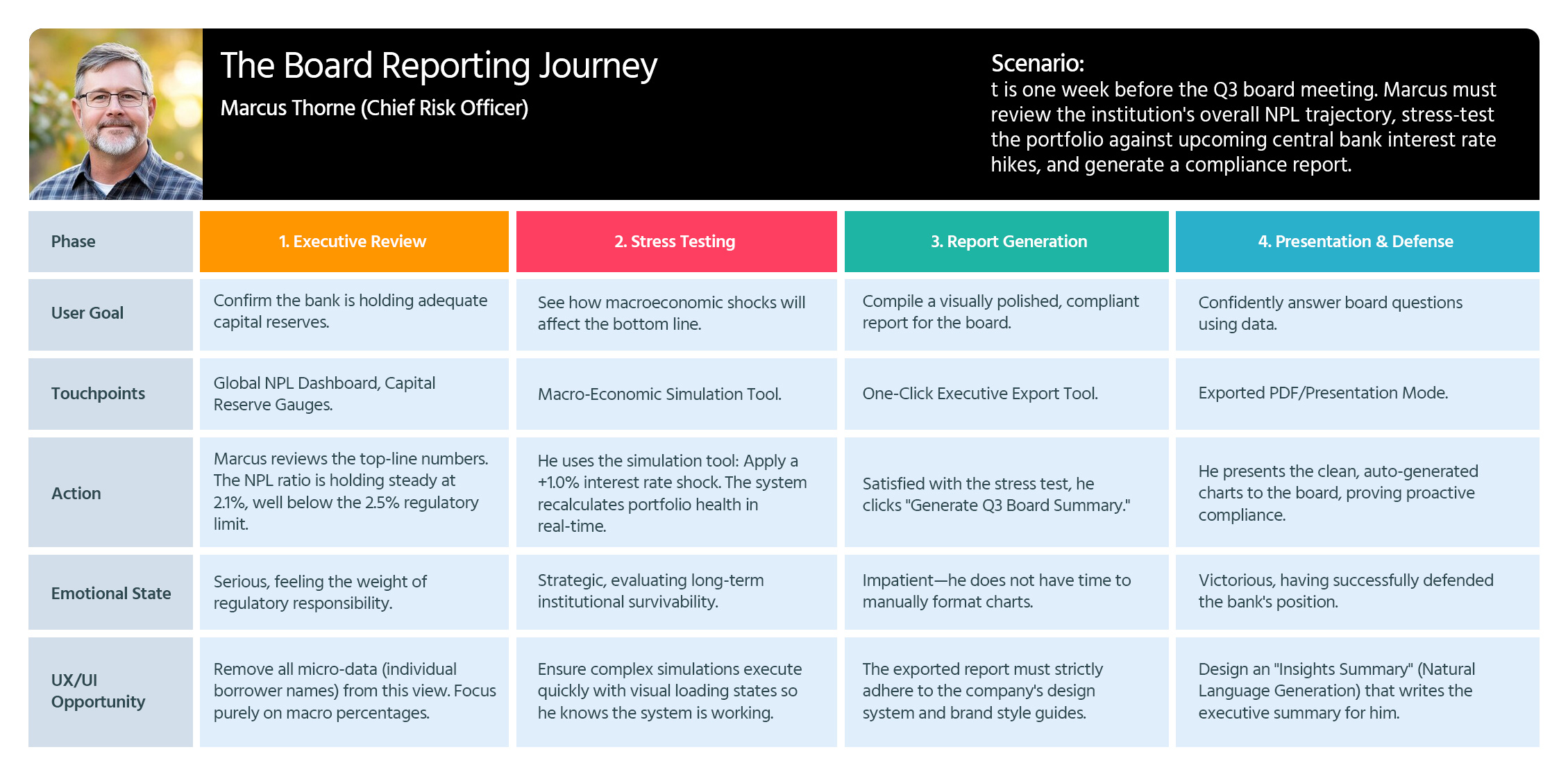
Journey Map 3: The Board Reporting Journey

Style Guide

I developed a comprehensive design system that eliminated inconsistencies and cut down production time, allowing the team to focus on delivering a superior user experience.

THE

Visual Design

To me, Visual Design is more than just aesthetics—it’s a communication tool. I use typography, color theory, and spacing to create a clear visual hierarchy that guides the user’s eye to what matters most.

  • Get in touch
    Work Inquiries
    +91 99444 00361
  • Assistance hours:
    Monday – Friday
    10 am to 8 pm ISD
  • Post address
    10/A, Indira Gandhi Street,
    Sengeniammal Nagar, Orlean Pet
    Pondicherry – 605005. (INDIA)
  • Sign up for the newsletter

This website stores cookies on your computer. Cookie Policy