Get In Touch
10/A, Indira Gandhi Street, Sengeniammal Nagar,
Orlean Pet, Pondicherry – 605005. (INDIA)
Work Inquiries
venki@venkidesigns.com
Ph: +91.994.440.0361
STRATEGY | UI/UX | WEB APP

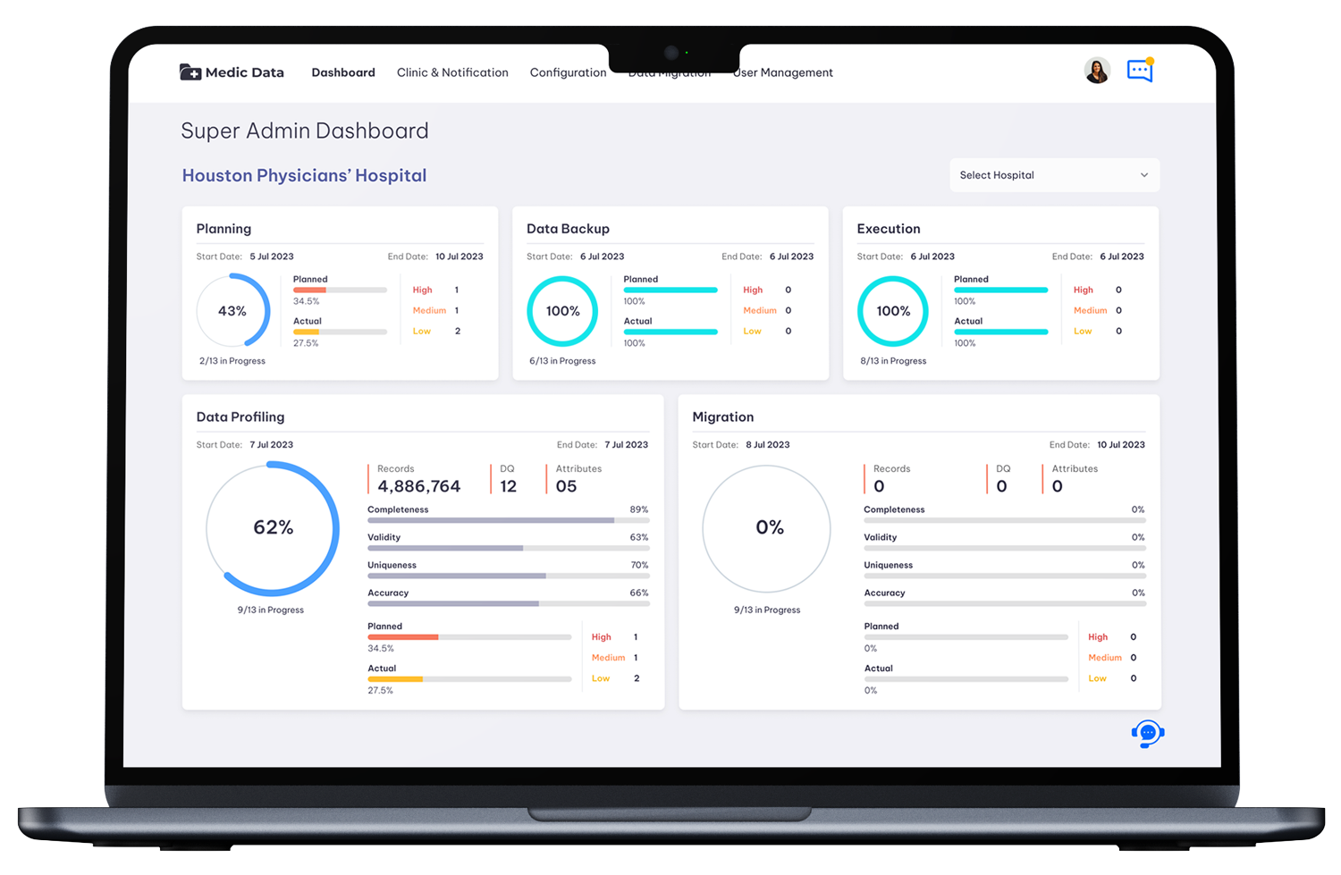
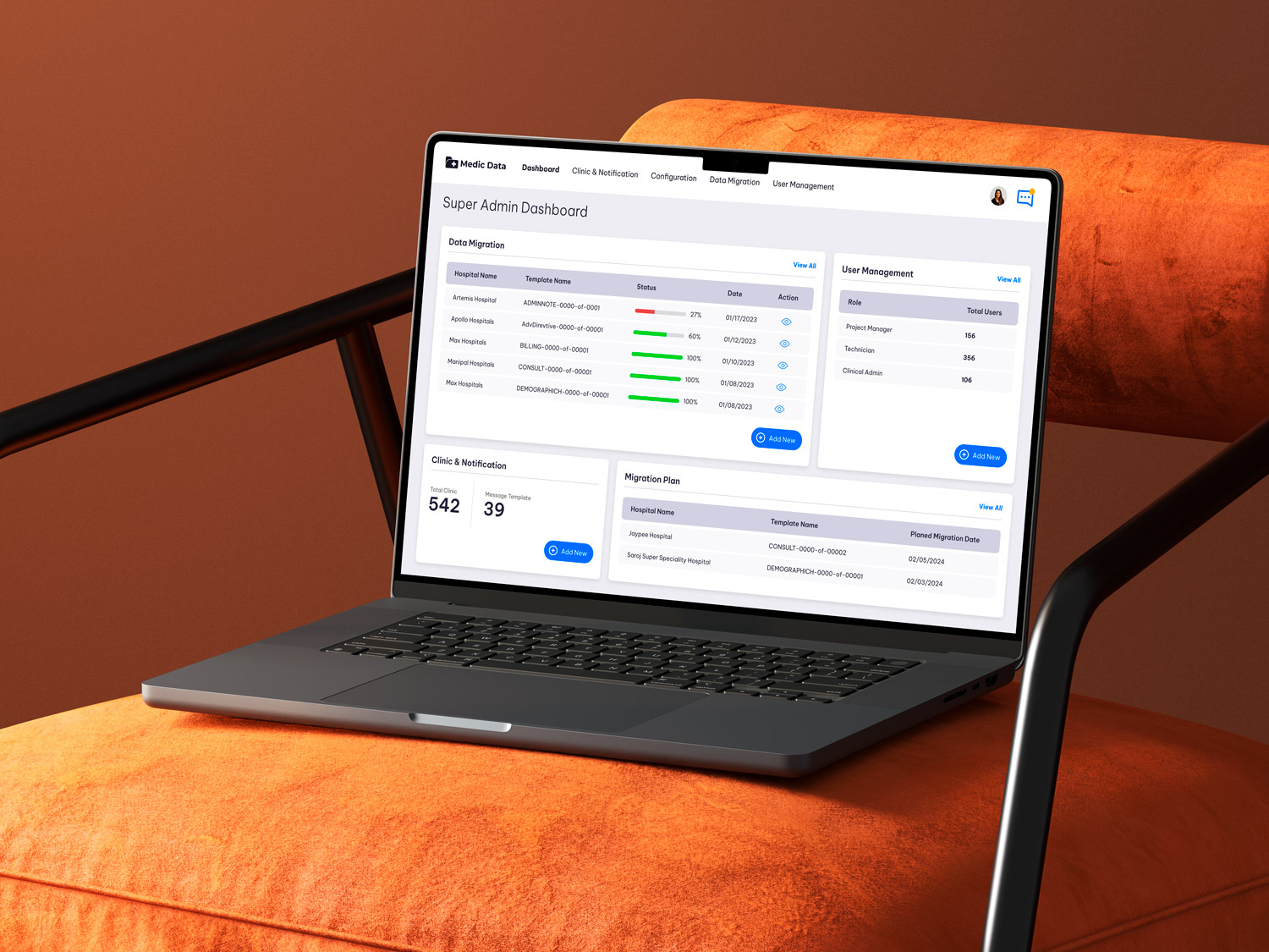
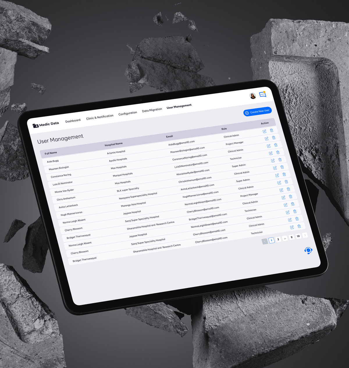
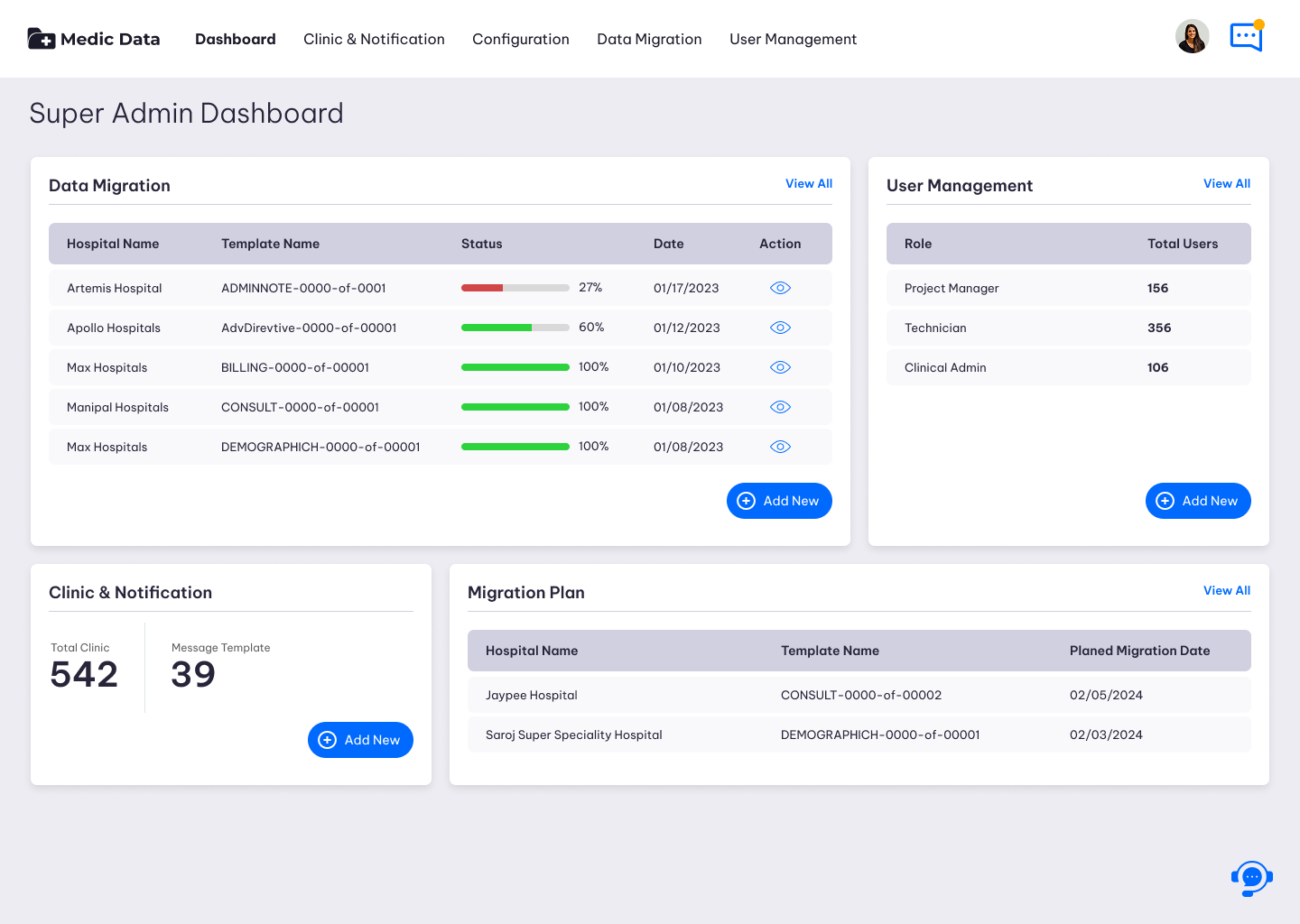
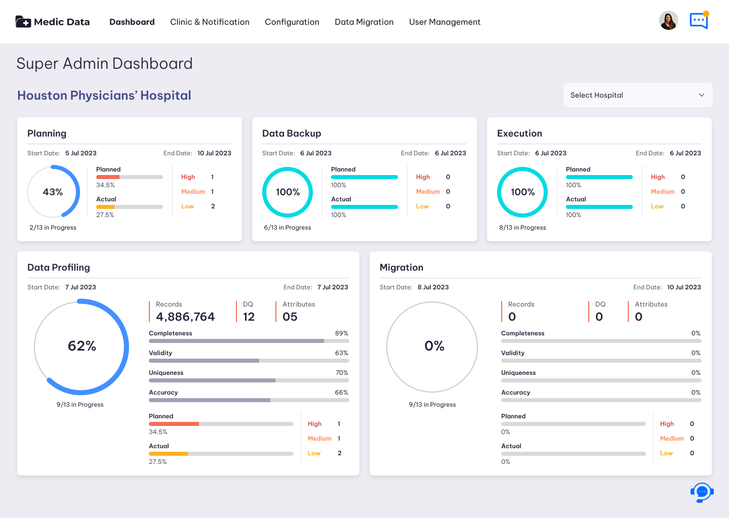
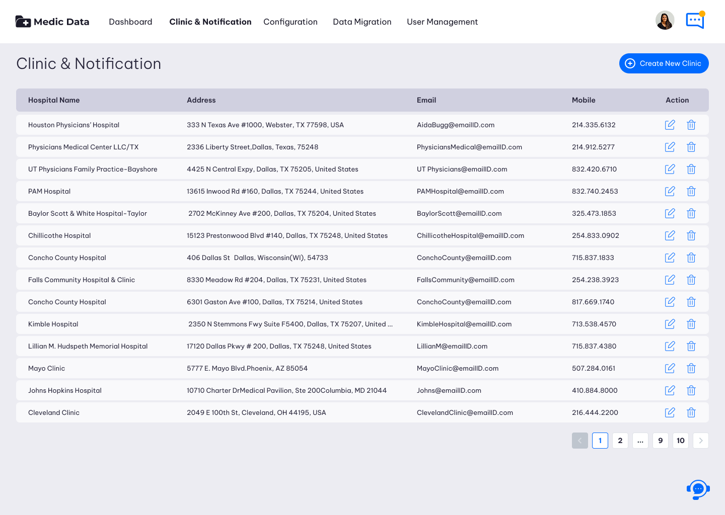
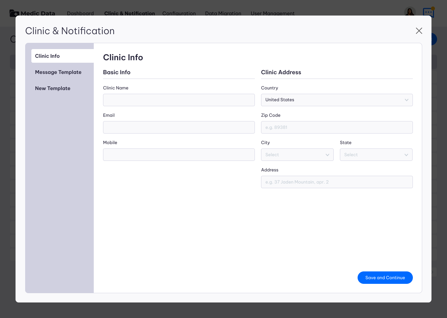
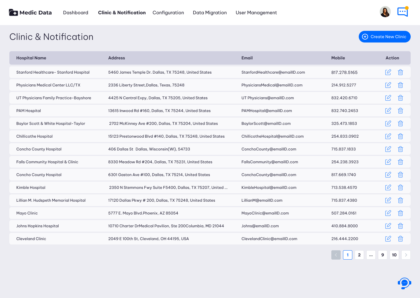
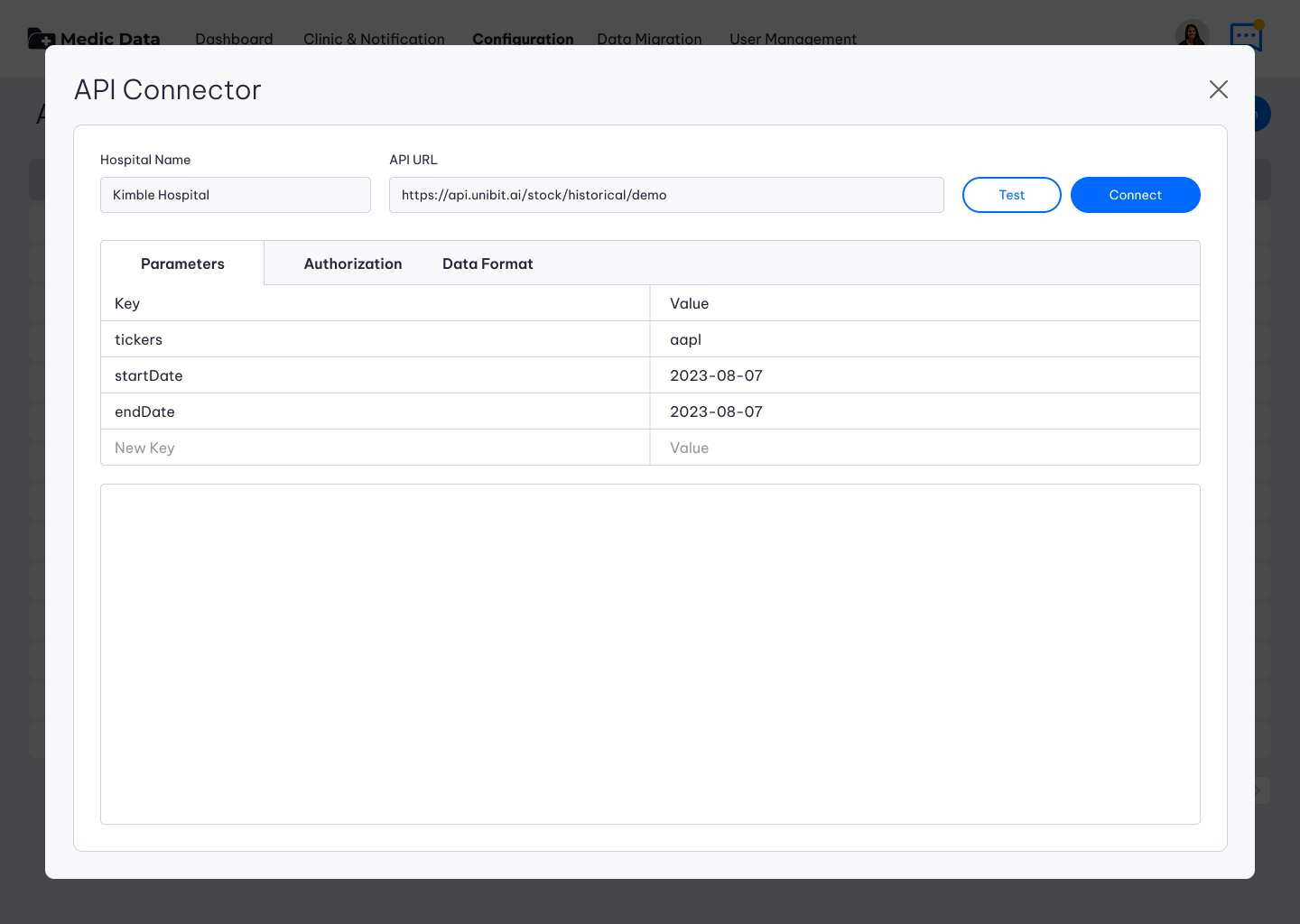
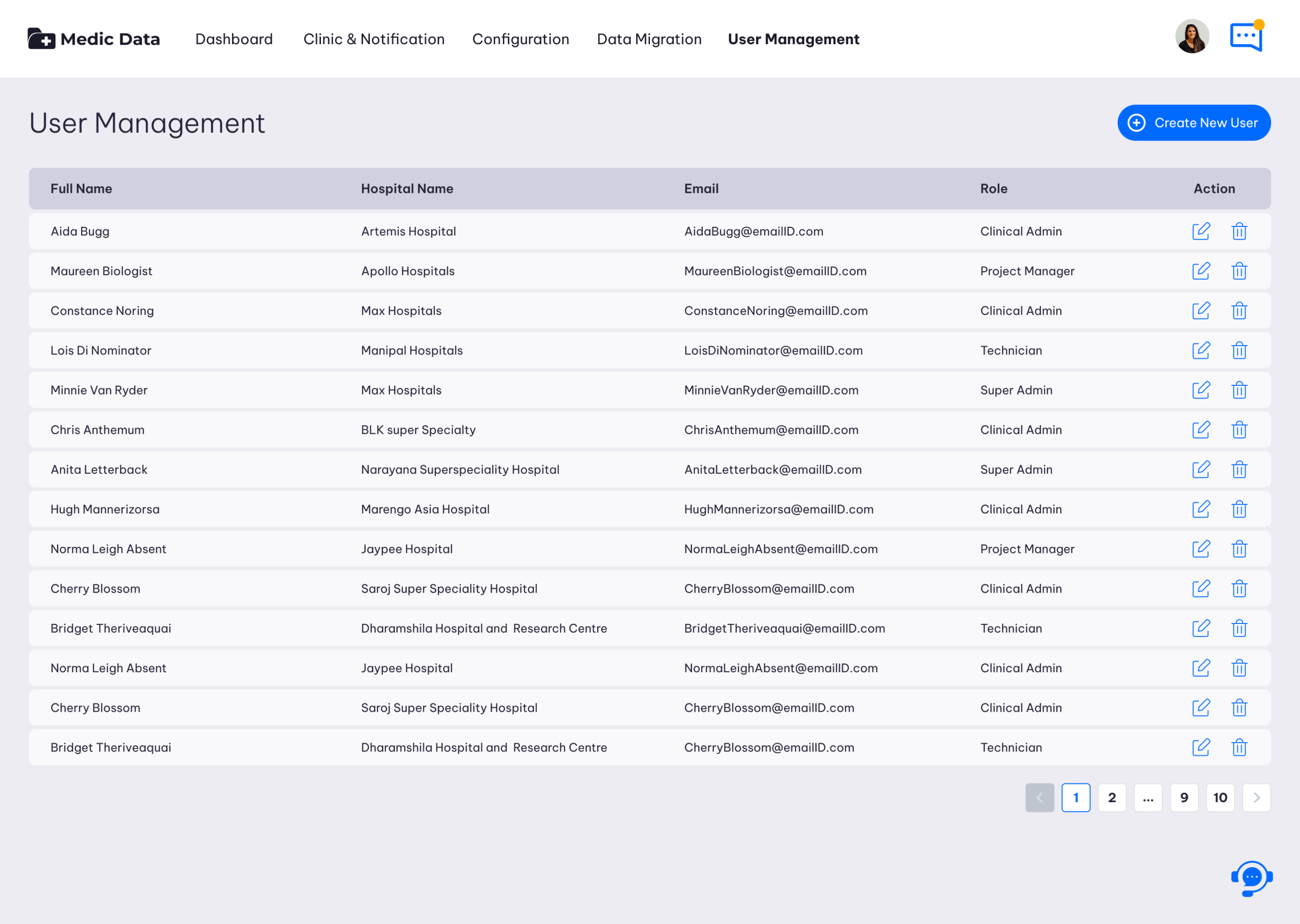
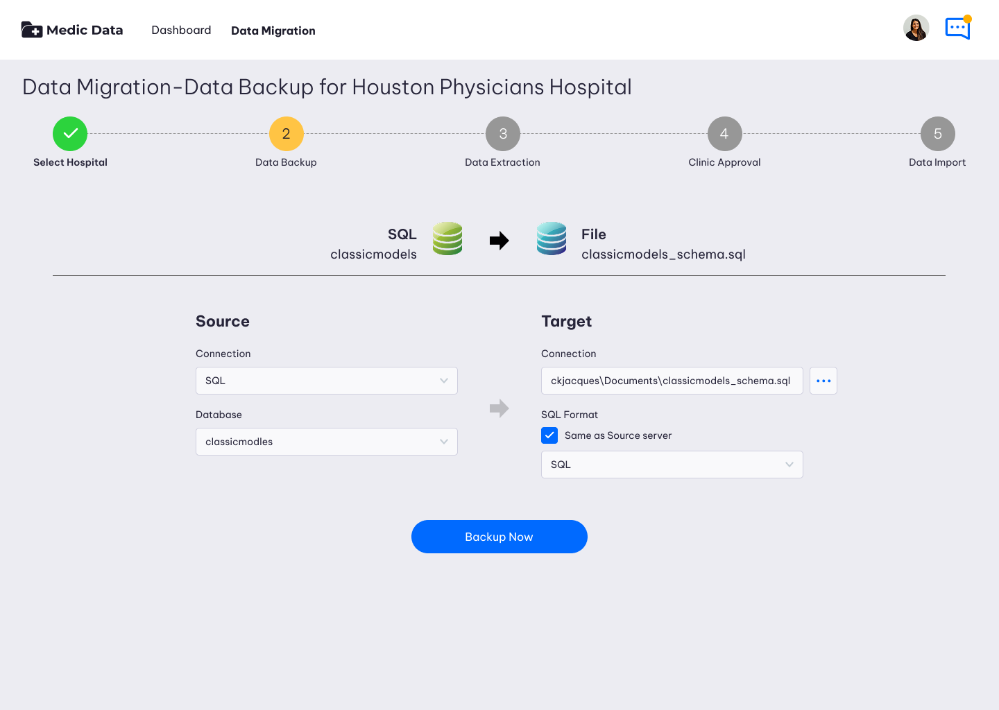
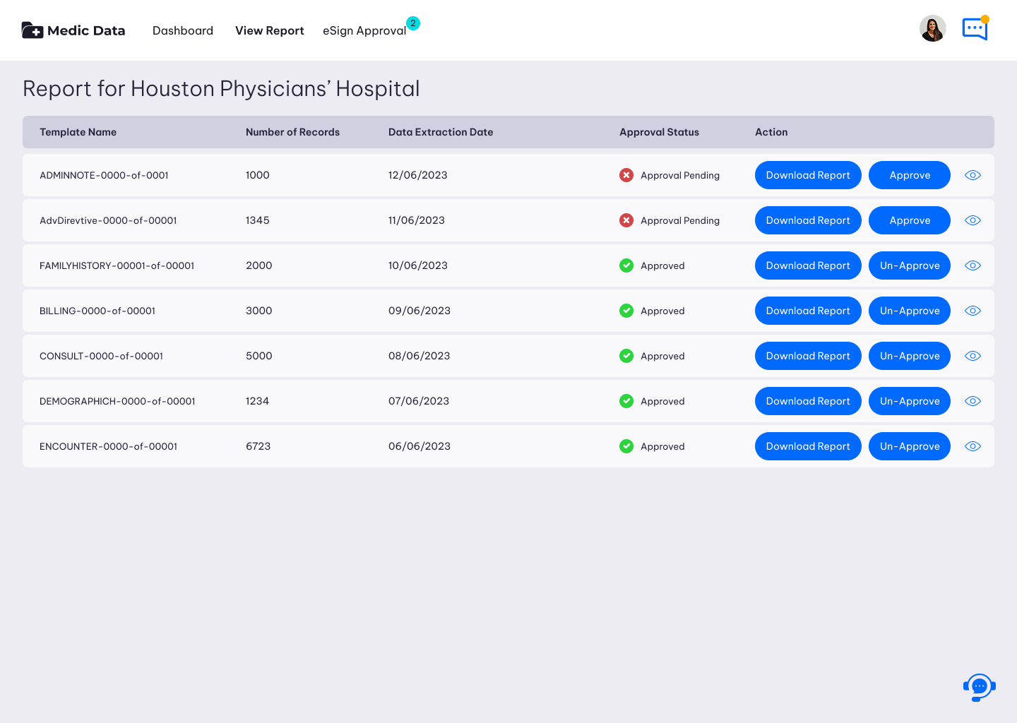
Hospital Data Migration App

The Hospital Data Migration Application is a secure, automated middleware tool designed to extract, transform, and load (ETL) complex clinical and administrative data. Its primary goal is to ensure zero-data-loss, maintain perfect data integrity, and strictly adhere to healthcare compliance standards (e.g., HIPAA) during system transitions.

Medic-Data-04

Core UX Principles for this Application

  • System Status Visibility: Because migrations take hours or days, the UI must never look “frozen.” Micro-animations (spinners, pulsing icons) and granular percentage counters (e.g., 45.2%) are essential to show the system is working.

  • Error Prevention (Friction is Good): Destructive or permanent actions (like overwriting a database) must have intentional friction. Use double-confirmation modals requiring the user to type “CONFIRM”.

  • Dense but Legible Data: Use monospace fonts for database identifiers (e.g., patient_uuid). Ensure high contrast (WCAG AA compliant) for readability during long hours of screen time.

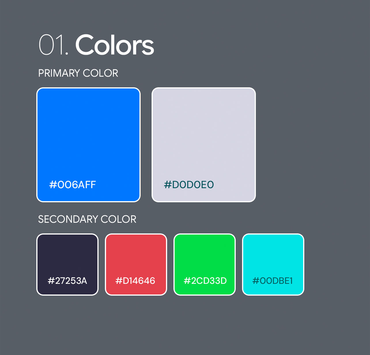
  • Clear State Management: Use universal color coding: Blue for processing, Green for success, Yellow for warnings, Red for critical failures/PHI breaches.

Medic-Data-03

Problem Statement

Migrating sensitive healthcare data from legacy Electronic Health Records (EHR) to modern systems is a high-stakes, technically complex process. Currently, migration tools rely on black-box scripts or dense, developer-centric interfaces. This creates severe cognitive overload for the cross-functional teams—database administrators, IT staff, and clinical data stewards—responsible for ensuring zero data loss and strict HIPAA compliance. The lack of visual clarity and error-prevention mechanisms leads to costly delays, migration fatigue, and unacceptable risks to patient safety.

Primary User Pain Points

To design an effective solution, the interface must address these specific friction points:

  • Cognitive Overload: Users are forced to parse thousands of rows of raw database tables and complex mapping rules without any visual hierarchy or guided workflows.

  • Lack of System Visibility: Long-running data extraction and loading jobs offer poor progress tracking, leaving users anxious about stalled or silently failing processes.

  • High-Stakes Anxiety: The fear of permanently corrupting patient records or causing a data breach paralyzes decision-making, as current tools lack “safe testing” sandboxes.

  • Collaboration Friction: Technical engineers and clinical staff (who must verify medical terminology) cannot easily collaborate, communicate, or hand off tasks within the existing software.

The Design Objective

The goal is to transform a highly technical database operation into a transparent, guided, and reassuring user experience.


Current State (The Friction) Target UX/UI State (The Solution)
Intimidating, code-heavy database screens Visual, drag-and-drop mapping canvases
Ambiguous, text-heavy error logs Semantic, actionable error highlighting
“Black box” processing with no feedback Transparent, step-by-step progress tracking
High risk of accidental data overwrites Intentional friction for destructive actions
Medic-Data-05
THE SOLUTION

Transform a highly technical database operation into a transparent.

If the UI redesign successfully solves the problem statement, the product should achieve the following measurable outcomes:

  • Decreased Time-to-Map: A reduction in the hours required to map legacy fields to the new system.

  • Reduced Error Rate: Near-zero critical mapping errors reaching the live production environment.

  • Faster User Onboarding: Reduced training time required for new hospital IT staff to feel confident using the platform independently.

DEEP UNDERSTANDING

The Users and the Industry

To design a mobile experience that converts, we must root the application in a deep understanding of the high-stakes Singaporean education landscape and the specific psychological drivers behind purchasing educational materials.

The Industry Landscape (The Environment)

Healthcare technology is uniquely challenging. Designing for this space requires acknowledging strict rules, archaic legacy systems, and the zero-tolerance policy for data loss.

Industry FactorThe RealityUX/UI Implication
InteroperabilitySystems must speak a common language (HL7, FHIR) to exchange data.The UI must clearly display which standards are being applied and highlight formatting conflicts.
Compliance & LawHIPAA (US), GDPR (EU), and strict audit requirements govern every action.Every action must be logged. The UI needs undeniable, immutable audit trails and masking for sensitive PHI (Protected Health Information).
Legacy DebtHospitals often use 20-year-old on-premise servers with custom, undocumented database structures.The mapping tool must be highly flexible, allowing users to handle messy, non-standardized legacy data gracefully.
Downtime IntoleranceHospitals operate 24/7. System cutovers usually happen at 2:00 AM on a Sunday.The interface must support “Dark Mode” for night shifts and provide high-contrast, unmistakable status indicators to prevent bleary-eyed mistakes.
Medic-Data-06
I MADE A

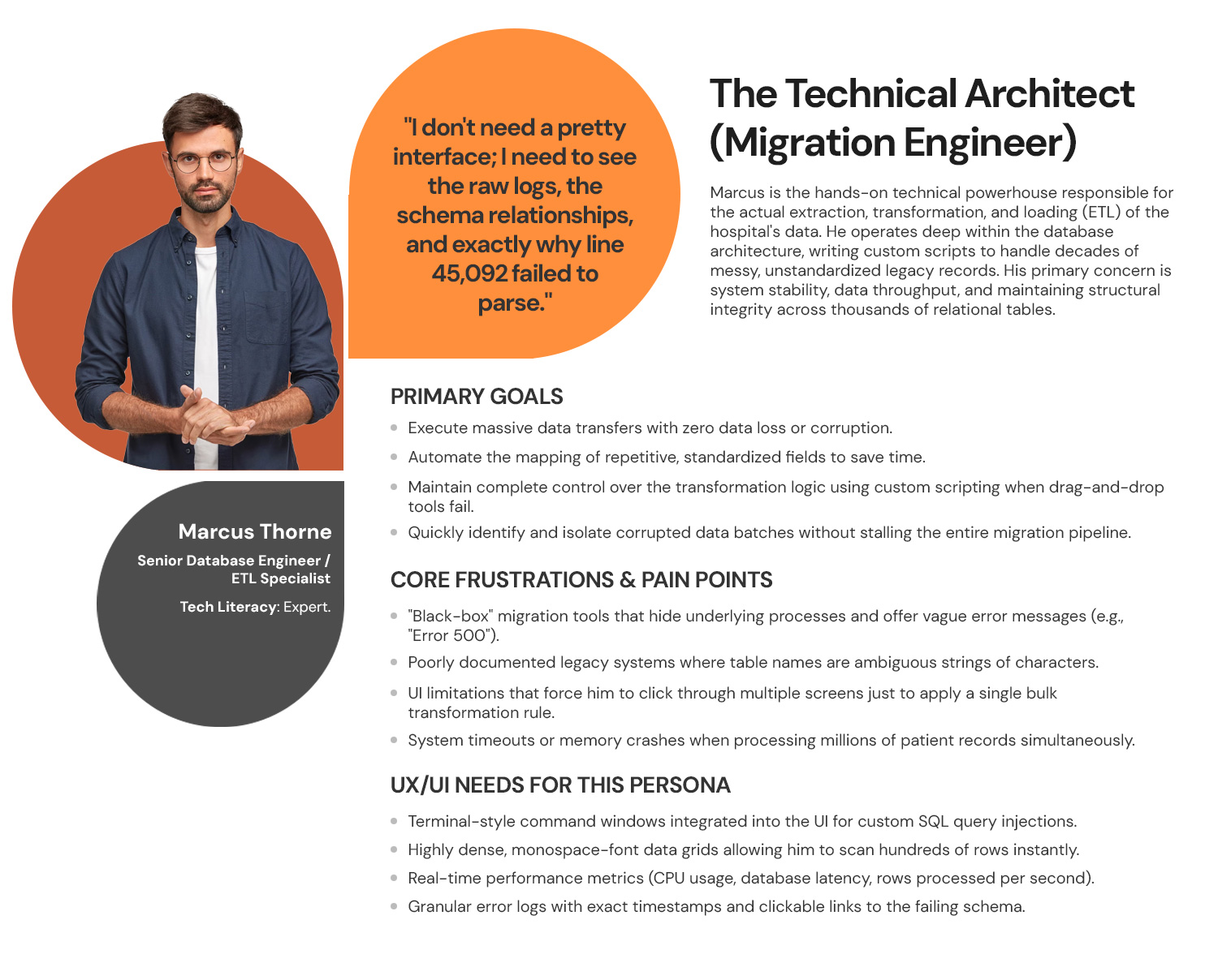
Personas & User Journey Maps

My interviews with the Business Users and Users provided critical, detailed information. This foundation allowed me to successfully create the resulting personas and journey maps.

Personas

Personas

Empathy is the foundation of great design. I develop UX Personas to humanize our target audience, allowing us to step into the user’s shoes. Understanding their ‘why’ helps me design interfaces that don’t just look good, but feel relevant and intuitive to the people using them.

Data-Migration-Personas-01
Persona 1: The Technical Architect (Migration Engineer)
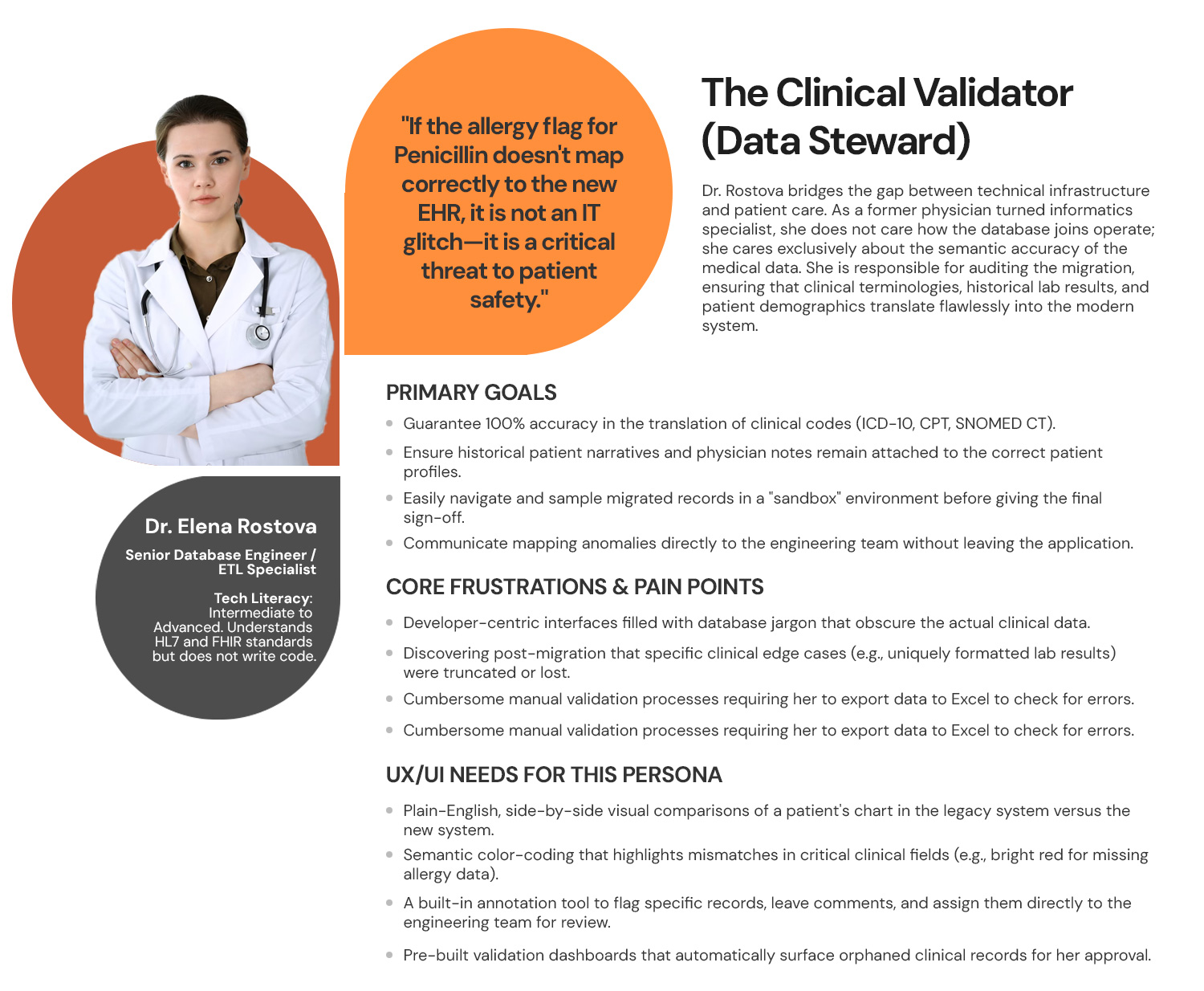
Persona 2: The Clinical Validator (Data Steward)
Data-Migration-Personas-03
Persona 3: The Strategic Overseer (Project Sponsor)
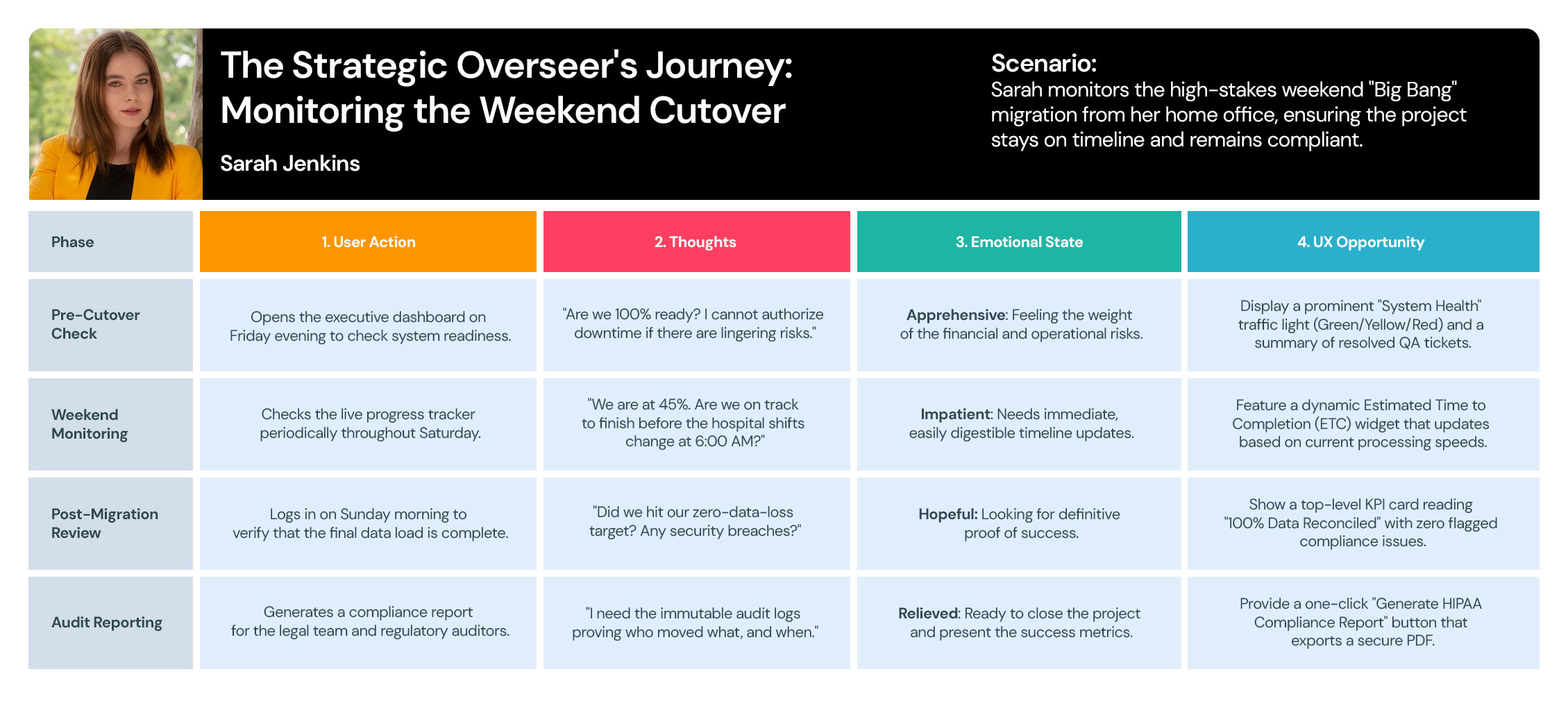
user-journey-maps

User Journey Maps

I use User Journey Maps to visualize the end-to-end experience and uncover hidden friction points. By mapping out every touchpoint—from discovery to conversion—I identify where users get frustrated or lose interest. This allows us to turn ‘drop-off points’ into opportunities for engagement.

Data-Migration-User-Journey-Maps-01
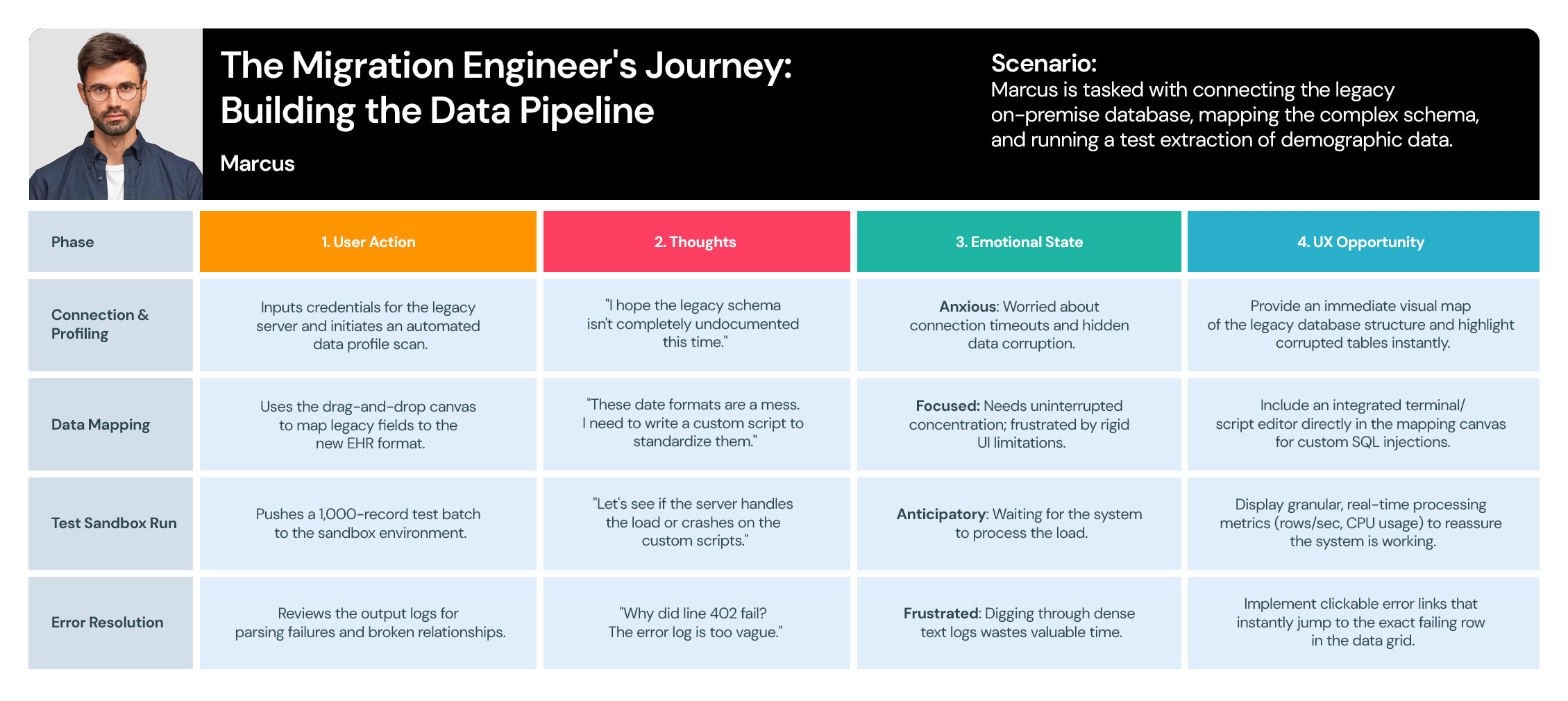
User Journey 1: The Migration Engineer's Journey
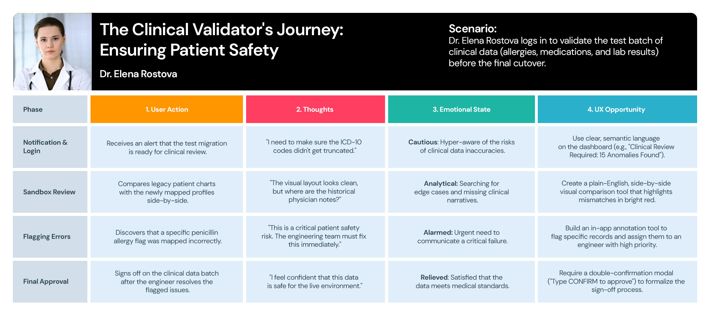
User Journey 2: The Clinical Validator's Journey
Data-Migration-User-Journey-Maps-03
User Journey 3: The Strategic Overseer's Journey

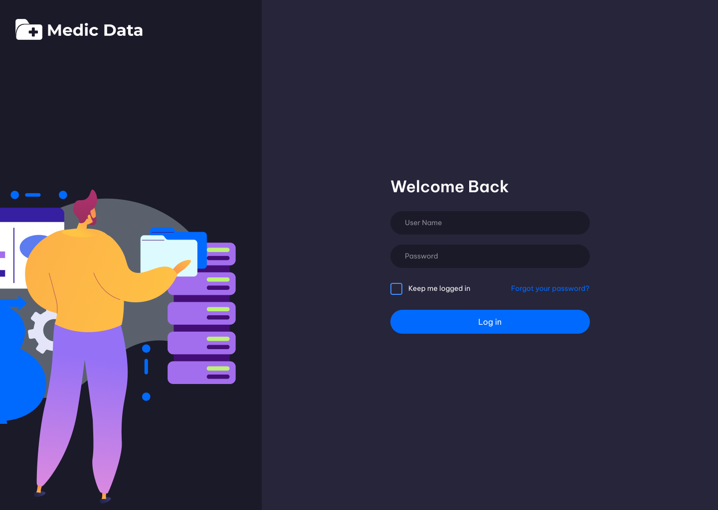
Style Guide

I developed a comprehensive design system that eliminated inconsistencies and cut down production time, allowing the team to focus on delivering a superior user experience.

THE

Visual Design

To me, Visual Design is more than just aesthetics—it’s a communication tool. I use typography, color theory, and spacing to create a clear visual hierarchy that guides the user’s eye to what matters most.

  • Get in touch
    Work Inquiries
    +91 99444 00361
  • Assistance hours:
    Monday – Friday
    10 am to 8 pm ISD
  • Post address
    10/A, Indira Gandhi Street,
    Sengeniammal Nagar, Orlean Pet
    Pondicherry – 605005. (INDIA)
  • Sign up for the newsletter