Get In Touch
10/A, Indira Gandhi Street, Sengeniammal Nagar,
Orlean Pet, Pondicherry – 605005. (INDIA)
Work Inquiries
venki@venkidesigns.com
Ph: +91.994.440.0361
BRAND DESIGN | LOGO DESIGN | BRAND IDENTITY

TureSend – Branding

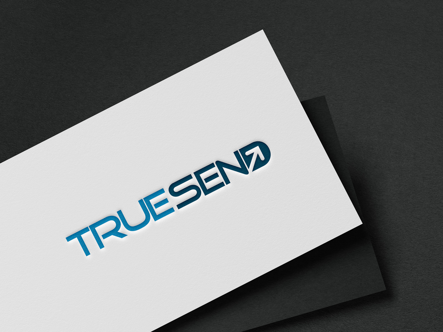
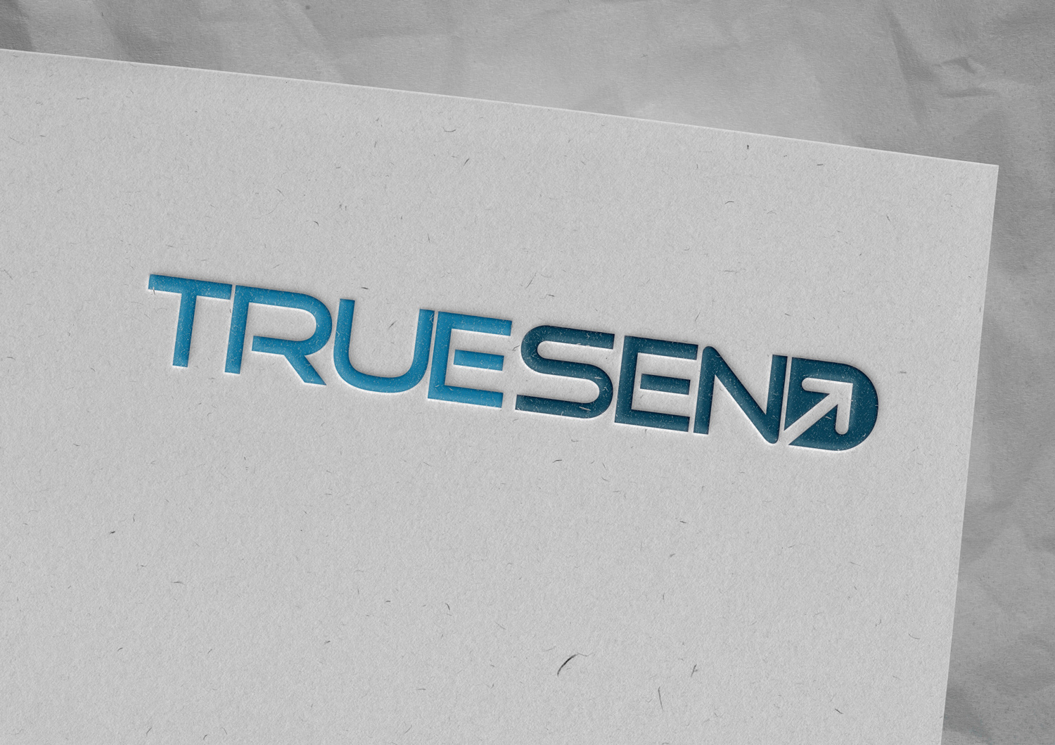
The brand identity for True Send, positioned as a Professional Email Service Provider in India, centers on a highly customized, modern wordmark that spells out “TRUESEND”. The design strategy leverages structural typography, negative space, and color psychology to communicate the core values of an enterprise software-as-a-service (SaaS) platform: speed, reliability, and guaranteed delivery.

TureSend-Branding-05

Typographic Architecture and Customization

The logo is constructed using a bespoke, all-caps sans-serif typeface that establishes a strong, horizontal footprint. This typographic foundation projects the stability and technical proficiency expected from a B2B infrastructure provider.

The letterforms are wide and geometric, featuring distinct horizontal cuts that emphasize digital precision.

Both instances of the letter “E” are customized with shortened middle crossbars, creating a streamlined, aerodynamic aesthetic that implies rapid data transfer.

The letter “R” features an open stencil-like gap where the bowl meets the stem, contributing to a modern, tech-forward visual language.

The tight kerning and unified baseline lock the compound name together into a single, cohesive brand mark.

Dual-Tone Color Strategy

To enhance legibility and communicate nuanced brand values, the design employs a strategic two-tone color palette that visually separates the brand name without requiring a physical space.

The word “TRUE” is rendered in a bright, vibrant cyan or light blue. This energetic hue is widely associated with digital innovation, transparency, clarity, and approachability.

The word “SEND” abruptly shifts into a dark, grounded navy or teal-blue. This darker shade provides a visual anchor for the logo, communicating the security, corporate trust, and enterprise-grade reliability necessary for a company handling critical communication channels.

Integrated Negative-Space Iconography

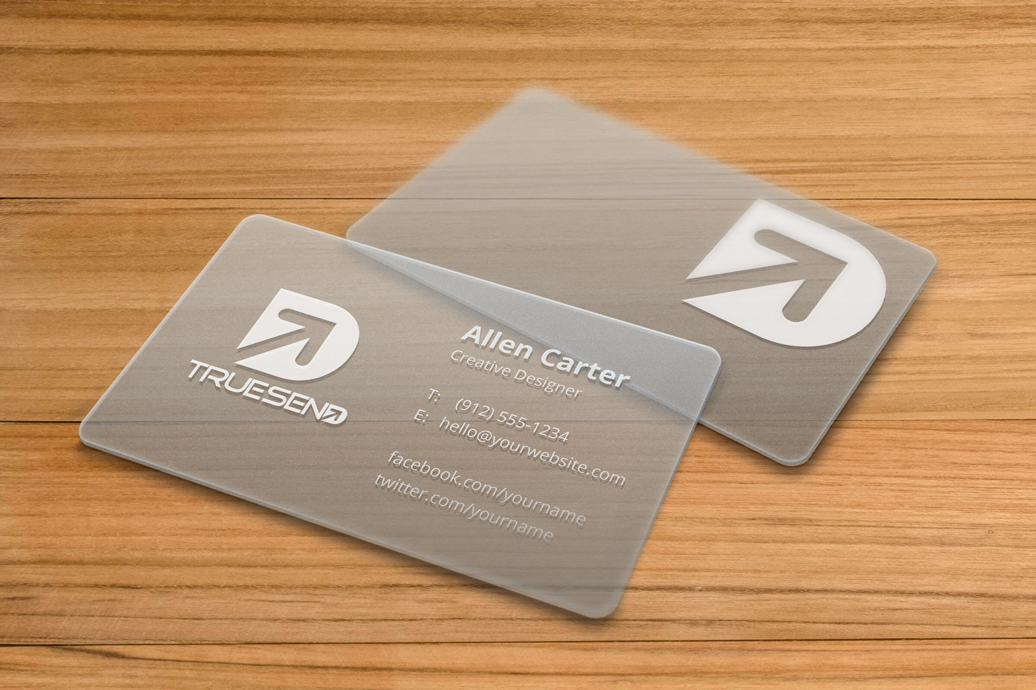
The defining characteristic of the True Send identity is the clever integration of a primary brand icon directly into the typography.

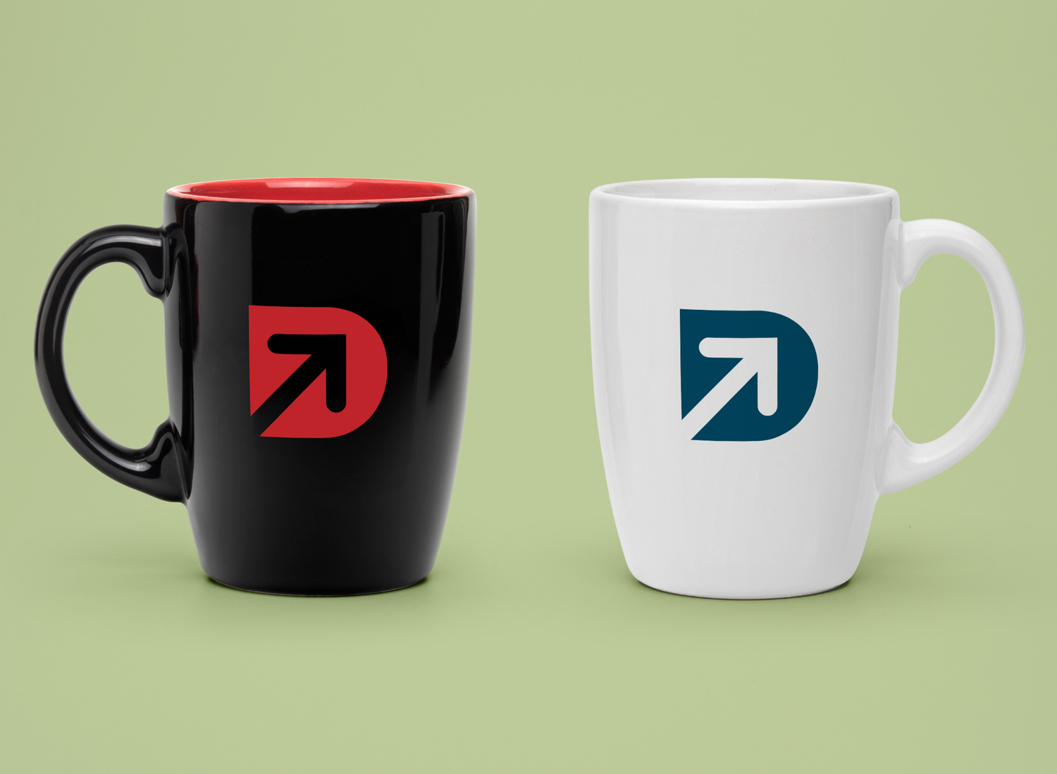
The final letter, “D”, is uniquely modified to house a distinct geometric arrow carved entirely out of the letterform’s negative space.

The arrow points diagonally upward and to the right, a universal directional cue for forward momentum, growth, transmission, and successful outbound delivery.

The stem of the arrow originates from the bottom left corner of the “D” and breaks through the inner counter, creating a dynamic sense of motion.

By embedding the “send” action directly into the final letter, the logo functions efficiently as a self-contained unit, ensuring it remains highly recognizable and scalable across complex software dashboards, marketing collateral, and compact mobile environments.
TureSend-Branding-03
  • Get in touch
    Work Inquiries
    +91 99444 00361
  • Assistance hours:
    Monday – Friday
    10 am to 8 pm ISD
  • Post address
    10/A, Indira Gandhi Street,
    Sengeniammal Nagar, Orlean Pet
    Pondicherry – 605005. (INDIA)
  • Sign up for the newsletter