Get In Touch
10/A, Indira Gandhi Street, Sengeniammal Nagar,
Orlean Pet, Pondicherry – 605005. (INDIA)
Work Inquiries
venki@venkidesigns.com
Ph: +91.994.440.0361
BRAND DESIGN | LOGO DESIGN | BRAND IDENTITY

WybeeTab - Branding

WybeeTab is a comprehensive, tablet-based learning platform based in India, designed to deliver an interactive, digital-first educational experience.

Project Scope: Brand identity development, including primary logo design, typography selection, color palette establishment, and business collateral application.

WybeeTab-Branding-02

Design Concept & Visual Identity

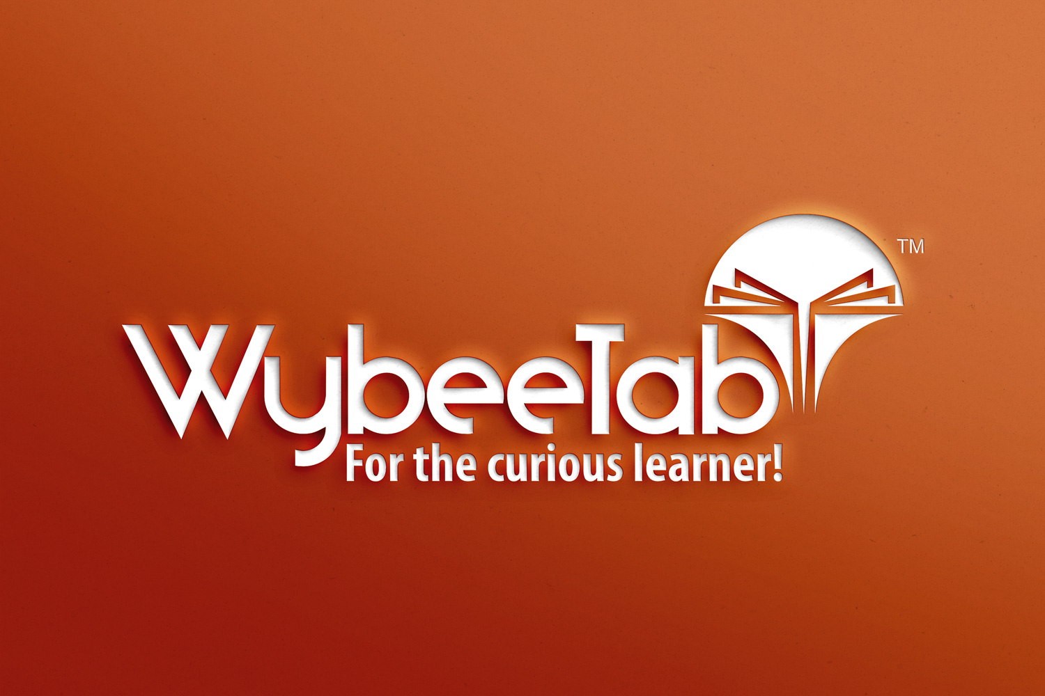
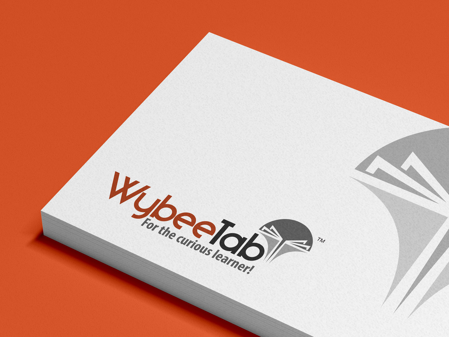
The WybeeTab logo balances the organic warmth of human curiosity with the solid structure of modern educational technology.

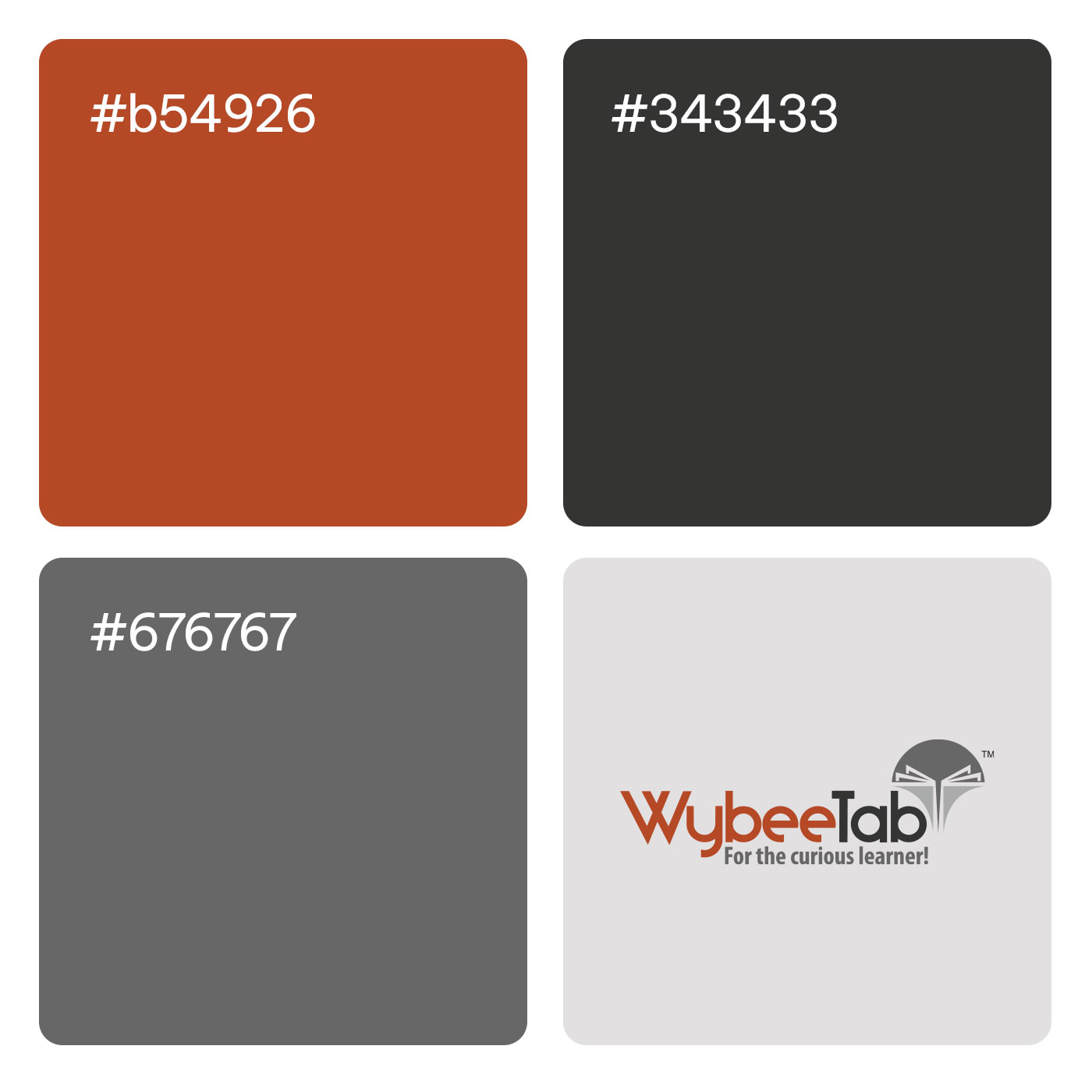
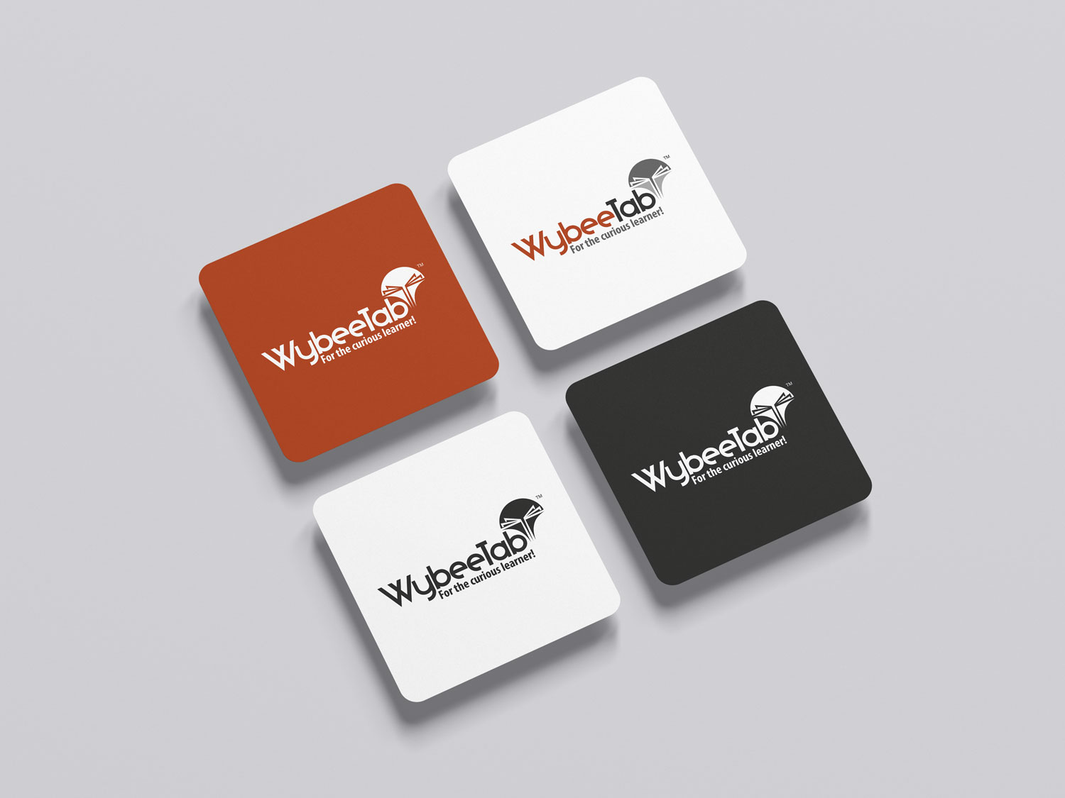
Typography: The primary wordmark is divided into two distinct visual treatments. The “Wybee” portion utilizes a stylized, interconnected font in a vibrant rust orange, symbolizing connectivity, energy, and the fluid nature of learning. In contrast, “Tab” is rendered in a solid, bold charcoal grey sans-serif, anchoring the brand in hardware, reliability, and modern technology.

Iconography: Positioned above the right side of the wordmark is the brand’s core emblem—a circular grey badge containing the abstract geometric shape of an open book. The white lines representing pages radiate outward and upward from a central spine, subtly mimicking a blossoming tree or an illuminated mind, aligning perfectly with an educational tool.

Brand Messaging: The tagline, “For the curious learner!”, is placed directly beneath the primary wordmark in a clean, legible grey font, immediately communicating the platform’s target audience and mission-driven approach.
WybeeTab-Branding-04

Collateral Application

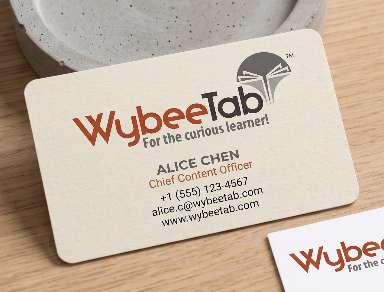
The visual identity translates seamlessly into physical brand touchpoints, such as professional business cards. The logo’s color palette and structure allow for highly effective collateral design featuring:

Contrast and Hierarchy: Utilizing natural off-white, light cream, and dark charcoal backgrounds that allow the rust-orange brand accents to stand out prominently.

Modern Utility: Integration of functional elements like scannable QR codes for direct platform access, maintaining the tech-forward, frictionless ethos of the brand.

Visual Communication: Using custom icon badges and bulleted lists on the reverse sides of cards to highlight core platform value propositions, such as “Curated Educational Content,” “Interactive Learning Modules,” “Data-Driven Insights,” and “Progress Tracking”

Color Psychology

Rust/Burnt Orange: Evokes enthusiasm, creativity, and youthful energy, ensuring the brand feels approachable, warm, and stimulating for students.

Charcoal/Slate Grey: Communicates trust, technological sophistication, and academic authority, assuring parents and educators of the platform’s robust quality.

WybeeTab-Branding-09
  • Get in touch
    Work Inquiries
    +91 99444 00361
  • Assistance hours:
    Monday – Friday
    10 am to 8 pm ISD
  • Post address
    10/A, Indira Gandhi Street,
    Sengeniammal Nagar, Orlean Pet
    Pondicherry – 605005. (INDIA)
  • Sign up for the newsletter