
Color is the silent ambassador of your digital product.
Long before a user reads a headline or taps a button, color has already communicated your brand’s personality, established a mood, and directed the user’s cognitive flow. In UI design, color theory is rapidly evolving beyond mere aesthetics; it is an active psychological tool used to reduce cognitive load, enhance accessibility, and build trust.
As we look toward the design landscape of 2026, we are seeing a profound shift. The sterile, minimalist palettes of the early 2020s are making way for hues that bridge the gap between digital innovation and ecological grounding. This year, the focus is on digital regeneration, stability, and a return to tactile warmth. Let’s explore the key UI color theory trends anticipated to define the digital experiences of 2026.
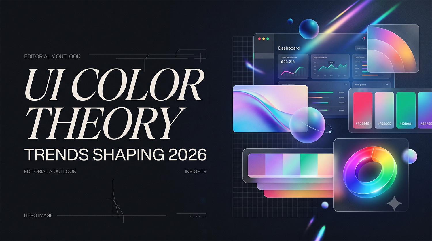
As we look toward the design landscape of 2026, we are seeing a profound shift. The sterile, minimalist palettes of the early 2020s are making way for hues that bridge the gap between digital innovation and ecological grounding. This year, the focus is on digital regeneration, stability, and a return to tactile warmth. Let’s explore the key UI color theory trends anticipated to define the digital experiences of 2026.
Key UI Color Theory Trends for 2026
Trend 1: Transformative Teal (Ecological & Digital Regeneration)
- Description: Recognized globally by trend forecasters like WGSN as the defining color for 2026, “Transformative Teal” is a cooling blue-green tone that captures a planet-focused mindset [cite: 1.1.1]. It is a fluid fusion of ocean and forest, blending stable dark blue with vibrant aquatic green. This shade marks a cultural turn toward ecological responsibility and long-term innovation.
- Psychology: In a fast-paced digital world, this color carries a calm and restorative presence that encourages resilience [cite: 1.1.1]. It mirrors a world searching for balance between technological progress and planetary preservation, symbolizing a return to stability and digital regeneration. Psychologically, blue and green tones are proven to lower user anxiety, making them highly effective for retention.
- Application: Transformative Teal is exceptionally versatile. In UI, it serves as a powerful primary brand color or a striking accent for call-to-action (CTA) buttons in otherwise dark-mode interfaces. It is particularly effective for fintech dashboards, health and wellness applications, and sustainable e-commerce platforms that want to project both forward-thinking innovation and trustworthy stability.
- Example Visuals (Describe): Picture a financial analytics dashboard in dark mode. The background utilizes deep slate gray, while data visualization graphs, progress rings, and primary interactive elements glow in Transformative Teal. The contrast provides high legibility while maintaining a calm, sophisticated, and futuristic aesthetic.
Trend 2: Future Dusk & Atmospheric Purples (Immersive & Tech-Driven)
- Description: Another major player in the 2026 palette is “Future Dusk,” a deep, atmospheric purple-blue hue [cite: 1.1.9]. Moving away from the stark, high-contrast blacks previously used in dark UI, designers are leaning into rich, celestial dark tones that feel expansive rather than confining.
- Psychology: Deep blues and purples evoke a sense of mystery, futuristic exploration, and deep focus. They reflect the continuous rise of spatial computing, Web3, and AI-driven platforms. These atmospheric tones reduce eye strain during prolonged screen time, offering a sense of depth and infinite space that keeps users immersed without feeling trapped.
- Application: Future Dusk is the ultimate background foundation for generative AI interfaces, immersive gaming hubs, and high-focus productivity software. It pairs beautifully with neon accents or soft metallic typography, providing a premium, cutting-edge feel.
- Example Visuals (Describe): Imagine the interface of a next-generation AI writing assistant. The application opens to a seamless, edgeless background steeped in Future Dusk. Soft, glowing white typography floats on the screen, while subtle, animated gradients of magenta and deep blue respond to the user’s cursor interactions, creating a sense of living technology.
Trend 3: Earthy Elegance & Warm Nuances (Tactile Intimacy)
- Description: The tech industry is officially saying goodbye to cool grays and sterile whites; design for 2026 is deeply rooted in nature and warm, enveloping colors [cite: 1.1.5]. We are seeing the rise of palettes like Cocoa Powder (a sophisticated alternative to black), Amber Haze, Butter Yellow, and Sage Green.
- Psychology: These earthy tones serve as grounding elements, creating a sense of warmth, intimacy, and organic charm. They are reminiscent of sun-drenched soil and natural landscapes, offering users a comforting digital embrace [cite: 1.1.5]. In a highly digitized era, humans inherently crave tactile, real-world connections; warm nuances trick the brain into feeling a sense of physical comfort and approachable humanity.
- Application: This trend is perfect for lifestyle apps, community-driven social platforms, and food delivery services. Using shades like Butter Yellow for card backgrounds or Cocoa Powder for typography (instead of harsh #000000 black) significantly softens the interface, making the product feel more human, accessible, and friendly.
- Example Visuals (Describe): A mental health journaling app utilizing a soft, “Earthy Elegance” palette. The main background is a creamy off-white, with interactive cards in Butter Yellow and Sage Green. The typography is rendered in Cocoa Powder, creating a low-contrast, gentle reading experience that feels like a physical, sunlit notebook.
Integrating Trends: Balance and Accessibility
While these trends are distinct, the magic of 2026 UI design lies in how they can be harmoniously blended to suit your brand identity.
- Blending the Palettes: Designers can mix the tech-forward nature of Future Dusk with the organic warmth of Earthy Elegance. For instance, a SaaS platform might use Future Dusk for its global navigation sidebar to signal deep technical capability, while utilizing a soft Butter Yellow background in the main content area to make data entry feel less clinical and more approachable.
- Contrast and Accessibility: When experimenting with these deep teals and atmospheric purples, accessibility must remain the North Star. Always ensure your color combinations pass WCAG 2.2 contrast ratio standards. User testing is critical here; what looks moody and sophisticated on an expensive 4K monitor might become illegible on a mid-range smartphone in direct sunlight. Use AI-driven color generation tools to instantly map out accessible variations of Transformative Teal or Cocoa Powder across your entire design system.