Biryani Pundits – Branding
Biryani Pundits, a South Indian Biryani restaurant based in Bangalore, requires a visual identity that instantly communicates flavor, warmth, and culinary expertise. The logo design achieves this through a bold, appetizing aesthetic tailored for a bustling and competitive local food market.
Design Concept & Imagery
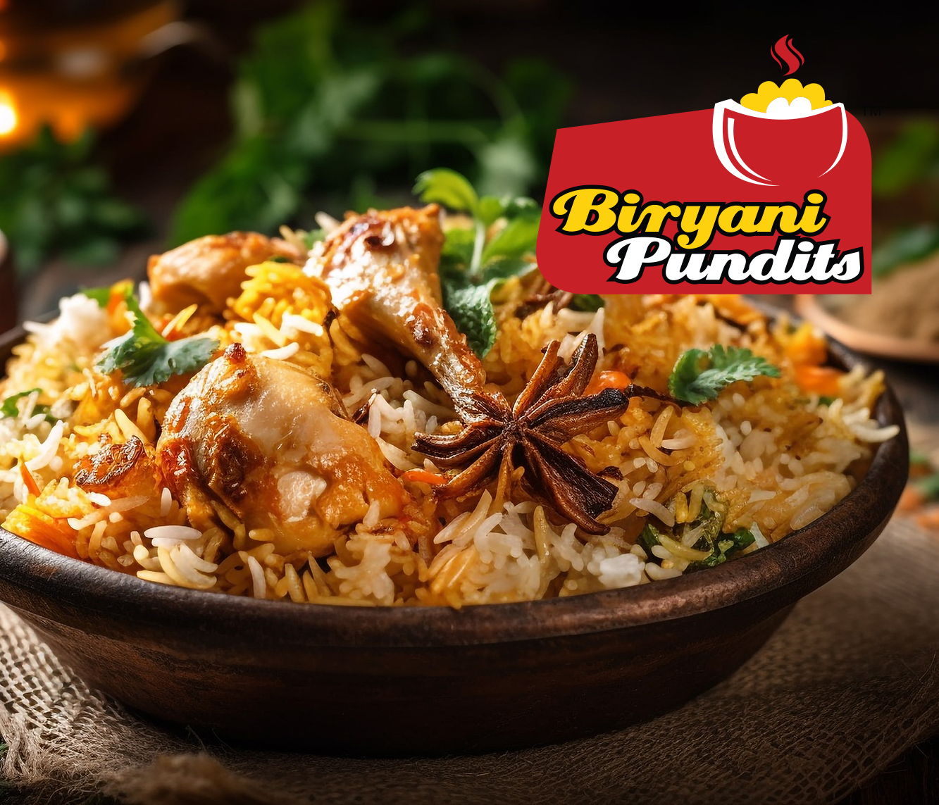
At the core of the brand’s visual identity is a promise of fresh, hot food. The design features a stylized red bowl, defined by sweeping white outline strokes, positioned prominently in the upper right. Resting inside the bowl are textured mounds of yellow and white, immediately recognizable as a hearty, aromatic serving of biryani. To reinforce the idea of freshly prepared food, two wavy red lines rise above the dish, depicting steam or heat.
Color Psychology
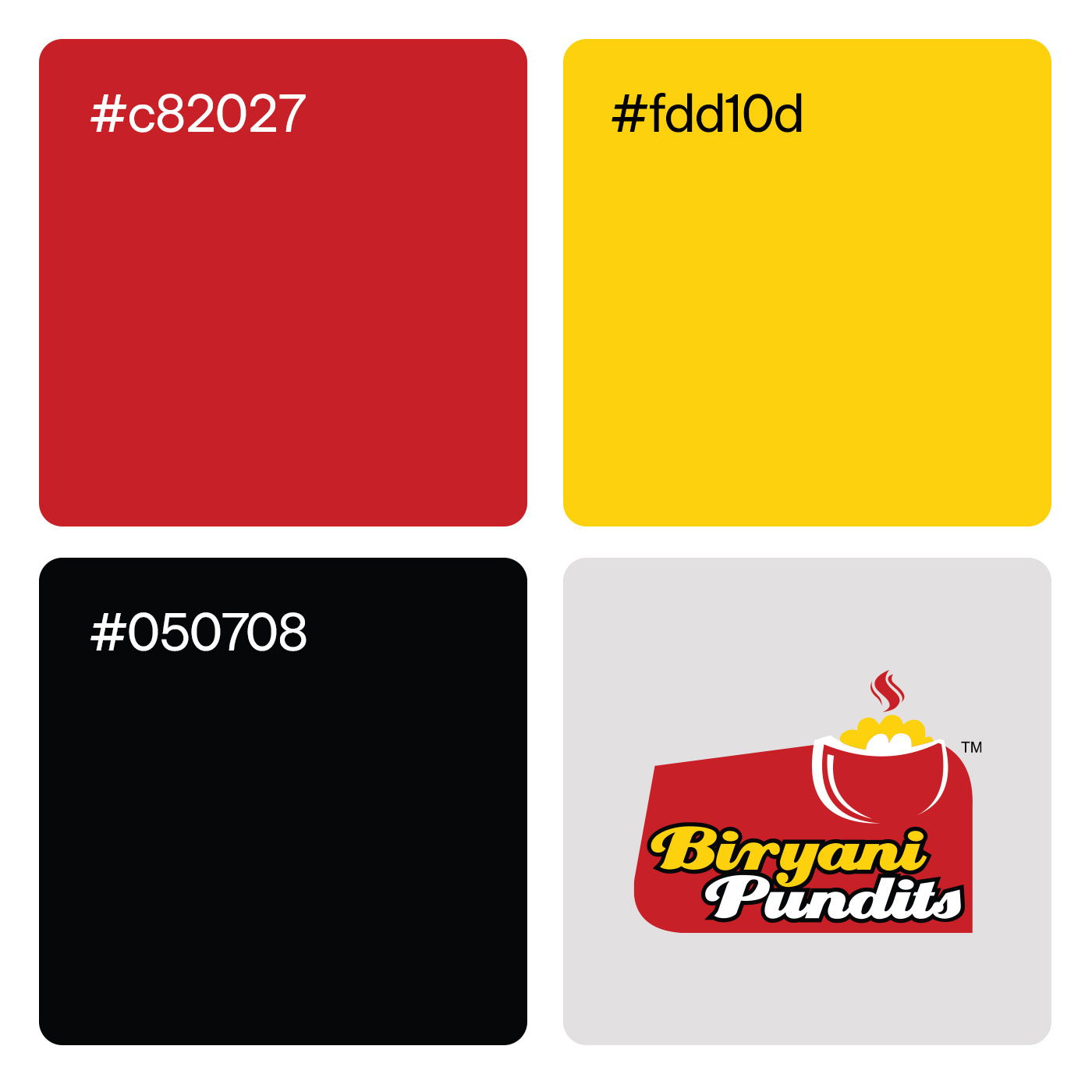
The logo leverages a classic and highly effective food-industry color palette, dominated by vibrant red and yellow.
Red: The solid, asymmetrical red background block grounds the entire logo, giving it a strong, badge-like presence. In culinary branding, red is heavily utilized to stimulate the appetite and grab attention quickly.
Yellow & White: The yellow used for the rice and the primary text evokes warmth, energy, and the rich spices—like turmeric and saffron—intrinsic to authentic South Indian biryani.
Typographic Strategy
The typographic layout uses stark contrast to separate the two words in the brand name, creating a dynamic visual hierarchy:
“Biryani”: The primary offering is rendered in a thick, bubbly yellow typeface enclosed by a heavy black outline. This ensures maximum legibility from a distance and sets a casual, inviting, and robust tone.
“Pundits”: Placed directly underneath, this word is set in a white, slightly italicized script font with a black drop-shadow effect. This stylistic choice adds dynamic flair and hints at the “mastery” or specialized knowledge the name implies.