Brand Design | Logo Design | Brand Identity
EnDigi Technologies
The logo design for EnDigi Technologies, a technology firm based in Bangalore, India’s premier IT and tech hub, is engineered to project innovation, digital connectivity, and corporate reliability. In a highly saturated and competitive market like Bangalore, a technology company’s visual identity must immediately communicate its core competencies while establishing a trustworthy and modern presence. The EnDigi logo achieves this through a strategic combination of a clever negative-space logomark, custom geometric typography, and a purposeful, tech-centric color palette.
Logomark: The Dynamic "e" Symbol
The most prominent visual anchor of the brand identity is the stylized emblem positioned to the left of the wordmark. This logomark is deeply symbolic and meticulously crafted:
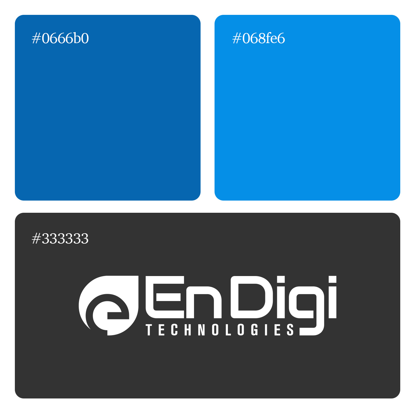
Negative Space Utilization: The focal point of the emblem is the lowercase letter “e” (standing for EnDigi), which is expertly carved out of the blue base shape using negative space. This design technique creates a sense of depth and visual intrigue, rewarding the viewer who looks closely.
Fluidity and Motion: The outer blue shape is not a static circle or square; rather, it resembles a droplet, a digital node, or a stylized speech bubble with a sweeping, aerodynamic curve pointing toward the top left. This asymmetry suggests forward momentum, agility, and the fluid nature of technological evolution.
Connectivity Loop: The internal spiral of the “e” mimics a continuous loop, an orbit, or the classic “@” symbol. This communicates the company’s focus on networking, seamless digital integration, and closed-loop technological solutions.
Typographic Strategy
The wordmark relies on a clean, modern, sans-serif typeface that has been customized to reflect the structural precision expected from a technology firm.
Dual-Tone Wordmark: The primary company name is split visually using color: “En” (Enable, Enterprise, Energy) is rendered in a vibrant, lighter cyan, while “Digi” (Digital) is presented in a deeper, resolute navy blue. This two-tone approach naturally guides the reader’s eye, breaks up the syllables for better readability, and emphasizes the “Digital” core of the business.
Custom Letterforms: The typography is highly geometric. The capital “E” features sharp, uniform horizontal bars, conveying stability. The lowercase “g” in “Digi” is particularly distinctive—instead of a traditional curved descender, it features a sharp 90-degree angle with a flat horizontal tail. This strict geometry reinforces a “coding” or “architectural” aesthetic, aligning perfectly with software and tech development.
Anchoring Subtitle: The word “TECHNOLOGIES” is set in an all-caps, dark charcoal grey font. It is heavily tracked (widely spaced) to stretch across the width of the primary wordmark. This creates a solid visual foundation, grounding the logo and giving it an established, authoritative, and corporate feel.
Brand Positioning in the Bangalore Ecosystem
As a company operating out of Bangalore—often referred to as the Silicon Valley of India—EnDigi Technologies requires an identity that scales effortlessly from favicons and mobile app icons to large-scale corporate signage. The self-contained “e” emblem is perfect for avatars and responsive digital environments, while the full horizontal lockup serves formal documentation and web headers.
Color Psychology and Palette
The chosen colors are foundational to the tech industry, utilizing variations of blue and grey to trigger specific psychological responses from clients and stakeholders:
Vibrant Cyan (The “En”): Represents innovation, clarity, and future-forward thinking. It brings a youthful, energetic, and modern startup energy to the identity.
Deep Corporate Blue (The Logomark and “Digi”): A staple in the IT sector, dark blue communicates security, intelligence, logic, and profound reliability. It reassures enterprise clients that EnDigi is a stable partner capable of handling complex digital transformations.
Charcoal Grey (The Subtitle): A highly professional neutral that grounds the bright blues. It represents structure, logic, and hardware, providing high contrast and readability without the harshness of a pure black.