Hospy Property Management - Branding
The brand identity for Hospy Property Management, a USA-based real estate management company, centers on conveying trust, protection, and professional hospitality.
Design Concept & Symbolism
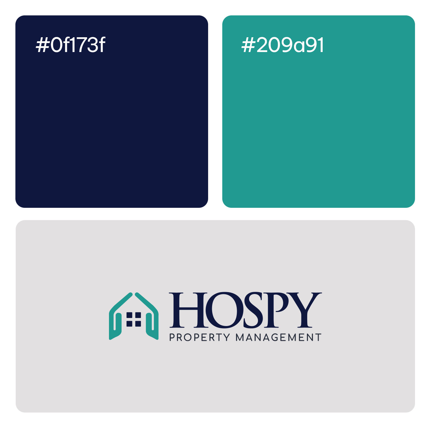
The Protective House Mark: The primary icon features a stylized house silhouette formed by two symmetrical teal shapes that mimic upward-reaching, protective hands. This dual imagery effectively communicates the company’s core offering (housing and properties) while emphasizing a hands-on, caring approach to management.
The Core Focus: Centered within the negative space of the hands is a dark navy blue, four-pane square window. This element clearly grounds the logo in the real estate industry and creates a focal point of stability.
Typography Strategy
Primary Logotype: The brand name “HOSPY” is set in a large, elegant dark blue serif typeface. The use of a classic serif font projects authority, heritage, and trustworthiness—crucial traits for a firm handling valuable physical assets.
Secondary Descriptor: The phrase “PROPERTY MANAGEMENT” is positioned underneath in a clean, widely tracked dark sans-serif font. This modern typographic contrast ensures clear legibility and adds a contemporary, structured touch to the overall design.
Color Palette Strategy
Teal: The icon utilizes a vibrant but calming teal, a color typically associated with renewal, tranquility, and approachable service.
Navy Blue: The deep navy used for the window element and primary text provides a strong visual anchor, representing corporate professionalism, security, and foundational strength.