The Secret Siddha - Branding
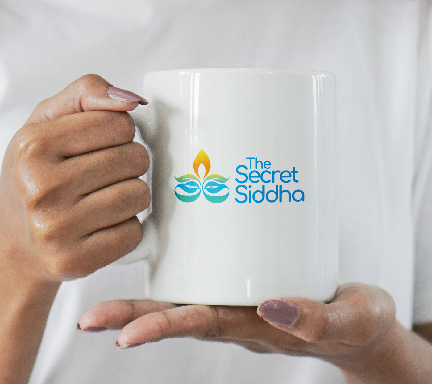
The Secret Siddha is positioned as an exclusive, high-quality herbal products company based in the coastal, culturally rich city of Pondicherry, India. The logo design perfectly encapsulates the brand’s core pillars: ancient Indian wellness (Siddha), botanical purity, and premium mystique.
Design Concept & Symbolism
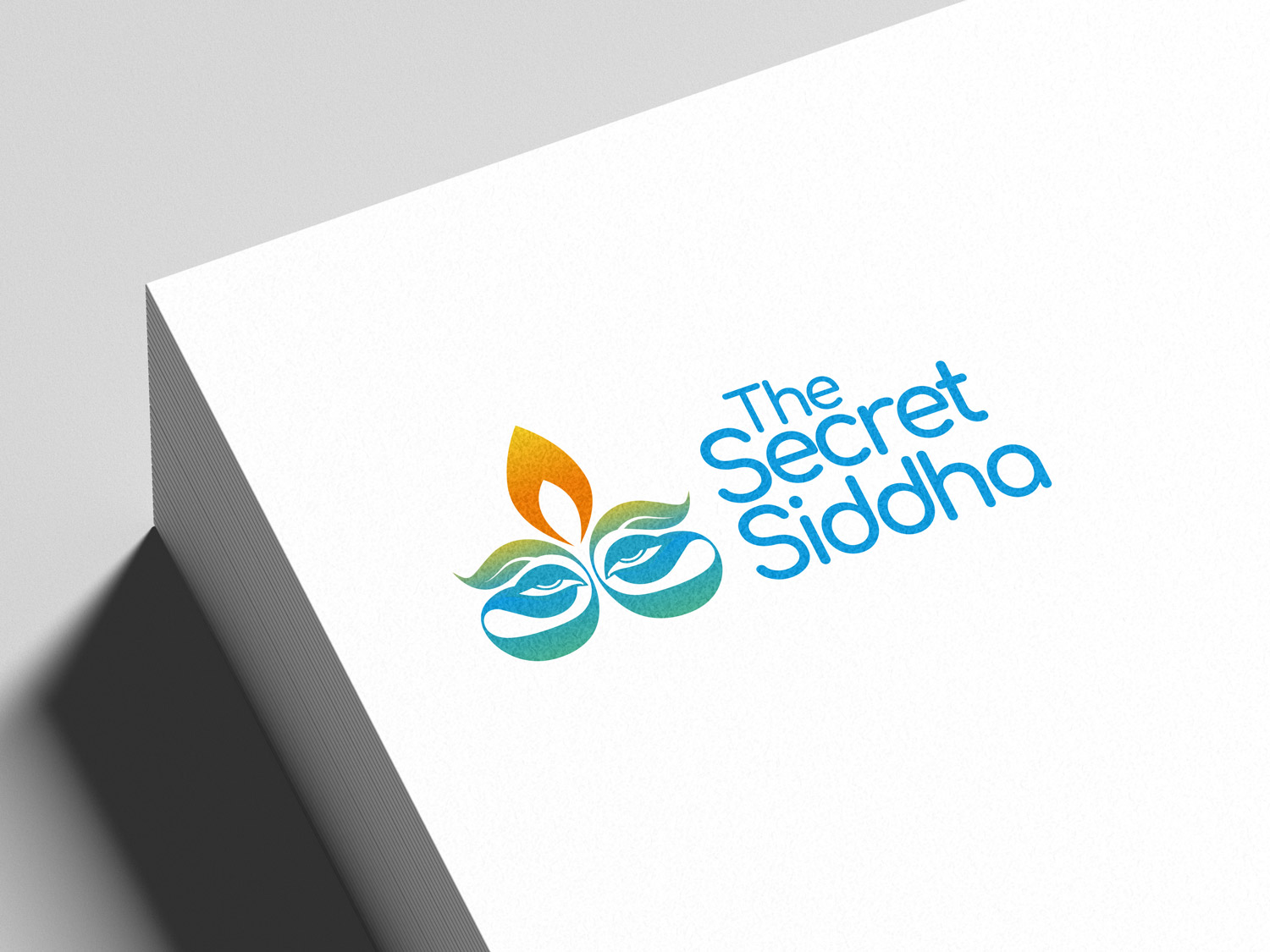
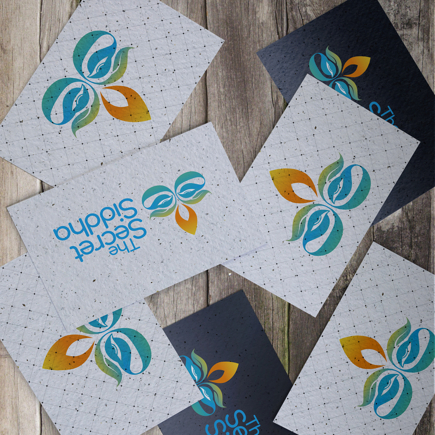
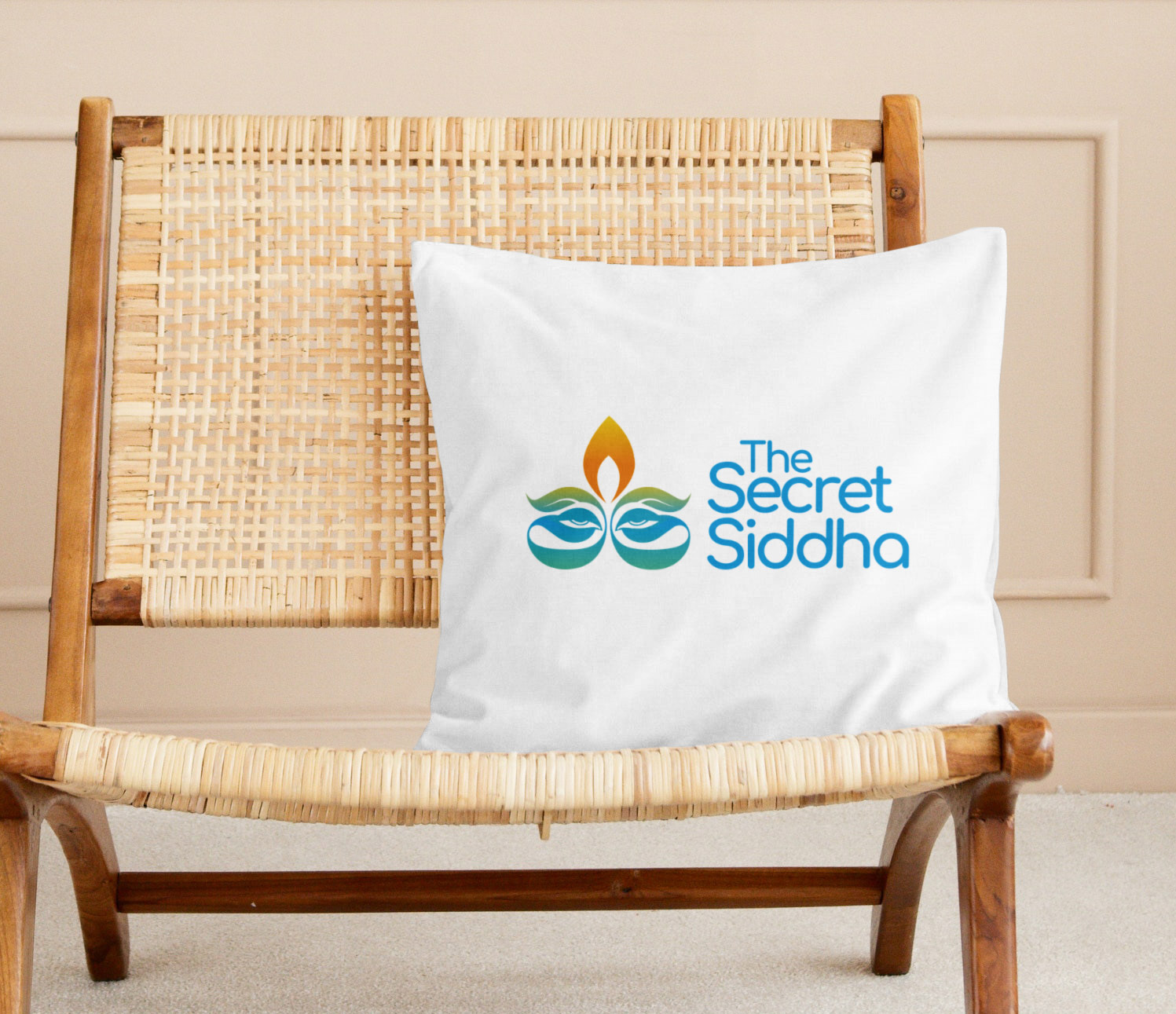
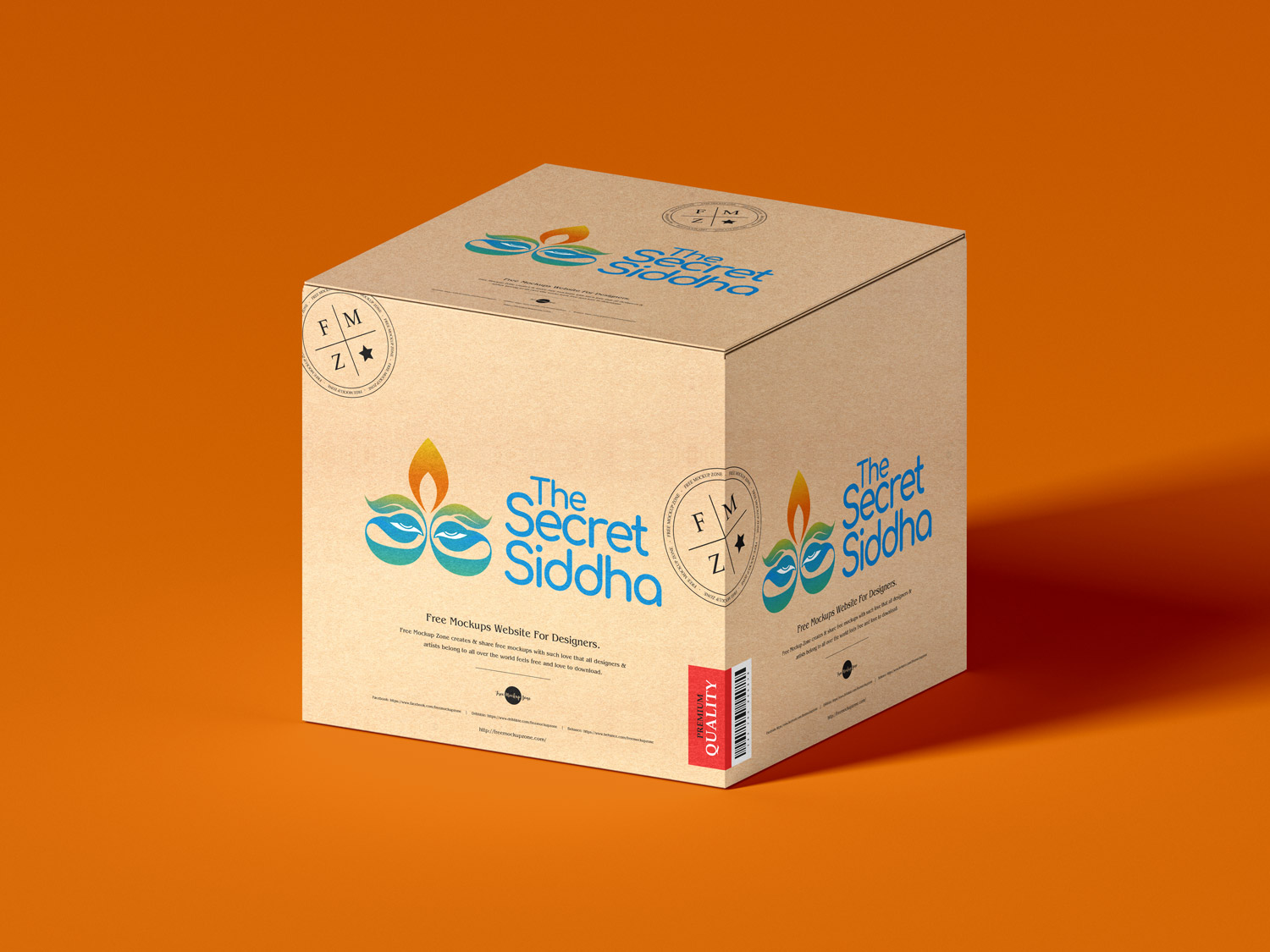
The brand mark is a complex, symmetrical icon that cleverly merges multiple natural and spiritual motifs into a single, cohesive emblem.
The Mystical Eyes: The focal point of the icon features two stylized, serene eyes. This directly speaks to the “Secret” and “Siddha” aspects of the name, representing ancient wisdom, mindfulness, and a deep, watchful understanding of nature’s secrets.
Botanical Integration: Sprouting just above the eyes are sweeping green shapes resembling leaves. This grounds the logo in the company’s core offering: high-quality, plant-based herbal products.
The Transformative Flame: At the very top of the emblem, a stylized flame reaches upward in shades of yellow and orange. In Ayurvedic and Siddha traditions, fire (Agni) represents transformation, energy, and the distillation of pure ingredients. It also acts visually as a “third eye” or bindi, reinforcing the Indian heritage of the brand.
Cupped Hands / Flowing Water: The bottom portion of the emblem uses sweeping, curved teal lines that cradle the eyes. This shape evokes a sense of nurturing (like hands gently holding the herbs) or flowing water, subtly hinting at the brand’s coastal Pondicherry roots.
Typography
Modern & Approachable: The wordmark “The Secret Siddha” is written in a clean, rounded sans-serif typeface. The rounded terminals of the letters soften the brand, making it feel accessible and gentle—ideal qualities for a wellness company.
Stacked Layout: The text is stacked in three right-aligned tiers next to the emblem. This creates a balanced, compact footprint that allows the detailed icon to breathe while remaining highly legible on product packaging.
Overall, the design successfully bridges the gap between ancient traditional medicine and a modern, premium lifestyle brand.
Color Palette Strategy
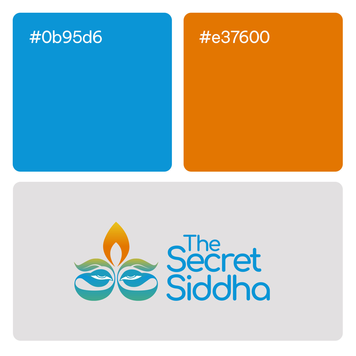
The color palette utilizes vibrant, nature-inspired gradients that communicate both healing and premium quality.
Golden Orange & Yellow: Used in the top flame element, signifying energy, vitality, and spiritual warmth.
Earthy Greens: Transitioning through the leafy middle section, representing natural growth, herbal medicine, and organic purity.
Oceanic Teal & Bright Cyan: The lower curves of the icon and the entirety of the brand text are rendered in vibrant blues and teals. Blue often conveys trust, clinical efficacy, and calmness, establishing the brand as a reliable authority in wellness.