TQ Fly Travels - Branding
The logo design for Pondicherry-based travel agency TQ Fly Travels captures the energy and momentum of the travel industry through high-contrast visuals and dynamic symbolism.
Visual Structure and Composition
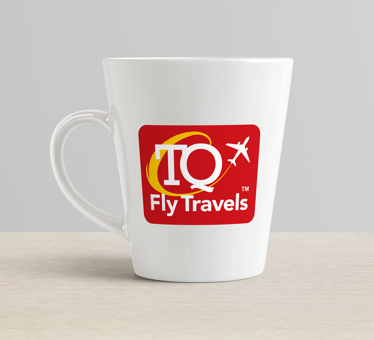
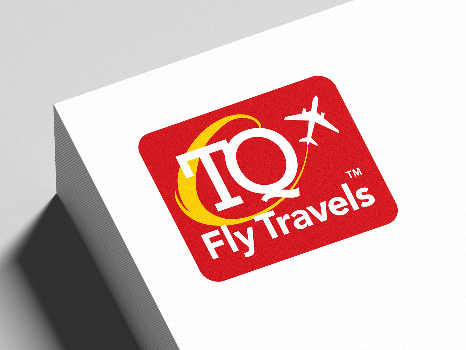
The foundational architecture of the logo relies on a contained, badge-style layout. The entire design is set within a solid red rectangle that features softly rounded corners. This self-contained structure ensures the logo remains versatile and visually stable across various applications, from digital social media avatars to physical storefront signage.
Typographic Strategy
The design employs a distinct typographic hierarchy to separate the brand’s core identifier from its descriptive title.
Primary Mark: The dominant visual element is the large, capitalized lettering “TQ” positioned in the center-left of the frame. These initials are crafted in a classic, white serif font. The use of serifs conveys a sense of established trust, authority, and reliability—crucial metrics for a consumer selecting a travel and ticketing partner.
Secondary Text: Positioned directly beneath the large initials is the phrase “Fly Travels”. To contrast the traditional feel of the primary mark, this secondary text utilizes a clean, modern, white sans-serif typeface.
Legal Marker: A small, white “TM” trademark symbol is strategically positioned to the right of the “Q” and directly above the word “Travels”, formalizing the brand’s intellectual property.
Color Palette Analysis
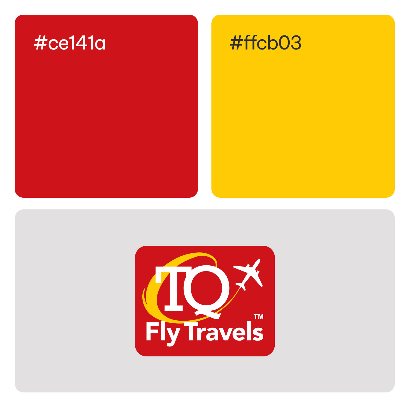
The brand’s color story relies on a tri-color palette that maximizes visibility and emotional impact.
Commanding Red: The logo is anchored by a solid red background. In branding, red is an active color that stimulates urgency, passion, and excitement, helping the agency stand out visually in a crowded commercial landscape.
Stark White: The central “TQ” letters, the “Fly Travels” wording, the airplane icon, and the “TM” symbol are all rendered in bright white. This provides the maximum possible contrast against the red backdrop, guaranteeing that the agency’s name and primary icon are legible even at scaled-down sizes.
Luminous Yellow: The golden-yellow flight path introduces a secondary accent color. This hue adds a spark of warmth and optimism, visually breaking up the red and white while evoking the joy and sunny dispositions associated with holidays and leisure travel.