Get In Touch
10/A, Indira Gandhi Street, Sengeniammal Nagar,
Orlean Pet, Pondicherry – 605005. (INDIA)
Work Inquiries
venki@venkidesigns.com
Ph: +91.994.440.0361
BRAND DESIGN | LOGO DESIGN | BRAND IDENTITY

VPJ Chikki - Branding

Client Overview: VPJ Chikki is a traditional snack company based in Tamil Nadu, India, specializing in peanut chikki—a beloved regional sweet crafted primarily from roasted peanuts and jaggery.

Project Scope: Development of a core brand identity and primary logo that immediately communicates the product’s natural ingredients, traditional heritage, and appetizing qualities.

VPJ-Chikki-05

Design Concept & Visual Identity

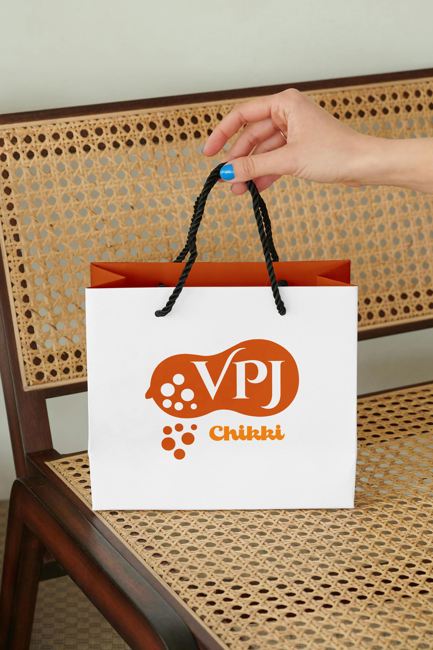
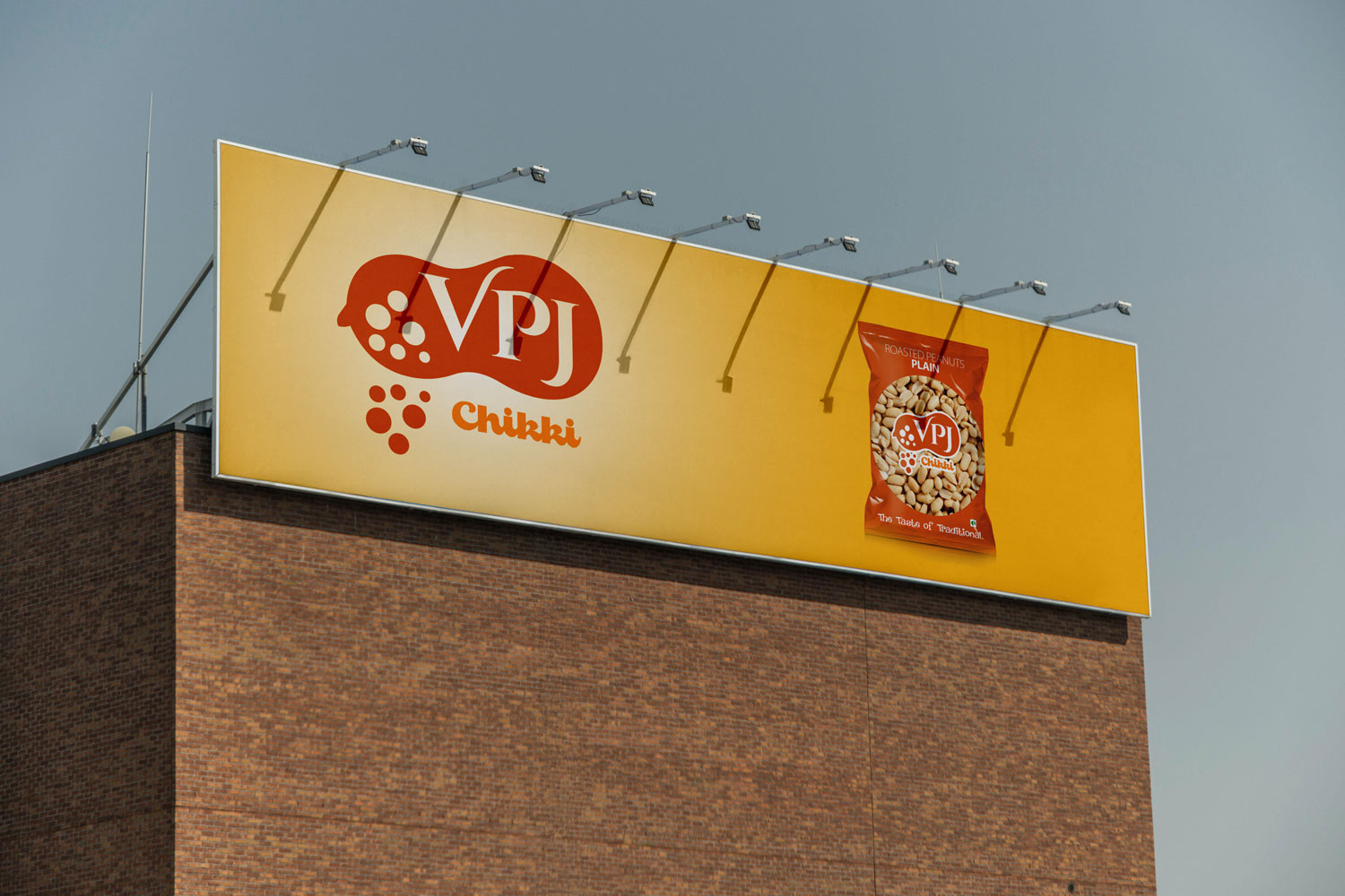
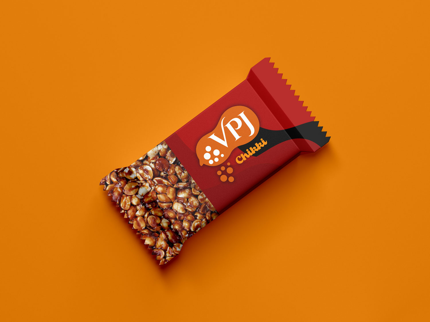
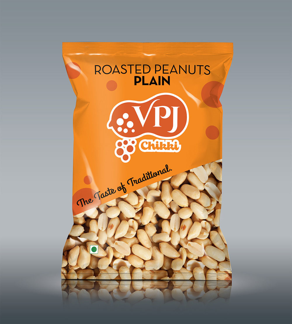
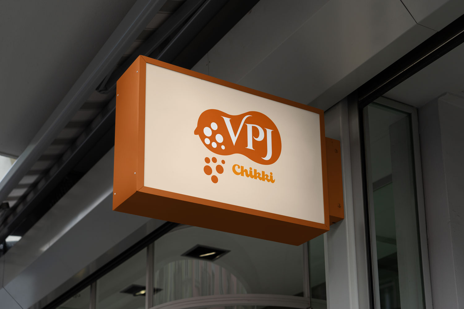
The VPJ logo balances organic illustration with classic typography to create a memorable and highly relevant brand mark.

Iconography: The core structural foundation of the logo is a stylized, solid silhouette of a peanut shell. This organic, horizontal container establishes an immediate and unmistakable visual connection to the brand’s primary ingredient.

Typography: The brand initials “VPJ” are set within the center of the peanut container, utilizing a crisp, white serif typeface via negative space. The classic, elegant styling of the lettering lends an air of heritage, trust, and premium quality to the traditional snack.

Dynamic Graphic Elements: Positioned to the left of the typography within the shell, and cascading dynamically below the main logo mark, are clusters of circular dots in varying sizes. These abstract elements evoke the satisfying crunch of crushed peanuts, the bubbling texture of boiling jaggery syrup, or the generous scattering of raw ingredients.
VPJ-Chikki-07

Typography and Craftsmanship

The brand initials “VPJ” are set within the right side of the peanut shape in a classic, elegant white serif typeface. The typography carries a traditional weight, communicating heritage and established quality. A notable custom typographic flourish is present in the letter “V,” where the right arm extends upward and arcs elegantly over the letter “P”. This sweeping curve adds a sense of artisanal craftsmanship and fluidity, breaking the rigidity of standard serif fonts.

Color Palette and Contrast

The design utilizes a stark, high-contrast, two-tone color palette consisting of white and a rich, earthy rust-orange. The dominant orange hue serves multiple psychological purposes: it evokes the warmth of South Indian culture, mirrors the exact caramelized tone of melted jaggery (the traditional sweetener used in chikki), and suggests the roasted nature of the peanuts. The white elements provide sharp contrast, ensuring the brand name stands out prominently against the dark background.

  • Get in touch
    Work Inquiries
    +91 99444 00361
  • Assistance hours:
    Monday – Friday
    10 am to 8 pm ISD
  • Post address
    10/A, Indira Gandhi Street,
    Sengeniammal Nagar, Orlean Pet
    Pondicherry – 605005. (INDIA)
  • Sign up for the newsletter