Get In Touch
10/A, Indira Gandhi Street,
Sengeniammal Nagar, Orlean Pet,
Pondicherry – 605005. (INDIA)
Work Inquiries
info@venkidesigns.com
Strategy UI/UX February 7, 2023

The StoreFront

StoreFront is the essential Telecom Customer Service Application designed to empower sales representatives. It streamlines store management and provides the tools needed to efficiently.

storefront-dashboard

Project Overview

StoreFront is the essential Telecom Customer Service Application designed to empower sales representatives. It streamlines store management and provides the tools needed to efficiently support and maintain customer accounts. With features like onboarding new customers, processing bill payments, and managing plan changes, StoreFront ensures representatives can meet customer needs quickly and effectively.

Design

UI/UX Design, Art Direction

Strategy

Brand Strategy, UX Strategy

Client

Confidential

Problem Statement

The current StoreFront in-store Telecom Customer Service Application features a complex and often non-linear workflow for essential services, including bill payments, account modifications (new/additional lines), product sales, and service-specific applications (e.g., home 5G, trade-ins). This complexity leads to:
  • Increased average handling time (AHT) for retail store associates
  • Frustration for both customers and employees due to prolonged service times and navigation errors
  • Higher training costs and a steeper learning curve for new store personnel
storefront-01
The Solution

Design and implement a simplified, intuitive, and task-based workflow.

The Customer Service Application to reduce the average transaction time by 50% and improve employee satisfaction with the tool, thereby enhancing the overall in-store customer experience.

I play a role of

  • Design Strategy
  • Problem Solution
  • Insights & Analytics
  • User Research
  • User Persona
  • Information Architecture
  • Wireframe
  • Prototyping
Deep Understanding

The Users and the Industry

During the initial week of the project, I conducted in-depth user research by visiting company retail locations. I interviewed a store manager and subsequently met with store sales representatives who are the primary users of the iPad web application.

This research provided a deep understanding of the application’s current challenges in supporting customers and the time involved in support workflows, particularly concerning the merged support modules.

I also gathered external perspectives by interviewing friends about their own customer service interactions.

Key Findings

The interviews confirmed the core functions of the application: customer support checks, onboarding, bill pay, service/number additions, new mobile sales, in-store pickup, product exchanges, and new home internet setup.

The most critical insight identified was two-fold: excessive application loading times and a complex information architecture that made key options difficult for sales representatives to locate quickly.

I made a

Personas
& User Journey Maps

My interviews with the store manager and sales representative provided critical, detailed information.
This foundation allowed me to successfully create the resulting personas and journey maps.

Personas

Personas

Empathy is the foundation of great design. I develop UX Personas to humanize our target audience, allowing us to step into the user’s shoes. Understanding their ‘why’ helps me design interfaces that don’t just look good, but feel relevant and intuitive to the people using them.
Persona
Sales Representatives Persona
Persona
Store Manager Persona
Retail Store Administrator Persona
User-Journey-Maps-img

User Journey Maps

I use User Journey Maps to visualize the end-to-end experience and uncover hidden friction points. By mapping out every touchpoint—from discovery to conversion—I identify where users get frustrated or lose interest. This allows us to turn ‘drop-off points’ into opportunities for engagement.
User Journey Maps
Sales Representatives User Journey Maps
Store Manager User Journey Maps
User Journey Maps
Retail Store Administrator User Journey Maps
The blueprint

Information
Architecture.

Information Architecture (IA) is rarely a “one size fits all” discipline. Even within the same software ecosystem, different users approach the system with vastly different mental models, goals, and time constraints.

To illustrate this, let’s look at two distinct workflows for a retail application: the Sales Representative and the Store Manager. By analyzing the sitemaps and user flows for these two personas, we can see how IA must shift to accommodate specific user needs.

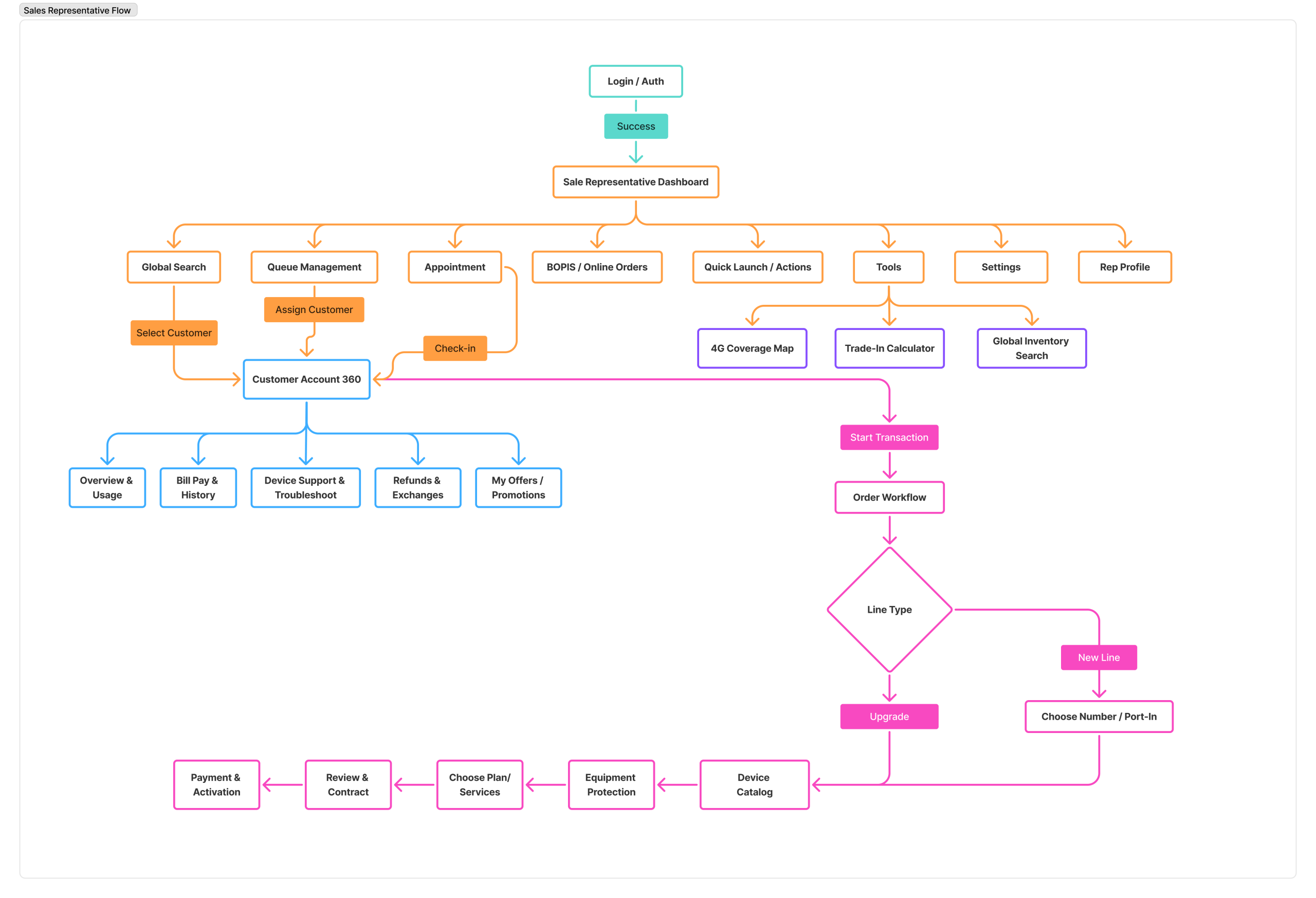
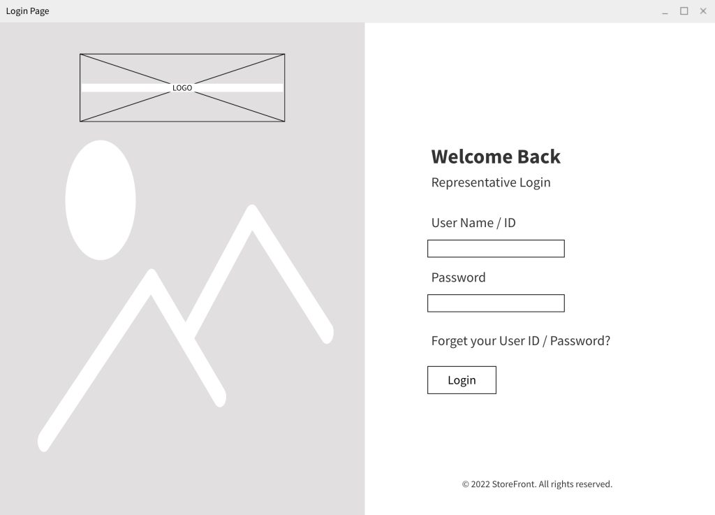
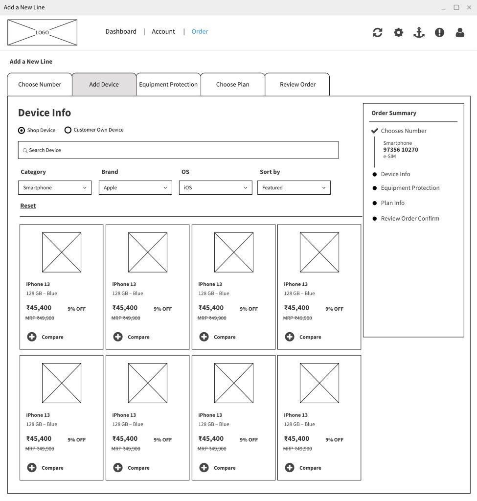
1. The Sales Representative: The “Tunnel” Architecture

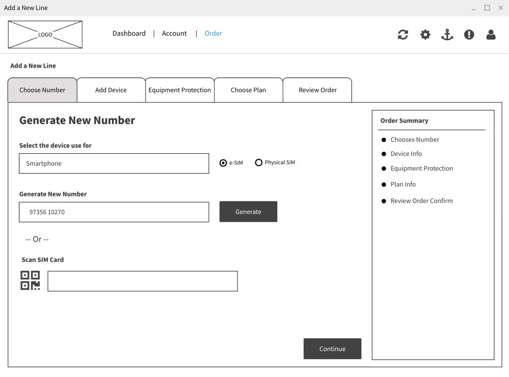
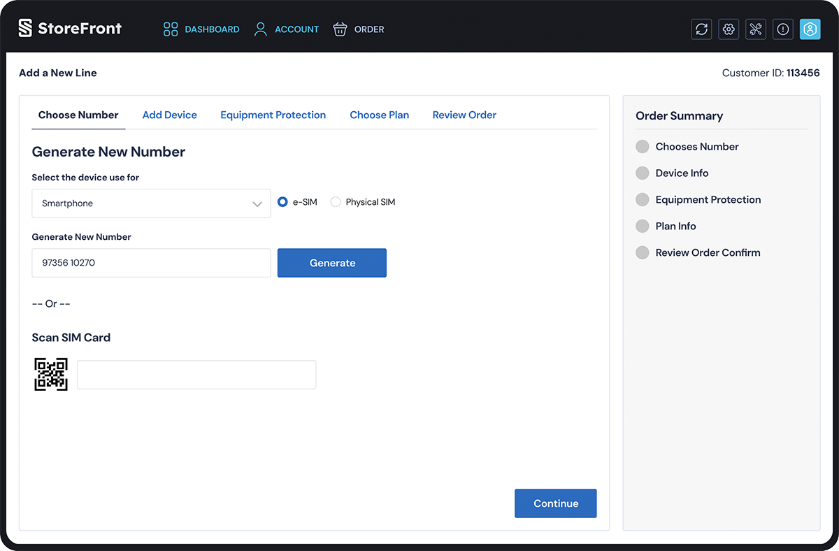
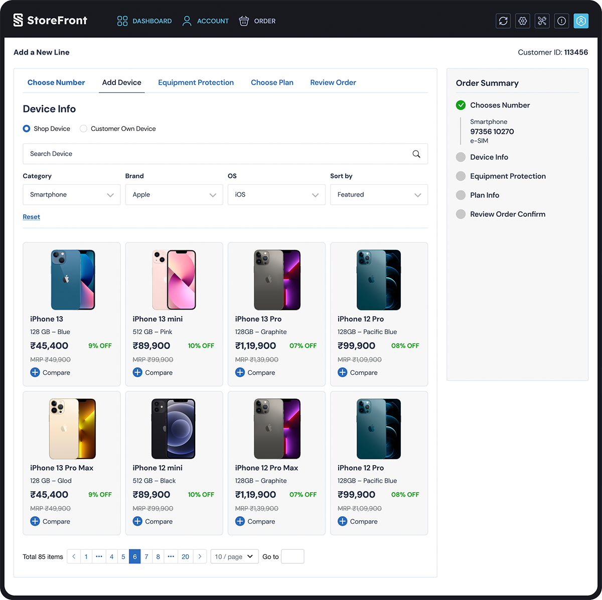
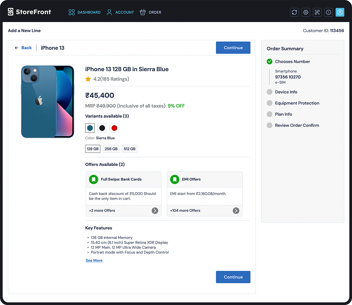
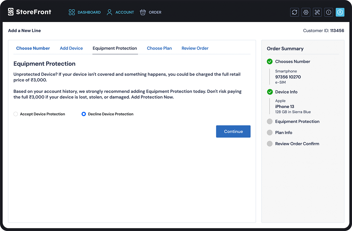
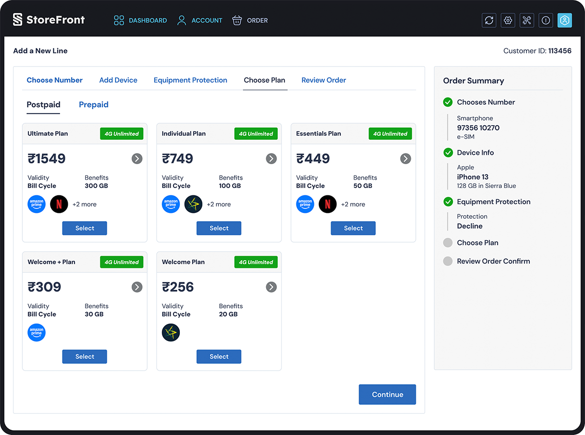
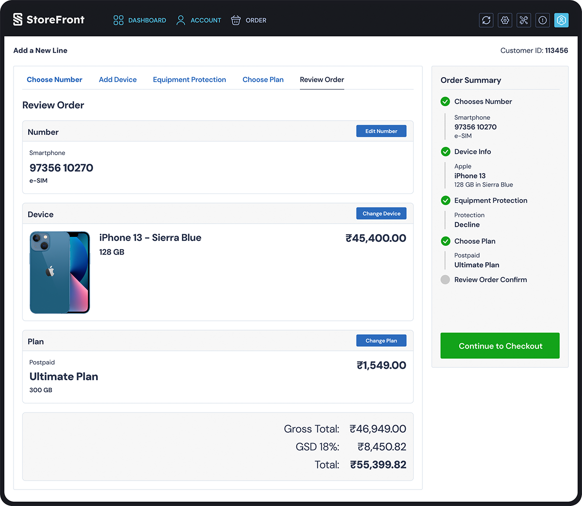
The Sales Representative’s primary goal is efficiency and conversion. Their IA is designed to reduce friction and guide the user through a linear process.

The Hub-and-Spoke Model

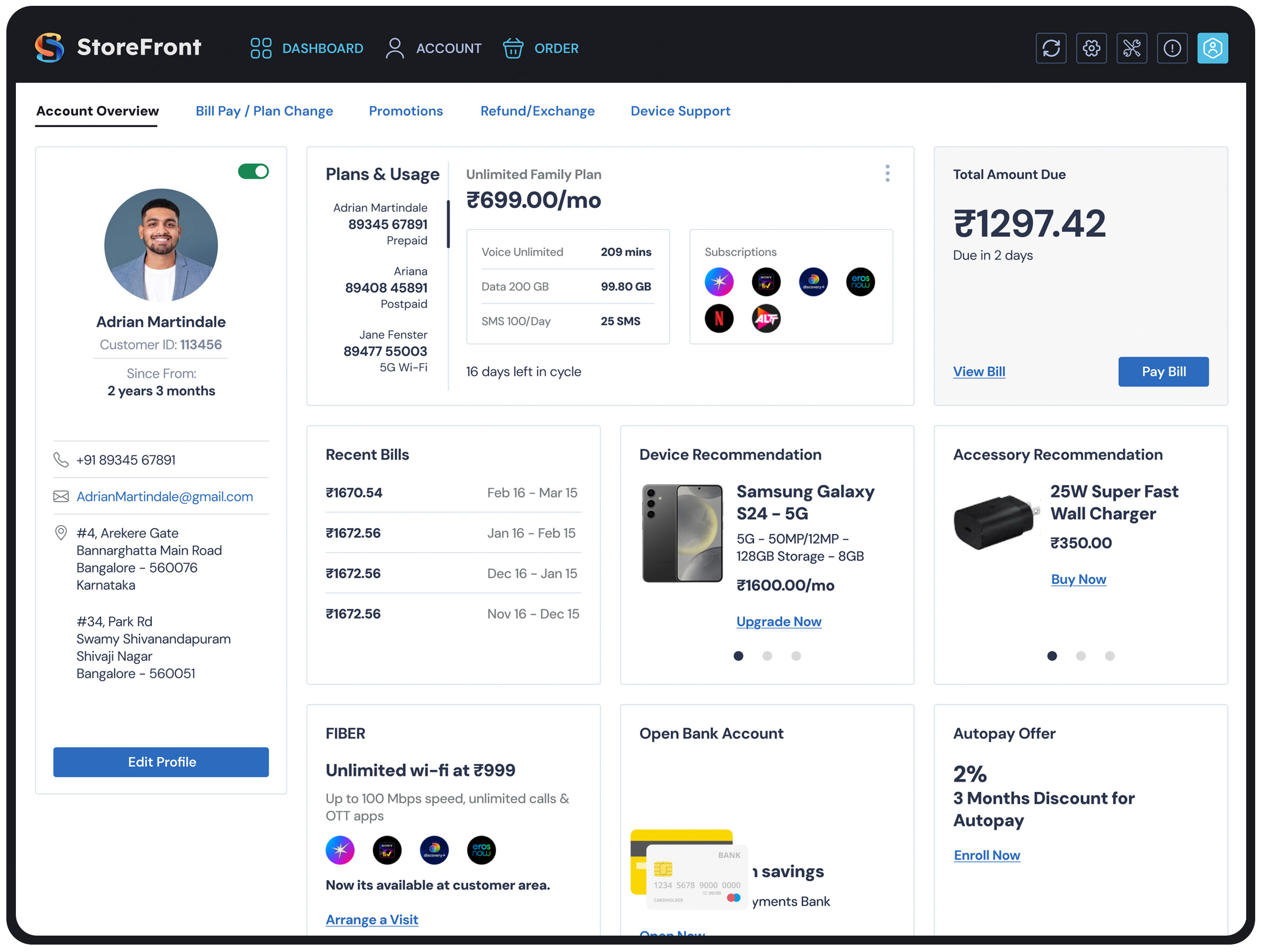
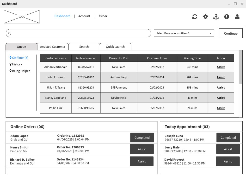
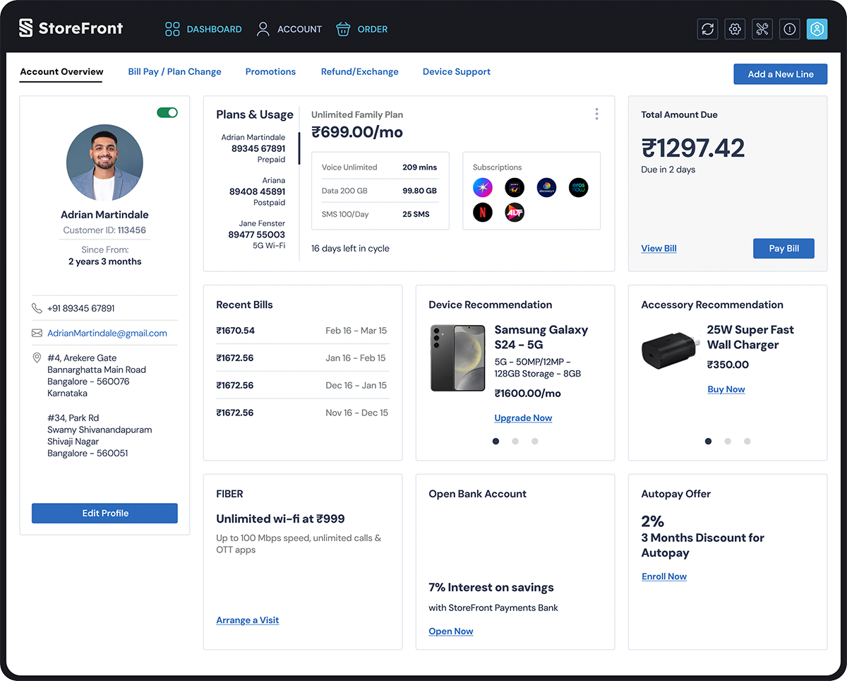
Looking at the Sales Representative Flow, the architecture begins with a Dashboard acting as a central hub. However, unlike a managerial dashboard designed for monitoring, this dashboard is designed for action initiation.

  • Quick Launch & Tools: The presence of 
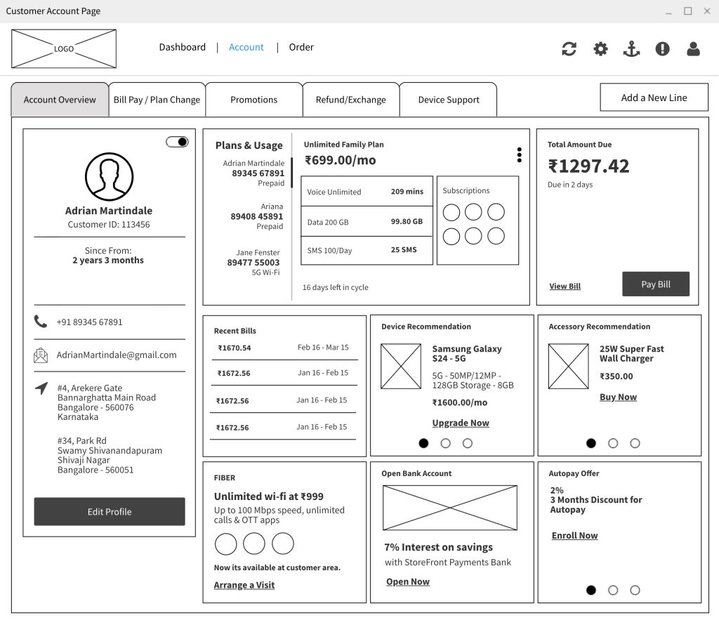
Quick Launch and Tools (like the Trade-In Calculator) indicates an IA prioritized for speed. The user needs immediate access to utility features without digging through menus.
  • Customer Account 360: This is the critical anchor point. The IA consolidates Overview, Bill Pay, and Troubleshooting under one parent node. This prevents the rep from hopping between disparate sections of the app to answer a single customer question.

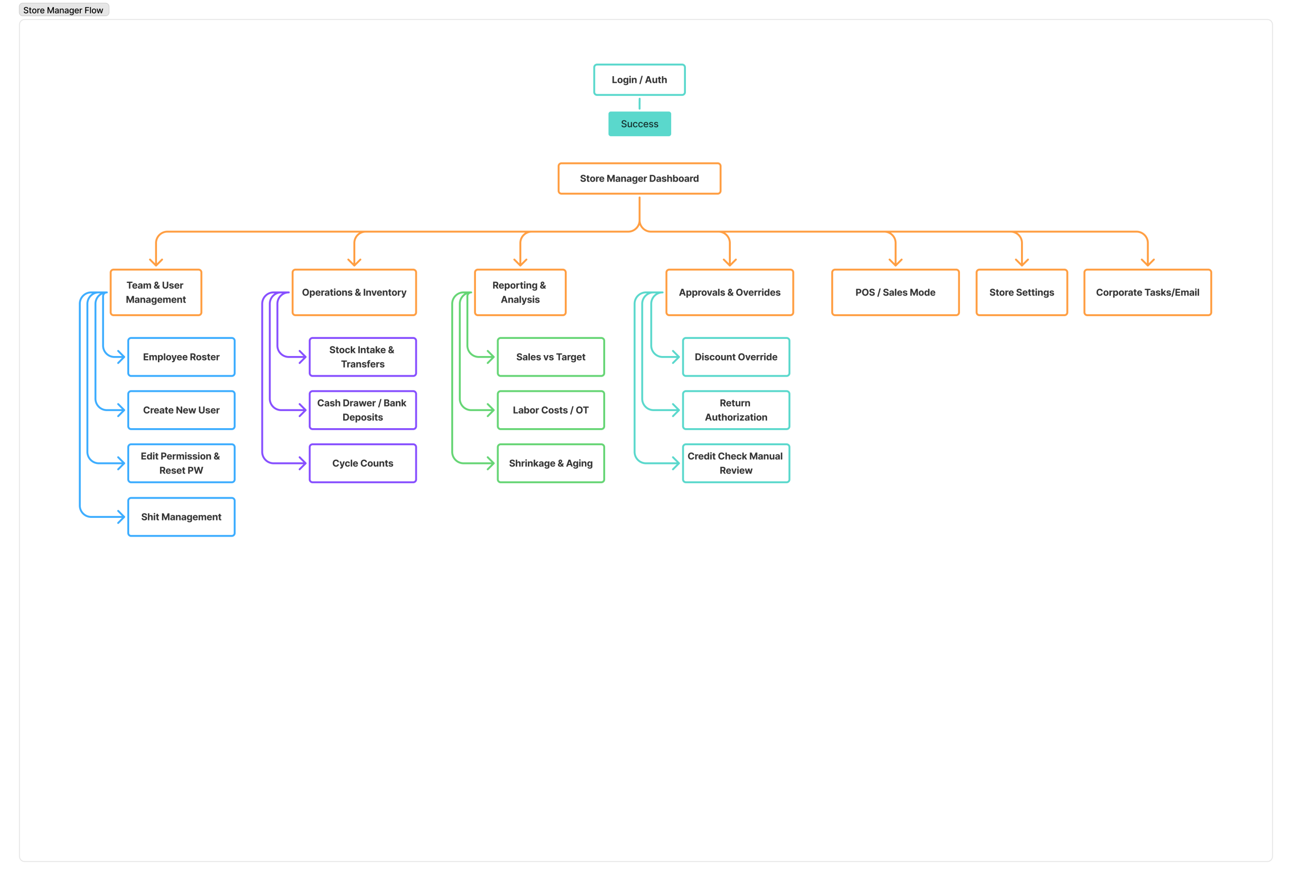
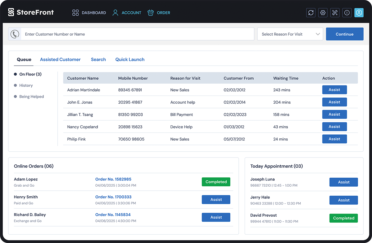
2. The Store Manager: The “Broad and Shallow” Architecture

The Store Manager’s primary goal is oversight and administration. Their flow is less about completing a single linear task and more about managing multiple concurrent buckets of information.

Categorical Grouping

The Store Manager Flow utilizes a broad, shallow hierarchy. Notice that there are no deep, multi-step tunnels like the Sales flow. Instead, the IA is organized into distinct administrative silos:

  • Team & User Management: (Rosters, Permissions)
  • Operations & Inventory: (Stock, Cash Drawer)
  • Reporting & Analysis: (Sales vs Targets, Labor Costs)
  • Approvals & Overrides: (Discounts, Returns)

Why this works: This structure supports “Berry-picking” behavior. Managers often need to jump in, approve a discount, check a labor report, and jump out. They need high-level visibility across many categories rather than a deep dive into one specific transaction.

Sales Representative Flow
Store-Manager-Flow
Store Manager Flow
The

Wireframing

Our internal process challenges eventually surfaced in our design output. In just two months, we generated over 400 artboards in a high-speed sprint to meet deadlines. However, the volume came at a cost: documentation suffered, and many screens were unintentional replicates. It was a powerful lesson in how ‘moving fast’ can sometimes get in the way of ‘moving right.
wieframe-01
Dashboard
AccountPage
New Line

Style Guide

I developed a comprehensive design system that eliminated inconsistencies and cut down production time, allowing the team to focus on delivering a superior user experience.
colors
typography
The

Visual Design

To me, Visual Design is more than just aesthetics—it’s a communication tool. I use typography, color theory, and spacing to create a clear visual hierarchy that guides the user’s eye to what matters most.

  • Address

    VenkiDesigns
    10/A, Indira Gandhi Street,
    Sengeniammal Nagar, Orlean Pet
    Pondicherry – 605005. (INDIA)
  • Sign up for the newsletter

This website stores cookies on your computer. Cookie Policy